Chapter 1: Layout and Presentation
This text was prepared for publication in March 2020. As a result, a lot of the code and techniques in this book are out of date. It is provided as a historical curio, and does not provide accurate guidance on using SwiftUI today.
- Getting Started
- Learning the SwiftUI Basics
- Working with Layout & Composition
- Handling Data Presentation
- Adding Navigation
- What You Learned
It’s time to take your first steps into a bright new world. SwiftUI brings with it a new way of thinking about user interface development, giving you an easy-to-use syntax and flexible types that allow you to concisely express your design.
SwiftUI considers the user interface to be a function of data, and this is how you’ll need to think of your views. You are no longer putting together an interface as its own object, and then wiring it into some data with the aid of controller code. Instead, the SwiftUI View is more akin to a transformation that is applied to your data and state: when the data and state change, the code you write for your views provides the instructions for SwiftUI to create an appropriate on-screen representation of that data. This is why SwiftUI views are struct types, lightweight and all but ephemeral, which in turn makes them easy to compose together.
In this chapter, you’ll start work on the application that you’ll use throughout the remainder of this book. You’ll see what Xcode provides to you when you create new projects and new SwiftUI views. You’ll learn how to use the building blocks that SwiftUI provides as you build out this application. There’s a lot to learn, but happily, the framework is concise and internally consistent, so you ought never to find yourself scratching your head in confusion.
Sample Code for this chapter can be found in the code bundle here, in the folder named
1-LayoutPresentation.
Getting Started
The best way to learn SwiftUI is to work with it directly. In that vein, you’ll immediately start building the sample application. What you create in this chapter will get modified throughout the course of this book, morphing from a simple to-do list application to a more complex and interactive project management tool, with support for every Apple platform.
The first thing to do is to create a new project. Launch Xcode and select Create a new Xcode project or choose File → New → Project…. Select iOS in the tab bar and choose the Single View App template. Click Next, and in the next section, name your project Do It, and ensure that SwiftUI is selected for the User Interface. Finally, choose a location to save your project, and click Create.
Do It: A Brief History Lesson
In the early days of the development of the Apple Macintosh computer, the familiar OK/Cancel dialogs didn’t exist. The OK button was felt to be too specific to the US dialect, so the designers settled on “Do It” instead. However, it didn’t test well. People were clicking on the Cancel button instead, baffling the team. One day, the team learned the reason when a tester got more and more agitated, eventually asking, “Why is the software calling me a dolt?”
The team realized that with the Chicago font on the Macintosh, a serif-less capital
Ilooks a lot like a lowercaseL. With the inter-word spacing being fairly compact within the buttons, people were reading it as Dolt instead of Do It. They changed the text to OK and found that, against their suspicions, it worked perfectly well in all localizations.
Learning the SwiftUI Basics
SwiftUI takes a layered approach to interface programming. It tries to make the most common actions simple and quick, reserving complexity for the edge cases. You’ll see this as you look at the sample view created by Xcode.
From the Project Navigator, select the ContentView.swift file to open it. You’ll see that by default, there’s a two-pane editor rather than the single text editor of earlier Xcode versions. To the left is the source code editor; to the right lies a new pane known as the canvas.
The canvas allows you to immediately see the results of any changes you make to your view code in the editor. Additionally, the canvas acts rather like Interface Builder in that you can select and edit components, and you can drag and drop existing items and new ones from a palette. Initially, though, it’s not running. When you make changes to a view file outside of the body property implementation, the canvas will pause. Click the Resume button at the top right of the canvas to see your view.
By default, the canvas shows an iPhone containing your view as its sole content:
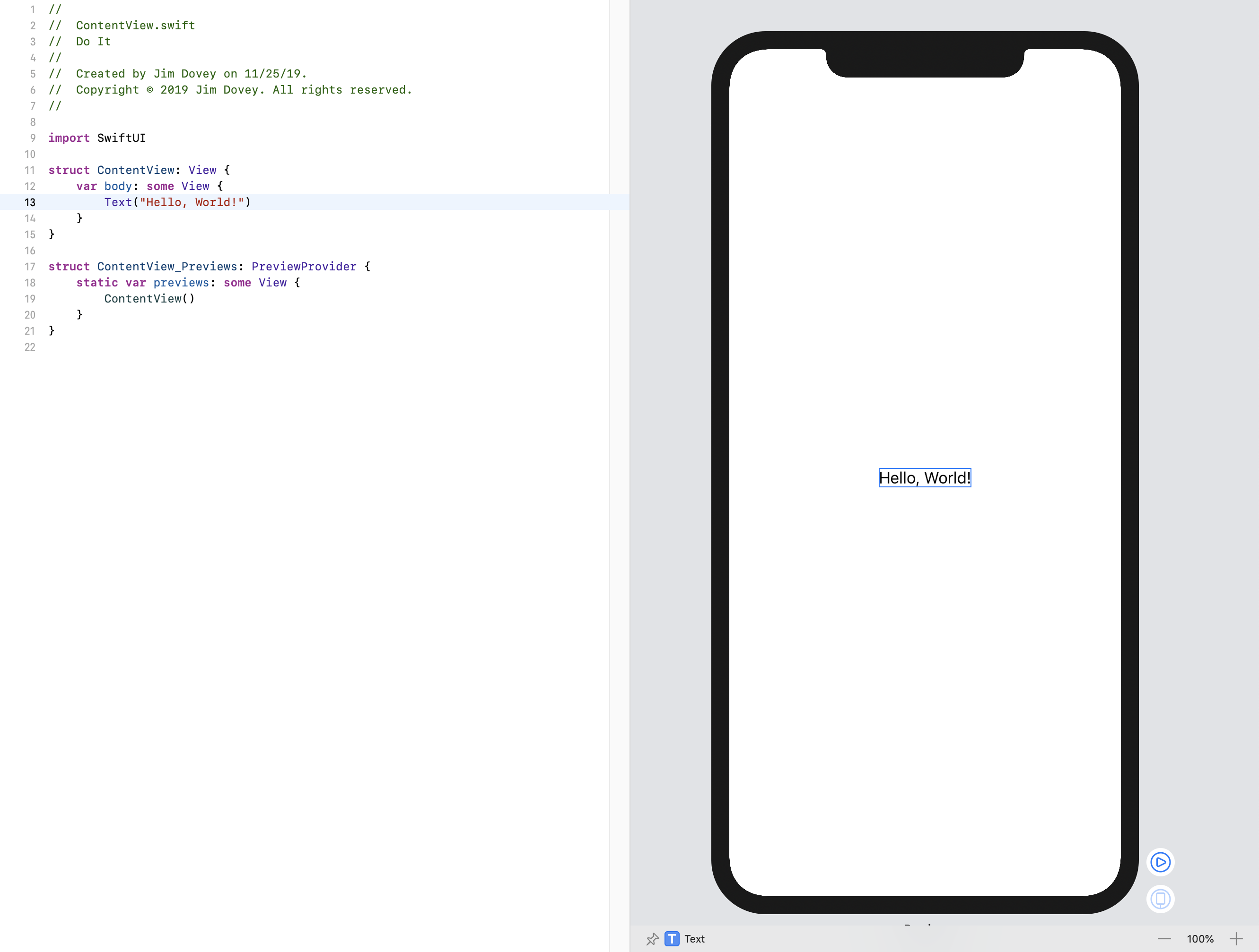
Currently, there’s only the “Hello, World!” text centered within the screen. Look at the editor to the left, and to the body property implementation. It contains the code Text("Hello, World!") and nothing more. Change the string value to "Hello, SwiftUI!", and notice how the canvas immediately updates to reflect your change.
View Types
Look at the type declaration for ContentView:
struct ContentView: View {
    // « … implementation … »
}
This type formulation is a little different from UIKit and AppKit. In earlier frameworks, all views and controllers have been class types, meaning they have reference semantics. Each instance exists once in memory, and other items reference that single instance. Here, though, you have a struct type, which uses value semantics. It can be mutable or immutable, and its contents are copied into new instances on assignment, making each copy independent.
Now, this may sound counter-intuitive. After all, you might reason that a view is showing something on the display, and so you want reference semantics to make alterations to that. This is a reasonable way to do things, though it doesn’t scale as well as it might. Once a view has become sufficiently complex (as most UIKit views are, for instance), there’s a lot of disparate state information held by each one, and there’s no simple way to guarantee ordered updates to that state.
Consider how this is affected when you introduce animation: each animatable piece of state information has both a logical value (where it’s going) and concrete value (where it’s at this moment in the animation). When you set a view’s alpha component from 1.0 to 0.0 with a two-second animation, then the alpha may logically be 0.0, but the concrete value is changing over time, and after one second may likely be closer to 0.5.
Alternatively, the logical value might remain at 1.0 until the animation is done. How does this affect future changes that look at the alpha value to make decisions, such as whether to enable complex blend modes? The alpha will be zero, quite soon, but isn’t yet. Now you have to think about whether you’ll allow interaction, for example, during the animation—do you disable interaction before the animation and restore it if the animation fails to complete? Do you only disable it after the animation succeeds?
Yep, there’s quite a deep rabbit-hole there, and it’s not exactly Wonderland waiting at the bottom.
SwiftUI works around this by using value types to describe all views. In effect, what SwiftUI calls a view is more accurately a view description. When state associated with a view is updated (as you’ll see in chapter 4), SwiftUI asks for a new implementation of that view—a new description—which incorporates the new state. SwiftUI then ensures that all of these changes are applied together, in a single logical step. It can coalesce multiple state changes together into a single update, and it can take ownership of state change animation to directly manage the concrete values displayed on screen. One result of this is that state change animations are always reversible and always adjust correctly when state is mutated multiple times during an animation. Your description specifies the logical end state, and SwiftUI works out how it should get there.
Opaque Types and Implicit Returns
The ContentView conforms to the View protocol. As a value type, it can’t inherit from a parent class, but it can take advantage of Swift’s ability to define default implementations for protocol members. As a result, defaults for every method on View exist already, with the exception of the body property, which you must provide, and is present in the template:
var body: some View {
    Text("Hello World!")
}
Here, again, are some things that look a little different to the Swift you know. First, the code implementing the property relies on a new feature in Swift 5.1 called implicit return statements. For a while now, Swift’s block syntax has contained a shorthand: when a block contains only one expression, then the result of that expression is implicitly returned from the block. That has enabled brief and easy-to-read code such as the following:
names.map { $0.uppercased() }
From Swift 5.1 onwards, this shorthand is available for all functions and property accessors that match the requirements: a single expression gets an implicit return added for them by the compiler:
func uppercase(name: String) -> String {
    name.uppercased()
}
With this facility, SwiftUI code now looks the same whether nesting via an inline block or returning from a bespoke function, keeping the syntax visually similar and code directly interchangeable between different locations.
Implicit return statements only work for single-statement implementations, though. Try adding let x = 0 at the top of the body implementation and you’ll see a compiler error appear. With more than one expression in the method body, you need to use an explicit return keyword.
Secondly, it uses an opaque return type, which helps deal with protocol-based types in an efficient way while maintaining a succinct declaration syntax.
Protocols in Swift are powerful. They can define lots of functionality, can contain default implementations of methods, and can define some quite complex behaviors based on associated types. This last feature, however, can cause some pain. Let’s say you have the following protocol definition:
protocol Identifiable {
    associatedtype Identifier: Hashable
    var id: Identifier { get }
}
extension Identifiable where Identifier == String {
    var uppercaseID { id.uppercased() }
}
Some problems occur when you want to make use of the protocol as its own type, however:
func doSomething(with: Any) -> Identifiable {
    // « … body … »
}
Here the compiler will complain: Protocol 'Identifiable' can only be used as a generic constraint because it has Self or associated type requirements. It can’t determine how to build this function, because without knowing the actual type of Identifiable.Identifier that was provided it can’t allocate enough memory, and it can’t tell if initializers and destructors for the associated type are needed.
That’s all very well for the compiler, but you just want to say that you want some sort of Identifiable to be returned. You don’t care exactly what, and thus the extra work of making this function generic seems like overhead. Also, generic protocol wrapper types have some downsides in terms of size and processing overhead, so this may be unusable within performance-critical code.
For this reason, Swift 5.1 introduces opaque return types. Adopting them is as simple as putting the keyword some in front of your return type:
func doSomething(with: Any) -> some Identifiable {
    // « … body … »
}
The compiler is now happy: it will inspect the code inside the function and determine the actual type being returned. The details of that type will be known to the compiler and will be used by any functions calling this one, but will be hidden from the programmer, keeping the interface simple and logical. SwiftUI uses this for its View types; many functions return some View.
Note that opaque return types only hide complexity in terms of the return type’s name. If you actually return an _IdentifiableDictionary<String, Array<Int>> then that’s the actual return type of your function, not ‘any Identifiable.’ Thus your code can only return instances of that one type. They can’t optionally return one of two distinct types, each conforming to the same protocol. Thus, in SwiftUI you’ll implement a body property that returns some View, but you’ll actually return a Text, or an Image, etc.
In SwiftUI, the result of the body property says that it will always return a single particular type, but it will at least conform to the View protocol. In ContentView, the compiler infers from the body implementation that the type returned is actually a Text instance, so the compiler will create storage enough to return that. Any code that calls this method will receive a thing that implements everything in the View protocol and takes up the amount of storage needed for a Text instance. This avoids the existential type wrappers around a pure-protocol instance—which quickly become expensive for any types larger than 24 bytes.
This has a secondary effect of ensuring that only a single type can be returned from a method, even though your API simply indicates that it returns ‘some sort of View’. To see what this means, replace the contents of body with the following:
if (Bool.random()) {
    return Text("Hello World!")
} else {
    return Text("Hello SwiftUI!")
}
This works fine, and the canvas displays one of the two text items at random. No matter which path the execution takes, the result will be the same size. Now, replace the content of the else clause with the following:
return Image(systemName: "iCloud")
This code generates an error because the compiler detects that no single type is returned:
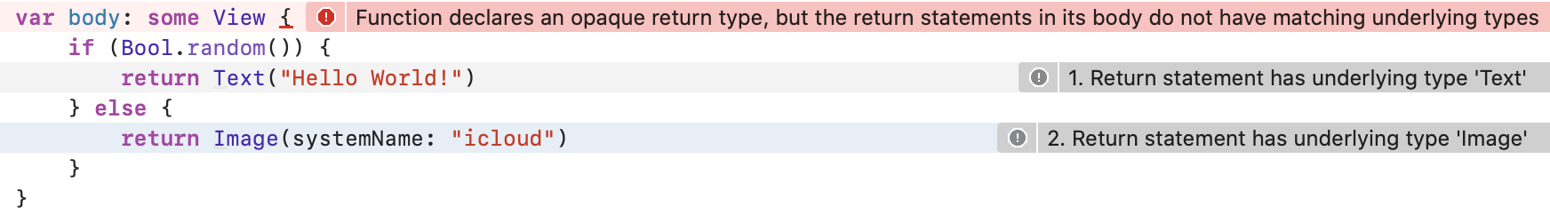
Since the Image and Text types aren’t necessarily the same size, the compiler can’t provide a single return type. Remove some from the property’s declaration and attempt to build the project—maybe you can return an existential ‘property-only’ type. Notice you get an error:
Protocol 'View' can only be used as a generic constraint because it has
Self or associated type requirements
You’ve seen this one before. It means that a return type of View alone doesn’t provide enough type information to the compiler. There may be methods that are available only if the instantiated view (the Self type) conforms to Equatable, for instance. Perhaps it contains a member variable of some associated type, and without knowing that type, the compiler doesn’t know how much memory it will take up. Opaque types solve this problem, allowing you to specify that while you (as the programmer) only care about conformance to View, the compiler can actually see a real type, in this case Text, and can handle it appropriately. The compiler knows how big the return type is, and can signal that size to the caller.
Now revert the method back to its original format: use some View for the return type, and replace the Image with a Text. The errors should then disappear.
View Modifiers
In the world of AppKit and UIKit, adjusting a view is a matter of creating your view and then setting values for various properties. The following code likely looks familiar:
let label = UILabel()
label.text = "Hello World!"
label.textColor = .green
label.font = UIFont.preferredFont(forTextStyle: .largeTitle)
In SwiftUI, things happen differently. One of the benefits of using value types is their innate immutability, which allows for much safer code. To keep that benefit, rather than using a mutable View instance and changing its contents, you create an immutable one and call a function to obtain a new immutable view reflecting your changes. For further modification, you call a function on that view to receive another, and so on. This is known as chaining, and it makes for some nicely-readable code:
Text("Hello World!")
    .foregroundColor(.green)
    .font(.largeTitle)
Make those changes to the Text view in your editor, and you’ll see the changes reflected immediately on the canvas.
⌘-click on the view in the canvas, and you’re presented with a pop-up menu containing numerous options. You’ll explore these in full later, but for now, select the first option, Inspect…, to reveal a floating inspector palette for the view:
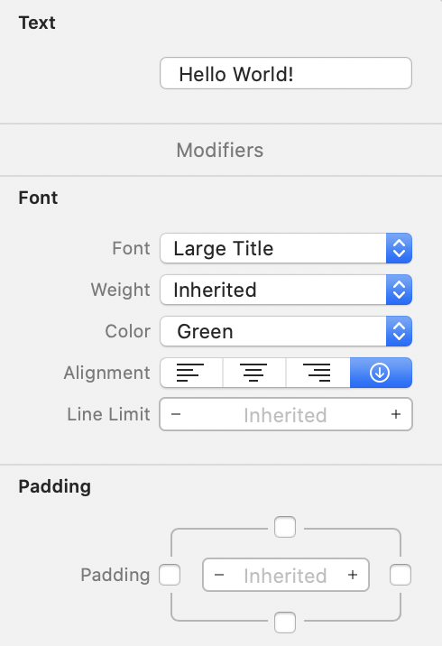
Here, you can change the value of the displayed text, adjust its font, weight, alignment, padding, and more. Scrolling down, you’ll see a Foreground Color section containing a pop-up menu. Use this menu to select a new color. Your canvas will update to show the new color, and in the editor, you’ll see that the code was altered to reflect the change. In SwiftUI, the code is the source of truth; xib files aren’t used to create and layout views now.
The inspector is also available directly from the code editor. ⌘-click on the Text initializer to see a similar pop-up menu, and again, select Inspect… to see the inspector. This time, change the font to Headline and note how the code and canvas both update to reflect the change. Open the inspector again, and this time set the font to Inherited. Your canvas updates to use the default font, and in the editor, the .font(.headline) line is removed. Do the same for the Foreground color.
Lastly, ⌘-click on the Text view and select Embed in VStack from the popup menu. Your body implementation should now look something like this:
VStack {
    Text("Hello World!")
        .foregroundColor(.purple)
}
The body property now returns a VStack view, which itself contains a Text view. The contents of the stack view are provided by a block, and in this case, it’s a rather special block: a ViewBuilder. A ViewBuilder is a type of function builder, another new feature in Swift 5.1 that’s put to heavy use by SwiftUI to provide its declarative syntax. This is what allows us to simply list out the contents of a stack view without using functions like append(view) all over the place:
VStack {
    Text("First")
    Text("Second")
    Text("Third")
    Spacer()
    Text("Last")
}
This works with a new attribute, @functionBuilder, which enables the creation of types that convert a series of inputs into a single output. The type of the block passed to the VStack in the example above has the @ViewBuilder attribute attached, meaning that an instance of the ViewBuilder function builder will be instantiated. The compiler will then collect the results of all expressions within the block which weren’t otherwise assigned and will pass all those values into the builder, and the builder will, in turn, examine each one and return them as an array to the VStack initializer.
Managing Long View Lists
Function builders work by converting each statement within their braces into a parameter to a single function. Because of this, if there are 20 statements, the creator of the function builder needs to provide a function taking 20 parameters. In the case of
ViewBuilder, implementations are provided for up to 10 parameters at once. If you want more subviews, you’ll need to break up your content a little by assembling them intoGroupviews, each containing ten or less subviews.
Drag & Drop Modification
In the Xcode toolbar, click the + button to view Xcode’s Object Palette:
If you’re familiar with Interface Builder, this will look similar, but since you’re working with SwiftUI, the first two tabs are different. The leftmost tab, selected by default, contains views. Double-clicking one of the views listed there will insert it at the cursor position. You can also drag views onto the canvas or the code editor to place them precisely where needed.
Drag out a new Text view, and place it below the existing one inside the VStack. If you drag it onto the canvas, a message will appear describing what the operation will do. By default, it creates a new VStack containing both the new item and the existing view (already a VStack). Dragging it into the editor will cause an empty line to appear, ready for you to drop it into place.
You now have a pair of Text views; let’s modify their content and appearance a little. First, replace the placeholder text with "Greetings from SwiftUI". Then, open the palette again, and this time, select the second tab to reveal a list of available modifiers.
Modifiers in SwiftUI are conceptually similar to properties. A modifier to a Text instance might set its font, or make its text bold. It might set a specific size for a view, or a background color, or more. Rather than modifying the content of a view class, a modifier on a SwiftUI view will yield a new view value with different properties all encoded—and all immutable, and thus thread-safe.
Scroll down to find the Font modifier, and drag one into the editor. Hover between the two Text declarations and an empty line will appear. Drop the font here, and it’s appended to the first Text view. Select the default value of .title and replace it with .headline. Repeat the process, this time dropping the font onto the second text field on the canvas. Again, the editor content is changed to add a call to .font(...). This time, replace the font with .subheadline.
Working with Layout & Composition
You now have the beginnings of a nice view. Let’s add some more items and adjust the layout to finish off with something that looks like this:

Currently, you have the pair of Text views vertically stacked on top of one another. To lay items to the left and right, you’ll need a horizontal stack as well. You can obtain one by wrapping the existing VStack in an HStack, either by editing the source code to to put HStack { ... } around the existing code, or by ⌘-clicking the VStack and selecting Embed in HStack.
Open the views palette and drag a Circle into the HStack, above the VStack. ⌘-click on the circle you just added and set its width and height to 40. Now change its color to blue by appending .foregroundColor(.blue) in the editor:
Circle()
    .frame(width: 40, height: 40)
    .foregroundColor(.blue)
Following the VStack, add an image using one of the built-in SF Symbols values, and set its color to green:
Image(systemName: "star.fill")
    .foregroundColor(.green)
At this point, everything is squashed together in the center of the canvas:

To add some space between the text and the star image, SwiftUI provides the Spacer view. Drag one from the palette between the VStack and Image, or simply type Spacer in the editor on a new line above the Image initializer.
This almost looks right, except for two things. First, the two lines of text appear to be centered with respect to one another. Second, the circle and the star are both tight against the edges of the screen on the canvas, which doesn’t look very pleasing:

To solve the first problem, you need to tell the VStack how to horizontally align its contents. By default it uses .center, but you can easily change that either via the inspector or by editing the call to its initializer directly, like so:
VStack(alignment: .leading) {
    // « … content … »
}
The two text fields are now left-aligned next to the circle. The only remaining step is to pull in your view’s content from the edges of the screen. To do this, you can append .padding(.horizontal) to the HStack’s declaration, after the closing brace. Alternatively, you can use the inspector, selecting the left and right checkboxes in the Padding section, which will insert the relevant code for you.
Now, the view should look correct, and your code should look something like this:
HStack {
    Circle()
        .frame(width: 40.0, height: 40.0)
        .foregroundColor(.blue)

    VStack(alignment: .leading) {
        Text("Hello World!")
            .font(.headline)
        Text("Greetings from SwiftUI")
            .font(.subheadline)
    }

    Spacer()

    Image(systemName: "star.fill")
        .foregroundColor(.green)
}
.padding(.horizontal)
Handling Data Presentation
Your applications won’t be creating user interfaces from whole cloth. You’ll be working with some sort of data, and your user interface will present that data to your users. For this application, you’re going to use to-do items, which you’ll initially present in a list, then later in a detail view and an editor.
In the downloadable code bundle for this book is a folder name Model; add this to your project, being sure to check Copy items if needed and Create groups. Inside the imported folder are four files, which you’ll use throughout this book; in this chapter, you’ll only need to think about two of them: TodoItem.swift and StaticData.swift.
Open TodoItem.swift to see two types defined there: TodoItem and TodoItemList. You’ll use the list type in the next chapter, so for now, take a look at TodoItem; its interface looks something like this:
struct TodoItem: Codable, Identifiable, Hashable {
    var id: UUID
    var title: String
    var priority: Priority
    var notes: String?
    var date: Date?
    var listID: UUID
    var completed: Date?

    enum Priority {
        // « …  ...  … »
    }

    var complete: Bool {
        // « …  ...  … »
    }
}
The structure is very simple, and you’ll be working with it over the next few chapters. It contains a UUID (Universally Unique IDentifier) as an identifier, a title, and an enumeration representing its priority. Optionally, it may have associated notes a due date, and the date on which it was completed. Lastly, it contains the UUID of the TodoItemList that contains this item.
The definition takes advantage of some automatically synthesized conformances here, as well. First, since all of the properties are simple types, it gets free Codable support. Second, by conforming the Priority enumeration to the CaseIterable protocol, the compiler synthesizes an allCases static property, which will return a list of all the enumeration’s values, in the order they appear in the source code. This is particulatly helpful in a UI application if you want to display a list of available priorities, for example.
Some sample data is also provided in the book’s code archive, in the sample-data folder. Drag the file todo-items.json from there into your project; this might also be a good opportunity to create a separate “Resources” group to contain this and the other assets from the application, though see Info.plist Trouble below for some important information when you do.
The JSON format of a to-do item looks like this:
"id": "63A3B756-BCBC-4EA3-8A35-A52462B24604",
"title": "Complete SwiftUI book sample",
"priority": "high",
"notes": "Use parts of the initial setup tutorial, to demonstrate how I plan to introduce and explain new code.",
"date": "2019-08-03T16:30:00-0500",
"listID": "B930B8BB-3804-440D-89ED-6F3E4DDCE22A",
"completed": "2019-08-05T12:14:51-0800"
Info.plist Trouble
In general, any file referenced in Xcode’s project navigator can be moved around within that navigator and everything will work out Just Fine™. Alas, for one particular file that’s not true:
Info.plist, while it’s handled normally as a resource file, is also referenced directly by a build setting—which includes the file’s path. By moving it into a sub-folder, you’ll break that build setting, and thus the build.There are two ways around this:
Define the
Resourcesgroup usingNew Group without Folder(⌃⌥⌘N); the group will exist in the project navigator, but the contents on disk won’t move.Select the
Do Itproject in the project navigator, then theBuild Settingstab, then edit the value of theInfo.plist Filesetting to include the new folder (e.g.Do It/Resources/Info.plist).Which approach you use is entirely up to you; Xcode will perform identically either way.
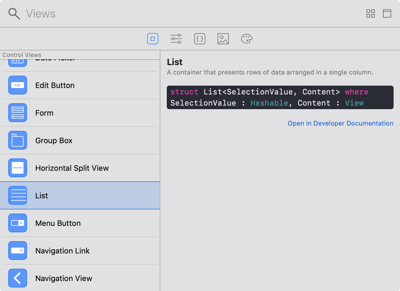
The initial view for the app will show a list of to-do items. In UIKit, you’d use a UITableView, UICollectionView, or a UIStackView to accomplish this. However, in SwiftUI’s concept-based nomenclature, you have the List view, which on iOS can create views analogous to a UITableView.
Start by creating a new group named Views, and within there create a new SwiftUI View file, naming it TodoList.swift. Open this file and resume the canvas to see the familiar ‘Hello World’ template code. Wrap the Text declaration in a call to List, like so:
List {
    Text("Hello World!")
}
The canvas now displays a familiar table view containing a single row with some text and a number of empty cells. You can repeat this cell by passing a sequence to the List initializer. The block is then invoked once for each element in the sequence, with that element passed as a value. You can use a Range to tell the list to generate multiple rows. Change your code to match the following:
List(0..<5) { num in
    Text("This is row \(num)")
}
Your canvas should now display five rows, each announcing their row number.
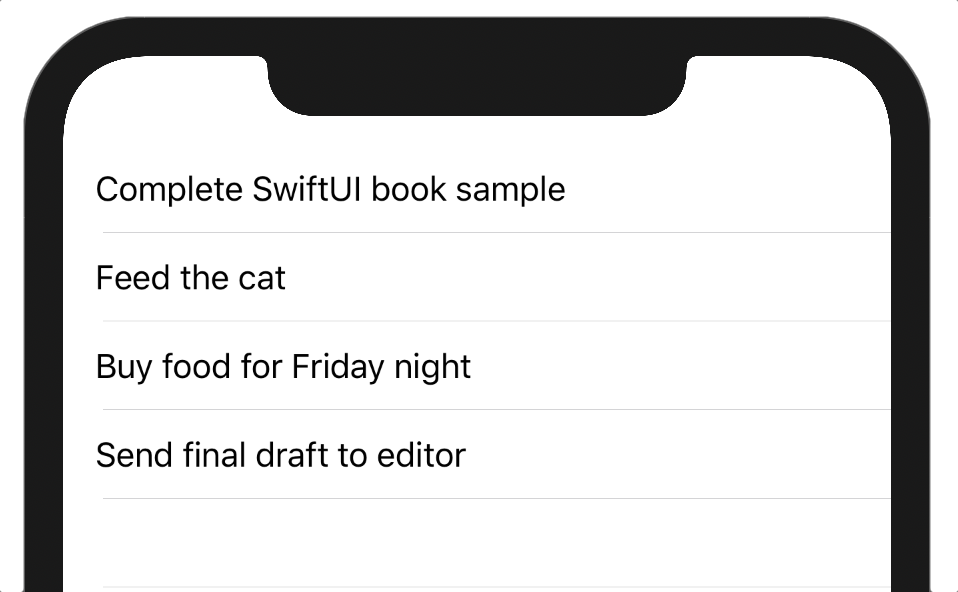
This, as it turns out, is everything you need to display the to-do items. All that’s left to do is pass in the todoItems list defined in StaticData.swift to the List initializer and reference each item in the supplied block:
List(todoItems) { item in
    Text(item.title)
}
Verbatim vs. Localized Strings
In AppKit and UIKit, strings were just strings. If you wanted to localize the title of a button, you had to call
NSLocalizedStringto look up a localized version of that string for the user’s current locale. When developing, though, that’s a lot of extra typing, and it’s not uncommon for developers to skip the call when starting their app or when trying things out. However, as the project gets larger, it becomes more and more difficult to remember where you need to go back and insert those localization calls, and inevitably, something slips through the net.SwiftUI takes the opposite approach. Any inline strings (e.g.
"Hello") passed to theTextinitializer are automatically considered localizable. What’s more, it automatically converts from Swift’s string-interpolation format to the numbered-parameter format used by string localization (i.e."Hello \(name), the current time is \(time)."becomes"Hello %$1, the current time is %$2."). String variables (e.g.self.name) are presented verbatim automatically. When you know a static string should not be a candidate for localization, use theText.init(verbatim:)initializer to skip all that; this should be the default for any text that comes from your user’s data. Conversely, when you want a string variable to be localized, use it to initialize aLocalizedStringKey, e.g. asText(LocalizedStringKey(str)).
You now have a basic list of to-do items.
It’s worth looking under the hood a little, though, to answer a pertinent question: how does SwiftUI know to associate a given item with a given row in the list?
The answer is in the Identifiable protocol, to which TodoItem conforms. This simple protocol has only one requirement: a property named id whose type conforms to Hashable (and thus Equatable):
public protocol Identifiable {

    /// A type representing the stable identity of the entity associated
    /// with `self`.
    associatedtype ID : Hashable

    /// The stable identity of the entity associated with `self`.
    var id: Self.ID { get }
}
If you’re working with a type that doesn’t conform to Identifiable, though, you can always supply a suitable identifier as a key-path; for enumerations or Strings, for example, you’d use \.self like so:
List(["Hello", "World"], id: \.self) { // « … ... … » }
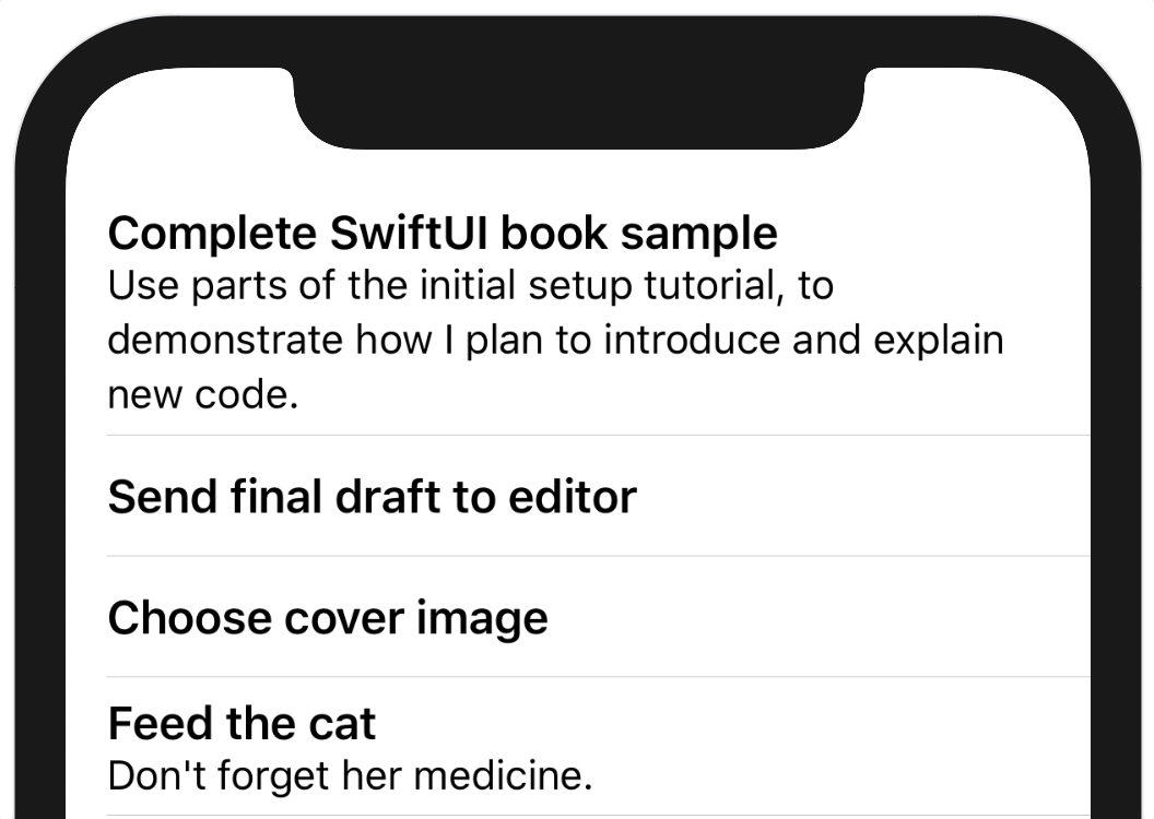
Let’s make some small changes to give the view some more flavor. First, set the title’s font to .headline by appending .font(.headline). Now, wrap it in a VStack(alignment: .leading). Lastly, inside the vertical stack block, check if the item’s notes are non-nil, and if so, declare another Text containing those notes, using the .subheadline font. Your list content should now look like this:
VStack(alignment: .leading) {
    Text(item.title)
        .font(.headline)

    if item.notes != nil {
        Text(item.notes!)
            .font(.subheadline)
    }
}
Author’s Note
At present the allowed syntax for builder blocks does not include the
if letconstruct, which is why you can’t use a more idiomaticif let notes = item.notes. Hopefully this can be rectified with a future compiler update, but until then this check-and-explicitly-unwrap is the only straightforward option within a@ViewBuilderblock.
Each row contains a nicely presented title and potentially the notes as well:
Adding Navigation
Now that you have the items displaying nicely, you want to be able to interact with them. The normal way of doing this is to place the list within a navigation view and to make each row tappable. Tapping on the row then presents a new view via the parent navigation view.
First, let’s make the rows interactive. In AppKit or UIKit, you’d likely set a property on the view to mark it as interactive, and then you’d add a tap gesture recognizer, you’d set a target and action on the recognizer, and so on. Or, if you’re using a UITableView or similar, you’d implement a method in the UITableViewDelegate that gets called when the user taps on a row. In SwiftUI, things happen differently.
As you’ve seen, SwiftUI prefers to describe things in a more abstract sense. Thus, for navigating, rather than setting some values on some view, you tell SwiftUI to use a NavigationLink. This view uses a view-builder block to define its content, so it can simply wrap the VStack you’re already using. It exists for the simple purpose of responding to single taps by pushing some new View onto a navigation stack. It also, depending on the platform, includes some extra subviews that indicate its nature, such as the trailing-edge chevron image used by navigable UITableView rows.
Wrap your VStack in a new NavigationLink, providing a simple Text view as its destination:
List(todoItems) { item in
    NavigationLink(destination: Text(item.title)) {
        VStack {
            // « … content … »
        }
    }
}
Your canvas will immediately reflect the change:
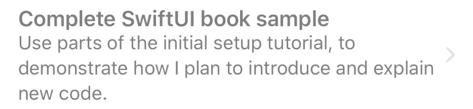
The trailing-edge chevron was added to each row, but for some reason the text appears to be using a more muted gray color. Launch a live preview from the canvas by clicking the play button on the lower right, then try clicking on the rows.
Nothing’s happening, it seems. The reason for this is tied to the sudden color change on the text. All the NavigationLink views are in their disabled state. Glancing at the code, can you see why?
You’re missing a NavigationView. The NavigationLink view must be inside a navigation view in order to function. Not finding one, it automatically adjusts its display to indicate that it’s disabled and will not function. This is easy enough to remedy. Wrap the List in a new NavigationView:
NavigationView {
    List(todoItems) { item in
        // « … … … »
    }
}
With that code, your preview comes alive. The text is in the correct color, and clicking on the rows in the live preview pushes a new view containing the item’s name. You can navigate in all the usual ways, whether with buttons or by swiping backward and forward.
There’s a large space at the top of the list view now, though, and the back button doesn’t look very interesting. Normally you’d set a title on a view for the navigation view to use; the same is true in SwiftUI, though naturally rather than setting a property, you’ll be chaining a call to your List view’s declaration (the List is the root view displayed by the NavigationView). After the list’s closing brace, append the text .navigationBarTitle("To-Do Items"). Your list now has a title, and when you click on a row in the live preview, you’ll see that the title animates into the place of the back button in the expected manner, and animates back to title position when you back out to the list again.
It’s time to clean up the UI a little by styling the list view. By default, the list uses a plain list style, described by the PlainListStyle class, but you can change this by chaining another call. Use .listStyle(GroupedListStyle()) to modify your list’s appearance, and you’ll get a more muted background behind the title and status bar, and any blank rows disappear from the list.
At this point, your body implementation should look like this:
// file: "1-LayoutPresentation/Do It/Views/TodoList.swift"
var body: some View {
    NavigationView {
        List(defaultTodoItems) { item in
            NavigationLink(destination: Text(item.title)) {
                VStack(alignment: .leading) {
                    Text(item.title)
                        .font(.headline)

                    if item.notes != nil {
                        Text(item.notes!)
                            .font(.subheadline)
                    }
                }
            }
        }
        .navigationBarTitle("To-Do Items")
        .listStyle(GroupedListStyle())
    }
}
The canvas should look similar to this:
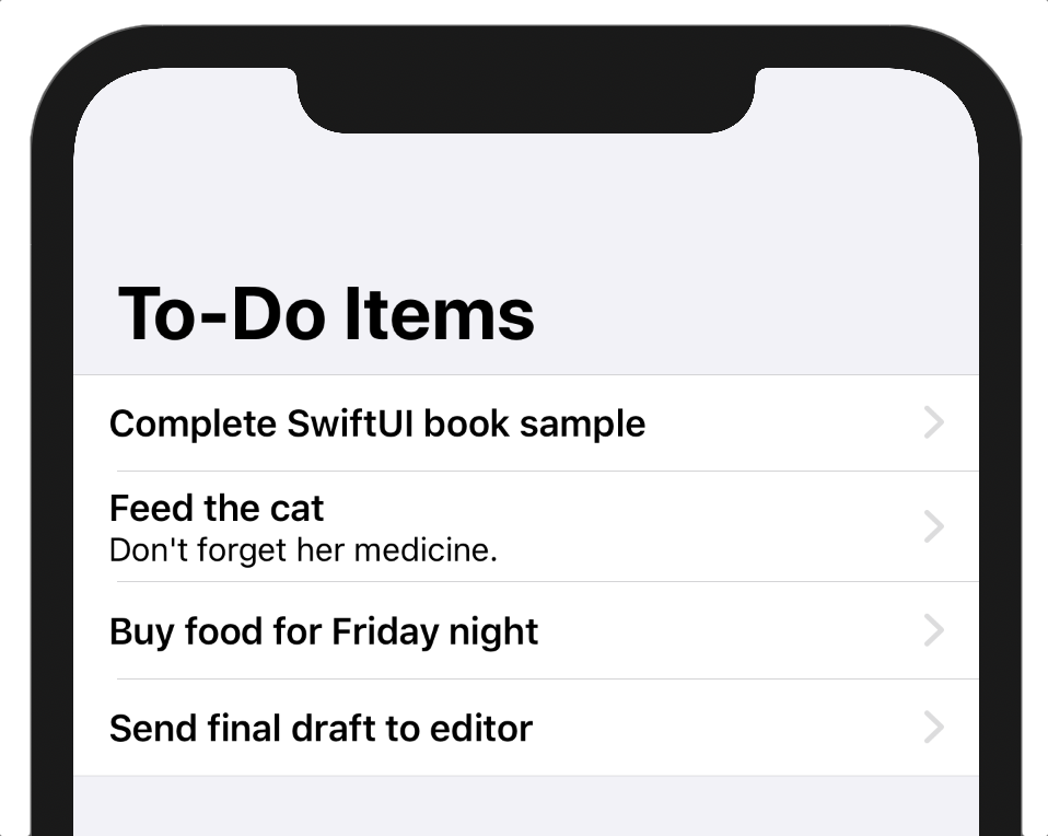
Not bad for a dozen or so lines of code, I think!
What You Learned
Writing user interface code with SwiftUI is quite different than using UIKit or AppKit. By now, you should be familiar with the new building blocks that you’ll be using going forward:
- The Xcode canvas and inspector, for visual feedback on your UI.
- Xcode’s palette, allowing for drag-and-drop interface design.
- Modifier methods and immutable value types, rather than shared reference types with world-mutable properties.
- A clean, terse programming syntax for quickly sketching and prototyping your interfaces.
In the next chapter, you’ll flesh out the application a little more by assembling a detail view for your to-do items. Along the way, you’ll learn about SwiftUI’s layout system, and you’ll get a feel for just how much functionality SwiftUI gives you for free.