Chapter 4: List Mutation
This text was prepared for publication in March 2020. As a result, a lot of the code and techniques in this book are out of date. It is provided as a historical curio, and does not provide accurate guidance on using SwiftUI today.
- Using Sections and Header Views
- Modifying List Data
- Manually Following Changes in Data
- What You Learned
In earlier chapters, you built a working to-do list application, complete with presentable detail views, colorful lists, and complex editors. Your users can find existing items and change them, but that’s about all—there’s currently no way to remove items or to add new ones. There’s also something to be desired in the list presentation itself, as once a list grows, it will start to be harder to locate items quickly. While the ability to sort the list is helpful, it would be more helpful to quickly focus in on particular subsets of your data, such as which items are due today, or which are overdue. These tasks are what you’ll tackle in this chapter.
To work along with this chapter, download the code bundle and use a copy of the starter project in 4-ListMutation/final-starter. It contains some adjustments to tidy up the code, and it includes a few new files. If you’re following along with your own project, these files have either been added or modified:
Affordances/ItemGroups.swiftModel/DataCenter.swiftTodoList.swiftTodoListChooser.swifthas been renamed toHome.swift, andTodoListChooserrenamed toHometo match.SceneDelegate.swift
Of particular note is a change in TodoList.swift which reorganizes its data storage. Rather than having an optional TodoItemList, it now uses an internal enum type to describe the type of data it represents:
// file: "TodoList.swift"
private enum ListData {
    case list(TodoItemList)
    case items(LocalizedStringKey, [TodoItem])
}

@State private var listData: ListData
You’ll update this to include a new type very shortly. Also, in this file, you’ll see that the numerous properties and methods are now defined mainly in extensions and that there’s even one empty extension definition. You’ll update all of these through the course of the chapter.
Using Sections and Header Views
When you created the original TodoListChooser, you used a pair of Section views to break up the content of the list into two parts: one contained a single static row titled “All Items,” while the second contained the list rows themselves. The design of the list rows was based on the home screen for Apple’s Reminders application, but if you look at that app now, you’ll see that the rest of its home screen is quite different. You’re going to assemble the same interface here using a section header view and design it to look good in both light and dark color schemes:
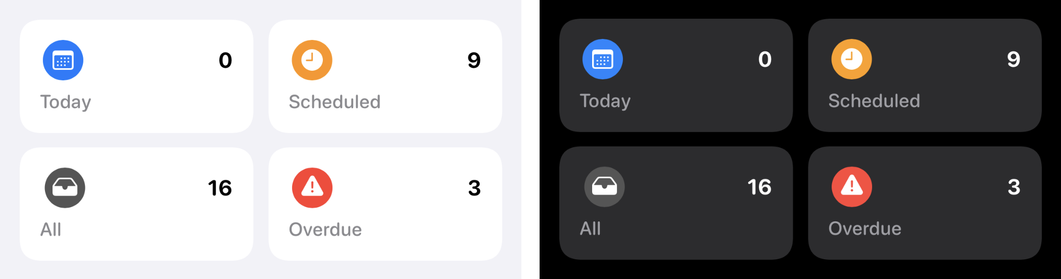
Each item will act as a navigation link leading to the familiar TodoList view but will refer to a dynamic set of items. To define the data for these groups, the TodoItemGroup enum type has been defined—you’ll find it in Affordances/ItemGroups.swift. Open that file and look around; you’ll see that it defines four groups and has properties that provide the title, color, and icon views for you to use.
Start on your headers by creating a new SwiftUI View named HomeHeader.swift. At the top of the view’s definition, above the body implementation, add the following static property:
// file: "HomeHeader.swift"
struct HomeHeader: View {
    static let layout: [[TodoItemGroup]] = [
        [.today, .scheduled],
        [.all, .overdue],
    ]

    // « ... »
}
This is a simple two-dimensional array that you’ll use to populate the four groups with the aid of a pair of ForEach views. This is a fairly straightforward task; here’s the main part of the body property definition:
// file: "HomeHeader.swift"
struct HomeHeader: View {
    // « static let layout: ... »

    var body: some View {
            VStack {
                ForEach(Self.layout, id: \.self) { row in
                    HStack(spacing: 12) {
                        ForEach(row, id: \.self) { group in
                            NavigationLink(destination: TodoList(group: group)) {
                                // « ... »
                            }
                        }
                    }
                }
            }
        }
}
The content is going to take more than a couple of lines to define, so you’ll create a private View for that; for the moment, place a Text view inside the NavigationLink:
// file: "HomeHeader.swift"
NavigationLink(destination: TodoList(group: group)) {
    Text(group.title)
}
That will fill out the preview nicely, or rather it would—except that Xcode isn’t happy with what you just wrote. “There is no TodoList(group:),” it’s saying, and … well … it’s right. Let’s fix that now.
Open TodoList.swift and look at the ListData definition. You’re going to need to add a new case to that, and define a new initializer to match. Update the class with the following code:
// file: "TodoList.swift"
private enum ListData {
    case list(TodoItemList)
    case items(LocalizedStringKey, [TodoItem])
    case group(TodoItemGroup)
}

// « Properties »

init(list: TodoItemList) {
    self._listData = State(wrappedValue: .list(list))
}

init(title: LocalizedStringKey, items: [TodoItem]) {
    self._listData = State(wrappedValue: .items(title, items))
}

init(group: TodoItemGroup) {
    self._listData = State(wrappedValue: .group(group))
}
That will take care of the error in HomeHeader.swift, but it’s created some more right here in TodoList.swift. Scroll down to find the lines where Xcode is reporting errors, at the tail end of the “Helper Properties” extension. There are three computed properties here that use the listData property to determine their results. Update them to return values for the new .group case:
// file: "TodoList.swift"
private var items: [TodoItem] {
    switch listData {
    case .list(let list): return data.items(in: list)
    case .items(_, let items): return items
    case .group(let group): return group.items(from: data)
    }
}

private var title: LocalizedStringKey {
    switch listData {
    case .list(let list): return LocalizedStringKey(list.name)
    case .items(let name, _): return name
    case .group(let group): return group.title
    }
}

private func color(for item: TodoItem) -> Color {
    switch listData {
    case .list(let list): return list.color.uiColor
    case .items: return data.list(for: item).color.uiColor
    case .group(let group): return group.color
    }
}
Xcode is now happy, and you can return to your header view definition. Open HomeHeader.swift.
Dynamic View Content
The individual items in your header will have a simple implementation, consisting of a white background with rounded corners topped with two horizontal rows containing data. The top row will contain a colored icon on the leading edge with the count of matching items on the trailing edge, in large clear text. Below that will be the name of the group, slightly muted with a secondary color. Both the counter and name will use a rounded font variant, with a bold and medium appearance, respectively.
Add a new View type inside the HomeHeader definition, below the body property:
// file: "HomeHeader.swift"
private struct HeaderItem: View {
    let group: TodoItemGroup
    @State var itemCount: Int = 0

    var body: some View {
        VStack(alignment: .leading) {
            HStack {
                group.icon
                Spacer()
                Text("\(itemCount)")
                    .foregroundColor(.primary)
                    .font(.system(.title, design: .rounded))
                    .fontWeight(.bold)
            }

            Text(group.title)
                .foregroundColor(.secondary)
                .font(.system(.subheadline, design: .rounded))
                .fontWeight(.medium)
        }
        .padding()
        .background(
            RoundedRectangle(cornerRadius: 15, style: .continuous)
                .fill(Color(.tertiarySystemBackground))
        )
    }
}
Everything here should look familiar by this point, with the exception perhaps of the color on line 24. Here, you’re again using one of UIKit’s semantic colors, specifically for something layered on top of a secondary background. The List view’s grouped background is considered secondary, so the tertiary color works well here, and matches what Apple uses in their Reminders app.
There’s something missing here, though: the counter text is never updated. It’s stored in a state property, so the view will update when it changes, but it never actually changes. You might add a custom initializer to set its value from the input group on creation, but that requires access to a DataCenter environment object. Well, you could add one of those just as you have elsewhere, but that would reveal another problem: it wouldn’t work within the view’s initializer. Because the environment object is installed through a view modifier, the underlying view will already have been created and initialized before the .environmentObject() call happens. If you try to read from an environment object inside your initializer, you’re likely to crash—certainly in the preview, and possibly elsewhere in your app, depending on how SwiftUI builds and initializes its view hierarchy. That’s all out of your control, though, so you can’t rely on that behavior everywhere.
Of course, if you were to set your itemCount when initialized, what would happen if the data changed? Let’s say you changed the date on an overdue item to today? The count for the “Overdue” group should decrement, and the “Today” group’s should increment, but there’s no guarantee that will happen. There is a solution, however, and it’ll work in every situation, meaning each HeaderItem will be entirely in control of its own dynamic content, not relying on any other view’s updates, or on SwiftUI’s rendering mechanisms.
Remember that DataCenter.todoItems uses the @Published property wrapper. This wrapper’s projected value, $todoItems, returns a Publisher instance from the Combine framework. Combine is Apple’s suite of reactive programming tools, implementing a publisher-subscriber API for passing data and events around your application. SwiftUI is using this under the covers to determine when your item lists are changing, and their related views need to be updated; there’s more you can do with them, though. You can attach to publishers directly by yourself and handle the values they publish when that happens; this sounds like exactly the tool you need.
If you subscribe to the output of the $todoItems publisher, then your subscriber will immediately be given that publisher’s current value. After that, whenever the list of items changes, your subscriber will receive the new set. You can use this to update your item count, recalculating its value any time any items are modified. This is such a common occurrence, in fact, that SwiftUI provides a view modifier for just this purpose: .onReceive(_:perform:). The method takes a Publisher instance and a block which will be passed the output of the publisher, handling all the subscription details internally.
To implement this approach, you’ll need to read the DataCenter from the environment and respond to changes in the item list by asking your group for its matching items, then assigning the number of items within that collection to your itemCount state property. The .onReceive() modifier can simply be attached to the existing VStack:
// file: "HomeHeader.swift"
@EnvironmentObject var data: DataCenter

// START:HeaderItem
var body: some View {
    VStack(alignment: .leading) {
        // « ... »
    }
    .onReceive(data.$todoItems) { _ in
        self.itemCount = self.group.items(from: self.data).count
    }
    // « ... »
}
Your header item view is complete—you can drop it into place inside HomeHeader.body now:
// file: "HomeHeader.swift"
NavigationLink(destination: TodoList(group: group)) {
    HeaderItem(group: group)
}
Previewing
If you refresh your canvas now, you’ll see your header view showing up in the correct proportions, but the backgrounds won’t show up—they’re white on a white background. Let’s fix that and take a look at how it appears in dark mode at the same time. Replace the content of the view’s preview with this familiar-looking implementation:
// file: "HomeHeader.swift"
ForEach(ColorScheme.allCases, id: \.self) { colorScheme in
    HomeHeader()
        .padding()
        .background(Color(.systemGroupedBackground))
        .colorScheme(colorScheme)
}
.previewLayout(.sizeThatFits)
.environmentObject(DataCenter())
The most important part here is the .background() modifier on line 4: the color used here is the one used by the List view when it’s using a grouped style, and by using it here you can see exactly how the header will appear when you add it to your Home view.
Attaching the Header
To attach the new HomeHeader view to your existing TodoList view, you’ll change the sectioning behavior slightly. Right now you have a List containing two Section views: one containing an ‘All Items’ list, and one with a row for each list. The new header is going to replace the ‘All Items’ section, but just dropping it in directly will result in it being placed within a row, which isn’t the right visual. Instead, you want the header to be placed as-is, just above a section.
Happily, SwiftUI has your back here, because Section views support both headers and footers. These are views that you provide which are laid out above or below the section, with no other appearance adjustments—meaning they’re not treated as rows by the enclosing List.
Open Home.swift and remove the first Section inside the List. Change the first line of the remaining section to add the header:
// file: "Home.swift"
Section(header: HomeHeader().padding(.vertical)) {
    ForEach(data.todoLists) { list in
        NavigationLink(destination: TodoList(list: list)) {
            Row(name: list.name,
                icon: list.icon,
                color: list.color.uiColor)
        }
    }
}
Now your app is starting to gain some character! Next, you’ll need to handle things like moving and deleting existing items within a TodoList.
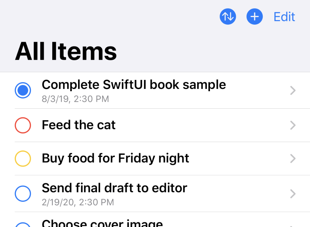
Modifying List Data
Open TodoList.swift and look around to familiarize yourself with its content. In the starter project for this chapter, the implementation has been shuffled around a bit in the interests of readability. The main struct definition now contains only properties and the body implementation, with everything else moved into extensions. Firstly, there’s an extension marked “Helper Properties;” the sortButton implementation has been moved here, and you’ll add some more shortly. The next extension, marked “Sorting,” contains the sortedItems property. Below that, there’s an empty extension marked “Model Manipulation,” which is waiting for some content.
Right at the bottom of the file is the SortOption type. Start by adding a new case to this enumeration, named manual:
// file: "TodoList.swift"
fileprivate enum SortOption: String, CaseIterable {
    case title = "Title"
    case priority = "Priority"
    case dueDate = "Due Date"
    case manual = "Manual"

    var title: LocalizedStringKey { LocalizedStringKey(rawValue) }
}
You likely have a compiler error showing up now, pointing to the lack of a clause for the new .manual case in the sortedItems property. This is simple to fix, since the manual sort option essentially means “don’t sort anything, use the items in their existing order.” Scroll up to the sortedItems property implementation and update it:
// file: "TodoList.swift"
private var sortedItems: [TodoItem] {
    if case .manual = sortBy { return items }

    return items.sorted {
        switch sortBy {
        case .title:
            return $0.title.lowercased() < $1.title.lowercased()
        case .priority:
            return $0.priority > $1.priority
        case .dueDate:
            return ($0.date ?? .distantFuture) <
                ($1.date ?? .distantFuture)
        case .manual:
            fatalError("unreachable")
        }
    }
}
You handle the .manual case upfront by returning the input item list unchanged. In the switch statement, though, you still need a clause handling that case, so here you simply fire off a fatal error—it shouldn’t be possible to reach here, and if it does, something very bad is happening, and you want it to crash and dump lots of useful info in the process.
Next, head up to the top of the file and look at the state variables. Right now you have three items there: sortBy, showingChooser, and showingListEditor. The default sort option should now be .manual, so make that change now:
// file: "TodoList.swift"
@State private var sortBy: SortOption = .manual
@State private var showingChooser: Bool = false
@Environment(\.presentationMode) private var presentationMode
Adding to the List
The first and easiest editing function you can implement is addition. You already have an editor view for TodoItem instances—all you need is the means to trigger its appearance and a way to save it. This can all function in exactly the same manner as you used in the previous chapter, with a state property used to present the editor in a modal sheet and a state variable used to hold a temporary TodoItem for the editor to use.
Scroll to the main struct definition for TodoList, and add the following properties:
// file: "TodoList.swift"
private static let itemTemplate = TodoItem(
    id: Int.min, title: "New Item", priority: .normal,
    notes: nil, date: nil, listID: 2002, complete: false)

@State private var editingItem = Self.itemTemplate
The @State property is familiar, but itemTemplate is new. This provides a simple starting value for a new TodoItem instance, and is used to initialize the editingItem property each time a new item is added. Note that its id property is set to something essentially invalid to begin with; the DataCenter will replace this when the new item is placed in the list.
Presenting the item editor will be a little different than what you’ve seen before, though. It seems logical to add a new .sheet(isPresented:content:) modifier next to the one used to present the list editor from the last chapter, but it so happens that the isPresented: variant only works when it’s alone; if you have two of them, only the last one will function. This likely indicates that SwiftUI uses view preferences internally to set this up; thus, one modifier is overriding the value placed by another.
Instead, you’ll use the more flexible version, .sheet(item:content:), which accepts a binding to an optional Identifiable value that you’ll use to determine what to present. When the bound value is nil, nothing will be displayed. When it’s non-nil, its value will be passed to the content block, which should then return a view.
To implement your value, use an enum type with two values, conforming to Identifiable and Hashable, then create a state property to hold one of these, with a default value of nil:
// file: "TodoList.swift"
private enum EditorID: Identifiable, Hashable {
    case itemEditor
    case listEditor

    var id: EditorID { self }
}

@State private var presentedEditor: EditorID? = nil
Now, scroll down to the “Helper Properties” extension, and below the sortButton property implementation, add two new properties:
// file: "TodoList.swift"
private var addButton: some View {
    Button(action: {
        self.editingItem = Self.itemTemplate
        self.presentedEditor = .itemEditor
    }) {
        Image(systemName: "plus.circle.fill")
            .imageScale(.large)
            .accessibility(label: Text("Add New To-Do Item"))
    }
}

private var editorSheet: some View {
    let done = Button(action:{
        self.data.addTodoItem(self.editingItem)
        self.presentedEditor = nil
    }) {
        Text("Done")
            .bold()
    }
    let cancel = Button("Cancel") {
        self.presentedEditor = nil
    }
    return NavigationView {
        TodoItemEditor(item: $editingItem)
            .navigationBarItems(leading: cancel, trailing: done)
    }
}
Here, you have a Button for the navigation bar that will present an editor for a new TodoItem instance. Its action resets the editingItem to the template created above, then it shows the editor sheet. Note the use of the .accessibility(label:) view modifier to provide a textual description to go with the image-based button.
The editor itself is defined in editorSheet; this creates the “Done” and “Cancel” buttons similar to the ones you used in Chapter 3 and attaches them to a TodoItemEditor wrapped in a NavigationView. The only difference is the action for the Done button, which now calls data.addTodoItem() to place the new TodoItem into the data store. This should all look quite familiar by this point.
The last step is to attach the new button to the navigation bar. Since the next step will be to add general editing support for the list, you can add a standard Edit button to the bar’s leading edge at the same time. Find the barItems property and update it to include two more items:
// file: "TodoList.swift"
private var barItems: some View {
    HStack(spacing: 14) {
        if isList {
            Button(action: { self.presentedEditor = .listEditor }) {
                Image(systemName: "info.circle")
                    .imageScale(.large)
            }
        }
        sortButton
        addButton
        EditButton()
    }
}
The EditButton is a view provided by SwiftUI, which toggles the editing mode stored in the environment; you’ll see its effects soon. If you refresh your Xcode canvas, you’ll see that and the new Add button, but the appearance looks a little off next to the Sort button. Find the sortButton implementation and change it to use a similar circular filled symbol:
// file: "TodoList.swift"
Button(action: { self.showingChooser.toggle() }) {
    Image(systemName: "arrow.up.arrow.down.circle.fill")
        .imageScale(.large)
        .accessibility(label: Text("Sort List"))
}
That looks better. Now, to present your editors when the buttons are tapped, find the existing .sheet() modifier attached to the List view in your body implementation, then replace it with the following:
// file: "TodoList.swift"
.sheet(item: $presentedEditor) { which -> AnyView in
    switch which {
    case .itemEditor:
        return AnyView(
            self.editorSheet
                .environmentObject(self.data)
        )
    case .listEditor:
        return AnyView(
            TodoListEditor(list: self.list!)
                .environmentObject(self.data)
        )
    }
}
Note that the block has to always return the same view type. Since you’re presenting either a TodoItemEditor or a TodoListEditor, you have to wrap them in an AnyView to ensure you’re always returning an instance of the same type.
If you start up a live preview now, you’ll be able to call up an editor and create new items to your heart’s content, while the list editor button will still function as before. All that remains is to implement support for deleting and manually reordering items, both of which come built-in.
Deleting and Moving List Items
The EditButton you added to the navigation bar provides access to controls to delete and reorder rows, but to access the functionality, you’ll need to enable it through some view modifiers. The .onDelete() modifier provides a block to run in response to a deletion interaction, and it passes in an IndexSet containing the indices of all the items being removed. Similarly, the .onMove() modifier is called when the user drags to move rows from one location to another within the list. This block receives the offsets of the items being moved and the single index to which they should go.
Happily, SwiftUI provides convenience functions on indexable Swift collections (such as Array) that take the same inputs and will perform the work for you. All you need to provide are the blocks for the two modifiers, which seems simple enough.
At least, it would be—if you weren’t displaying a list that’s been re-ordered, meaning the indices of the visible rows and their indices within DataCenter.todoItems are not the same. Picking a non-manual sort order, then deleting items leads to some strange behavior if you pass through the IndexSet unmodified; your humble author found himself scratching his head in confusion for some time before realizing what was going on.
Scroll down in TodoList.swift to find the empty extension titled “Model Manipulation.” If you’re not using the starter project directly, create a new extension on the TodoList class. Inside here, you’ll implement both the methods used to translate from visible-row indices to data-list indices and the methods that will move and delete items from your data source.
Start with the translation methods:
// file: "TodoList.swift"
private var usingUnchangedList: Bool {
    sortBy == .manual
}

private func translate(offsets: IndexSet) -> IndexSet {
    guard !usingUnchangedList else { return offsets }
    let items = sortedItems // calculate this just once
    return IndexSet(offsets.map { index in
        data.todoItems.firstIndex { $0.id == items[index].id }!
    })
}

private func translate(index: Int) -> Int {
    guard !usingUnchangedList else { return index }
    return data.todoItems.firstIndex { $0.id == sortedItems[index].id }!
}
There are three items here. First is a property that will return true if the list is manually sorted. If that’s the case, then the visual indices and the data indices match, and no translation needs to happen.
The next two methods translate either a single index or an entire IndexSet. They function by using the provided index to locate an item within the visibleItems array, then look up the item with the same id within data.todoItems.
With this in place, you can implement the delete and remove methods themselves:
// file: "TodoList.swift"
private func removeTodoItems(atOffsets offsets: IndexSet) {
    let realOffsets = translate(offsets: offsets)
    data.removeTodoItems(atOffsets: realOffsets)
}

private func moveTodoItems(fromOffsets offsets: IndexSet, to newIndex: Int) {
    let realOffsets = translate(offsets: offsets)
    let realIndex = translate(index: newIndex)
    data.moveTodoItems(fromOffsets: realOffsets, to: realIndex)
}
Each of these translates the supplied indices and then calls through to a method in DataCenter (provided in this chapter’s starter project), which in turn simply calls the SwiftUI-provided collection methods in a thread-safe manner.
Now only one step remains—adding the view modifiers. Note, however, that you only want to support moving items while using the manual sort ordering; moving items around while sorted by date rather defeats the purpose of sorting them. As it happens, the .onMove() modifier can be passed nil to disable reordering completely, so you’ll check the current sortBy value to determine whether to enable that feature, and pass nil in all other cases.
Find the ForEach view definition in TodoList.body and add these view modifiers after its closing brace:
// file: "TodoList.swift"
ForEach(sortedItems) { item in
    // « ... »
}
.onDelete { self.removeTodoItems(atOffsets: $0) }
.onMove(perform: self.sortBy == .manual
    ? { self.moveTodoItems(fromOffsets: $0, to: $1) }
    : nil)
In the .onMove() modifier on lines 5–7 a ternary operator is being used to either install a handler or to set its value to nil. This is because you only want to allow the user to re-order items when in manual ordering mode. By passing nil in every other case, you disable the move functionality; by using the ternary operator to make this decision inline, you help SwiftUI detect that this particular modifier’s value is driven by the sortBy state property. When in doubt, it’s best to try and make these calculations happen at the same time you hand their results into SwiftUI because the framework can infer a lot of information about the view graph and its relation to the underlying data based on seeing when certain data is accessed while the view graph is being assembled.
Coming Home
Now let’s do the same for the Home view. First, you’ll need the usual state variables used to present the sheet. You’ll need a template TodoItemList to pass into the editor, and you’ll need a button used to create the new item.
Open Home.swift and update the content of the Home view:
// file: "Home.swift"
static private let listTemplate = TodoItemList(
    id: Int.min, name: "New List", color: .blue, icon: "list.bullet")
@State private var showingEditor = false

var body: some View {
    NavigationView {
        // « ... »
    }
    .sheet(isPresented: $showingEditor) {
        TodoListEditor(list: Self.listTemplate)
    }
}

private var addButton: some View {
    Button(action: { self.showingEditor.toggle() }) {
        Image(systemName: "plus.circle.fill")
            .imageScale(.large)
            .accessibility(label: Text("Add New List"))
    }
}
This is all familiar. Note on line 10 that since the TodoListEditor doesn’t operate on a binding, it is passed the listTemplate directly. Being a value type, the editor receives and operates on a copy of the template.
Implementing delete and move operations for the lists is simpler than it was for the TodoList view, since the content of the view is essentially always manually ordered. This means that you can dispense with index translations and pass the indices from SwiftUI directly into the DataCenter. Add the view modifiers to the end of the ForEach view, as before, and add navigation bar items for addButton and an EditButton:
// file: "Home.swift"
List {
    Section(header: HomeHeader().padding(.vertical)) {
        ForEach(data.todoLists) { list in
            // « ... »
        }
        .onDelete { self.data.removeLists(atOffsets: $0) }
        .onMove { self.data.moveLists(fromOffsets: $0, to: $1) }
    }
}
.font(.system(.headline, design: .rounded))
.listStyle(GroupedListStyle())
.navigationBarTitle("Lists")
.navigationBarItems(leading: EditButton(), trailing: addButton)
Manually Following Changes in Data
Following the principles described in Dynamic View Content, the TodoList view should own the task of observing changes to its content. While its list content usually comes from DataCenter.todoItems, which is already monitored by SwiftUI, that’s not always the case, and isn’t the case for everything. Looking at the ListData type, for instance, one can see several cases where model value types have been copied out of the DataCenter. ListData.items contains a copied list of TodoItem instances. If one of these items is deleted from the data store, nothing happens to the copy being used by this view. Similarly, while the TodoItemList held by ListData.list will fetch items through the DataCenter, the same can’t be said for the list itself: its title, icon, and color might change, leaving the TodoList with incorrect data.
The solution to this is to update the static data inside the listData state property when the underlying data store changes. In the case of ListData.group, nothing needs to be done, since everything is fetched dynamically from the DataCenter. For both .list and .items cases, however, you’ll need to fetch any updates and apply them to the local values.
Start by implementing the update method. Place this inside the TodoList extension titled “Model Manipulation,” just below moveTodoItems(fromOffsets:to:):
// file: "TodoList.swift"
private func updateData() {
    switch listData {
    case let .items(title, items):
        let newItems = data.items(withIDs: items.map { $0.id })
        listData = .items(title, newItems)

    case let .list(list):
        if let newList = data.todoLists.first(where: { $0.id == list.id }) {
            listData = .list(newList)
        }
        else {
            // List is gone!
            forciblyDismiss()
        }

    case .group:
        break
    }
}
On line 3 you handle the case where a specific collection of items is being used. The identifiers of the included items are used to fetch fresh copies from the DataCenter, which will leave out any that have been removed from the store. The new items are used to reset the listData property.
Meanwhile on line 7, you handle any changes to the TodoItemList copy being held. Here you fetch the list with the matching identifier and use that to reset listData. Here, however, a particular situation arises: while the view might legitimately display that a certain list has no items, it can’t reasonably do the same thing for the list itself. If the list it’s displaying is deleted, this view should no longer exist. It’s for that reason that you call forciblyDismiss() on line 13; that method will use the current PresentationMode from the environment to pop the TodoList from the top of the navigation stack.
With all the possibilities of stale data taken care of, you now need only to call updateData() when the underlying store changes. This can be done by taking an idea from DataCenter itself, using its @Published properties to trigger an action via the .onReceive() view modifier. Attach this modifier to end of the List view in the body implementation, after the .sheet() modifier:
// file: "TodoList.swift"
@State private var listData: ListData
// « ... »

var body: some View {
    List {
        // « ... »
    }
    // « existing view modifiers »
    .onReceive(data.$todoItems.combineLatest(data.$todoLists)) { _ in
        self.updateData()
    }
}
Here, you’ve used the .combineLatest() modifier from the Combine framework to be signaled when either the todoItems or todoLists properties change. Another example of this can be found in DataCenter.swift, in the saveWhenChanged() method.
At this point, you’re done—congratulations. You now have a fully editable to-do list.
What You Learned
This chapter has touched on several important items of SwiftUI design:
- You learned to manually react to changes in data with the aid of publishers.
- You worked with editable lists, adding, removing, and reordering items, correctly handling cases where on-screen and data-store locations don’t match.
- The application’s home screen now has a bespoke interface tailored into the
Listitself. - Your list view is more flexible than ever, supporting several different types of initialization, used for several purposes.
Now that your lists are looking good, you’ll spend some time working with custom views—going beyond simple stacks of other views—and how to define and handle user interactions through SwiftUI’s gesture system.