Chapter 2: Application Data in SwiftUI
This text was prepared for publication in March 2020. As a result, a lot of the code and techniques in this book are out of date. It is provided as a historical curio, and does not provide accurate guidance on using SwiftUI today.
- Interaction in Lists
- Handling User Input
- Nesting Data
- Dynamically Ordering List Contents
- Crafting a Full-Screen View
- What You Learned
In the last chapter, you created a simple to-do list application in a few lines of code. Now that you have some familiarity with the canvas and inspector, and know how to use view modifiers, it’s time to look at two more involved tasks. First, you’ll handle user input, making adjustments to your user interface to match. Second, you’ll compose a more detailed view using stacks and more. The data model has been updated slightly, adding support for lists with icons and associated colors, letting you create a simple detail view that really pops. Along the way, you’ll encounter some of the vagaries of SwiftUI’s data and layout flow, and learn how best to deal with them.
This chapter builds on the code developed during chapter 1, but makes use of some additional helpers. You can follow along by using the starter project for this chapter, which can be found in the source code download in the folder 2-ApplicationData/starter. Code for the completed chapter can be found in 2-ApplicationData/final.
Interaction in Lists
Now that your data model has some extra information, let’s present it to the user. You’ll add a button in your item rows to toggle that item’s completion state, and you’ll color the button according to the color of the item’s list. First, though, the code for your list view has rather a lot of levels of indentation. Let’s fix that by factoring out the row content itself.
Refactoring
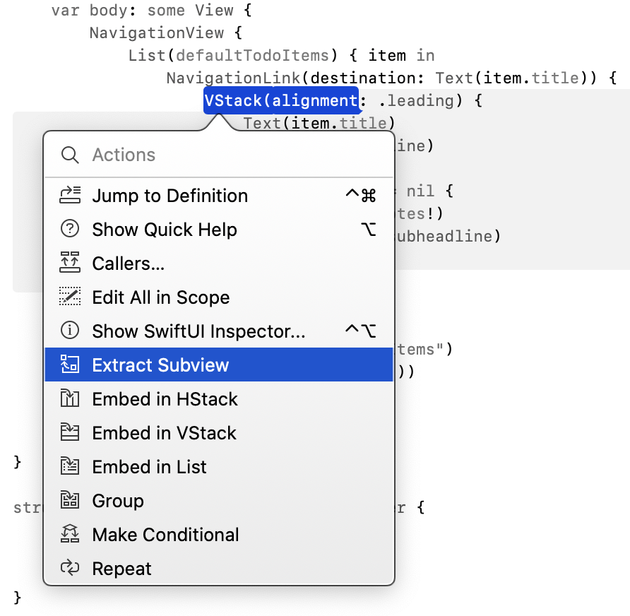
Open TodoList.swift and locate the VStack section inside the NavigationLink block. ⌘-click on the VStack constructor and select Extract Subview:
This will add a new struct at the bottom of the current file and let you choose its name—use TodoItemRow. You should end up with the following definition:
struct TodoItemRow: View {
    var body: some View {
        VStack(alignment: .leading) {
            Text(item.title)
                .font(.headline)

            if item.notes != nil {
                Text(item.notes!)
                    .font(.subheadline)
            }
        }
    }
}
The compiler is likely alerting you about the item variable used to fill out the row’s content; you need to pass that into this new view, which means you’ll need somewhere to store it. Add a property for this to the:
let item: TodoItem
You don’t need a var here since there’s no plan to modify the data. You just need an immutable copy of the data from which you’ll read the details you need to provide the view when the framework requests it.
Now the editor will note that you need to pass an argument when creating the row from within your TodoList. Use the fix-it suggestion to pass in the current item:
NavigationLink(destination: Text(item.title)) {
    TodoItemRow(item: item)
}
Let’s neaten up the source code a little at this point. Select the entire TodoItemRow type and cut it from the document (⌘-X). Now create a new SwiftUI View file inside the Views group, named TodoItemRow.swift. Finally, replace the TodoItemRow definition in that file with the one you just cut out of TodoList.swift.
The editor will draw your attention to the preview provider at the bottom of the file. The TodoItemRow initializer call requires a TodoItem parameter. Replace the offending line with:
TodoItemRow(item: defaultTodoItems[0])
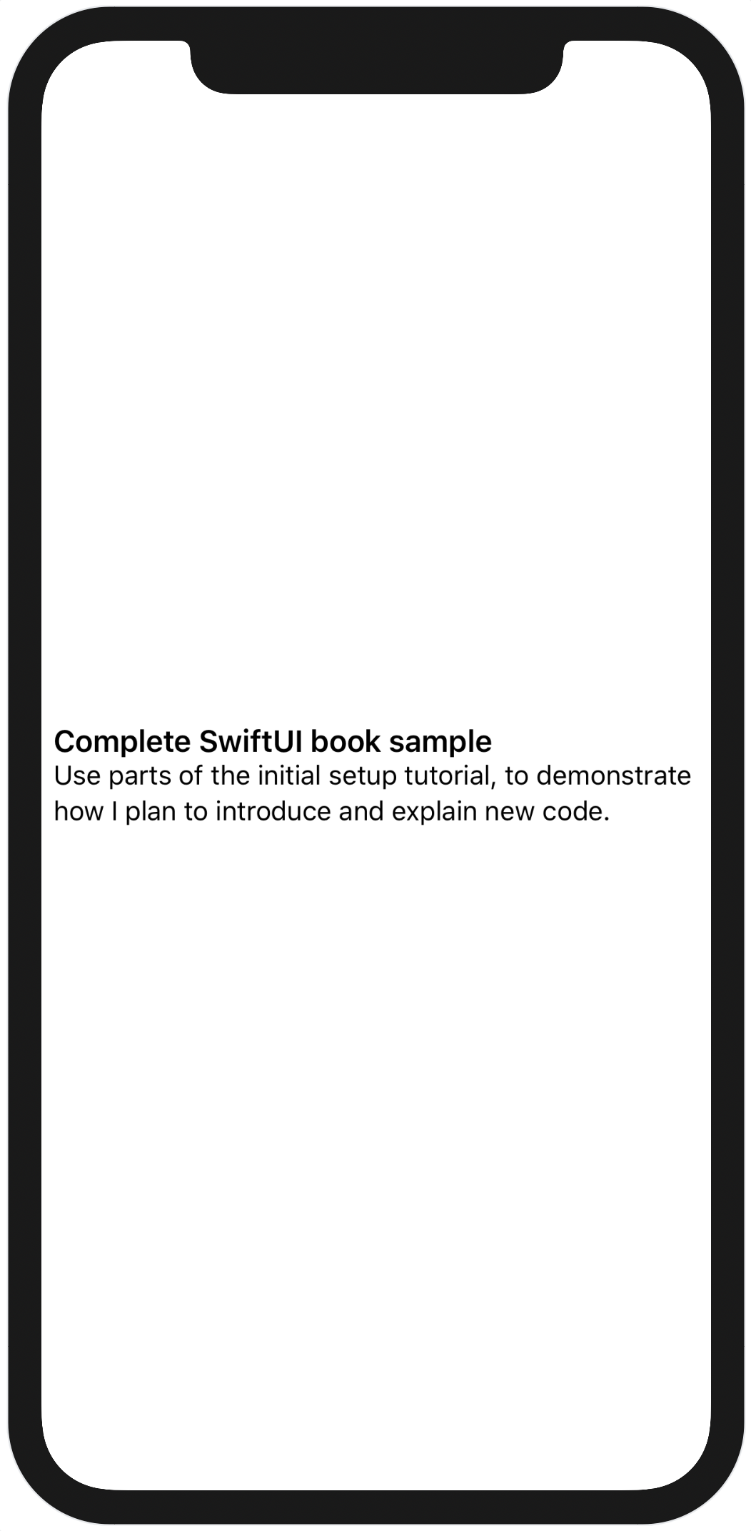
Now you can launch the preview, and you’ll see a two-line list row rendered on the canvas. Alas, it’s centered in a screenful of white:
To remedy that, you’ll need a customized preview layout. You do this with the previewLayout modifier. This modifier takes a single argument of type PreviewLayout, which comes in three flavors:
.device. This is the default, and it centers the preview within a container matching the size of the device being used on the canvas..fixed(width:height:). Centers the preview in a container view with the specified dimensions..sizeThatFits. Offers the preview the size of the current preview device, then fits the container to the size chosen by the preview. This will allow it to fit itself into any size that will fit on the screen of the current device, but no larger.
For this example, the sizeThatFits layout works best, because it provides a flexible width that will max out at the width of the device’s display. You’ll see how to alter the device used by the canvas later on, but for now just append some padding with the padding modifier then select your chosen layout.
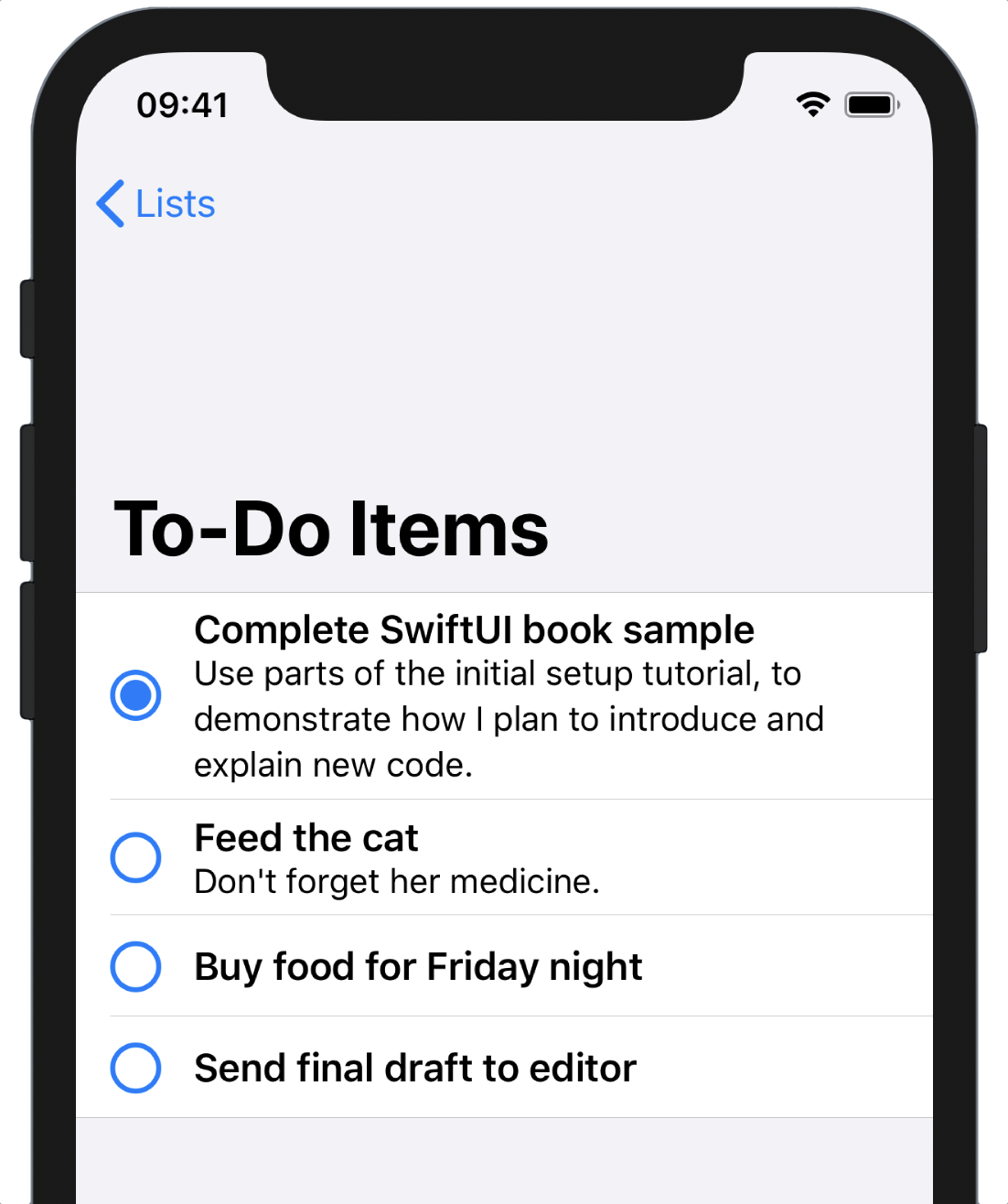
Completion
A real to-do item row would have one attribute that is currently lacking here: a button to mark the item completed. Let’s follow the example of the built-in Reminders application and use a button whose icon is either an empty or a filled circle, depending on whether the item is complete.
First, you need to embed the current VStack inside an HStack, and then you can add the button at the front of the new stack:
// file: "Views/TodoItemRow.swift"
HStack {
    Button(action: {
        // « ... »
    }) {
        Image(systemName: item.complete
                ? "largecircle.fill.circle"
                : "circle")
            .imageScale(.large)
            .foregroundColor(.accentColor)
    }
    .padding(.trailing, 6)

    VStack(alignment: .leading) {
        // « ... »
    }
}
The button’s action needs a little more work. The infrastructure to edit the item isn’t yet in place, so instead, you’ll pop up an alert when the button is clicked, to prove that it’s working. The first part of this is to add a new Bool property to the TodoItemRow with a default value of false, marked with the @State attribute.
State Variables
The row needs to keep track of its item’s completion state in order to update its appearance when it changes. SwiftUI provides support for this through a property wrapper named
@State.Swift has a few special keywords or attributes that can be applied to properties to induce certain behavior. For example, the
lazykeyword causes a property to be initialized lazily—i.e., only when first requested. The@NSCopyingattribute for properties of an Objective-C type will cause that type to be copied rather than retained during the assignment to the property.Swift 5.1 democratizes these features by allowing the programmer to specify their own wrapper types for properties. These are classes or structures marked with the
@propertyWrapperattribute and which obey certain rules. The compiler then allows the use of these as attributes on property declarations, and silently uses the wrapper type under the hood.You’ll see this a lot in SwiftUI. It’s used there to define state variables (via the
@Statewrapper attribute) and bindings (@Binding) and more. It’s also used to great effect in the Combine framework, which you’ll encounter later in the book as you deal with more complex data flows.When you apply the
@Stateattribute to a property in a view, SwiftUI will detect when its value changes and automatically request that the view update itself by re-fetching itsbodyproperty.
Use the button’s action to toggle its value:
// file: "Views/TodoItemRow.swift"
@State var showAlert = false

var body: some View {
    HStack {
        Button(action: {
            self.showAlert.toggle()
        }) {
            // « ... »
        }
        .padding(.trailing, 6)
        // « ... »
    }
}
To make an alert appear on screen, you use the .alert(isPresented:content:) view modifier. The first argument takes a binding to a boolean property, and the second a block that returns an Alert instance. For the former, you’ll pass $showAlert; you’ll learn more about this in Bindings and Dependency Propagation. For the latter, a simple alert with a title, a message, and a button to dismiss it:
// file: "Views/TodoItemRow.swift"
Button(action: {
    // « ... »
}) {
    // « ... »
}
.padding(.trailing, 6)
.alert(isPresented: $showAlert) {
    Alert(title: Text("Complete!"),
          message: Text("This will work soon, honest."),
          dismissButton: .default(Text("OK")))
}
This tells SwiftUI to monitor the value of the showAlert property, and to present the alert as long as its value is true. Additionally, SwiftUI will reset the value to false when the alert is dismissed. Toggling the value to false will also cause the alert to be dismissed, should you need to do so programmatically.
Launch a live preview in the canvas and click on the button to see your alert pop up. Dismiss it and click again, and it will reappear. The button works. In later chapters, you’ll hook this up to the data model directly.
Now return to TodoList.swift and fire up a live preview or launch the app in the Simulator, and try out all the functionality—everything that worked before still works now.
Unfortunately, not everything you’ve added is functional. The completion buttons aren’t doing anything, even though no problems showed up when testing the item row view alone. Instead, tapping on the button merely activates the row and its navigation link, and that’s definitely not what you wanted to happen; marking a task as complete or incomplete is important enough that it should be a simple one-tap task from the list. So, what’s happening here?
To understand what’s going on, you need to look at SwiftUI’s input mechanism on iOS, the Gesture.
Handling User Input
In SwiftUI, you respond to input—whether directly or indirectly—through a Gesture of some kind. Gesture itself is a protocol, much of its details internal, but it requires two or three things:
- Some
Valuetype that will change as the gesture progresses, if appropriate. - A means to register a callback that will fire when the gesture ends successfully, and any action should be triggered.
- If its
Valuetype conforms toEquatable, then it should allow a callback to be registered, which will be invoked each time the value changes.
With these base requirements, then, SwiftUI provides us with several gesture types you can create and use, including TapGesture, MagnificationGesture, LongPressGesture, DragGesture, and RotateGesture. Internally there are many more, and they’re used as the standard means of passing around event information in SwiftUI. One internal gesture, for example, handles the normal behavior of buttons, highlighting during touch-down, unhighlighting on touch-up, or if the finger is dragged out of the button’s frame. Alas, that one isn’t for us to use, but it gives us a hint as to where to look for the cause of our current issue.
Gestures are attached to the view using one of several modifiers:
gesture(_:including:)attaches a gesture to a view, making it one of the candidates for receiving events.highPriorityGesture(_:including:)attaches a gesture to a view but raises its priority, meaning that it has a right of first refusal to any applicable events.simultaneousGesture(_:including:)attaches a gesture to a view, specifically enabling it to handle events along with another gesture—for example, magnify and rotate gestures might be paired to allow both actions at once.
There are also some modifiers that install common gestures automatically. onTapGesture(count:perform:) installs a TapGesture at normal precedence that performs the provided action after the requested number of taps is recognized. Similar modifiers exist for other gestures.
Additionally, gestures can be made exclusive, setting an order of precedence between two gestures; a long-press might take precedence over a tap. They can also be sequenced, letting us require one gesture to complete before another can be recognized: so that an item may be dragged, but only after a long-press on the item in question—a ‘long press and drag’ similar to the iPhone’s home screen.
Each of the initial three methods above takes an additional parameter, including:. This is a GestureMask, which has several values: none, gesture, subviews, and all. Passing none disables all gesture handling on this view, completely: you might use it to conditionally make a button inactive, for example. The gesture option specifies that only the gesture installed by this modifier should be recognized, and all others should be ignored. Passing subviews does the opposite: use it to disable just the gesture being passed, allowing any others on subviews to continue functioning. Lastly, all implies both gesture and subviews, and is the default behavior when no value is given.
This is all beginning to paint a picture. It seems quite possible that the gesture used to trigger the list row and its associated navigation link is installed in one of two ways: either as a high-priority gesture or with a gesture mask of gesture, disabling any gestures attached to its content. Either of these would cause the buttons in the rows to become ‘untouchable.’
It seems, then, that raising the priority of the button’s gesture might help here. But how to do that? We can call the API directly while adding our own gesture handler, like so:
Button(action: { /* perform action */ }) {
    // « …  define label  … »
}
.highPriorityGesture(
    TapGesture(count: 1)
        .onEnded { /* perform action */ }
)
That doesn’t look exactly graceful, though—the action is being defined twice, and you can’t easily predict which order they might be called in, if at all. There should be a better way—and happily there is. Let’s take a look at how you can begin to customize some of SwiftUI’s components by looking at button styles.
Button Styles
It just so happens that Button is one of the more customizable parts of the SwiftUI toolkit. Every button looks for a style component in its environment, which provides the details of the UI surrounding the provided label view. These styles are provided through the .buttonStyle modifier, and several styles are provided by the system, including DefaultButtonStyle, BorderlessButtonStyle, and PlainButtonStyle. More useful, however, are the protocols these are based on, and which enable you to create your own button styles.
SwiftUI provides two protocols for defining button styles: ButtonStyle and PrimitiveButtonStyle. Both require the definition of a makeBody(configuration:) method which takes some configuration information and returns a view used to represent the button. For ButtonStyle, the configuration contains the Label view passed to the button’s constructor along with a Bool value indicating whether the button is currently ‘pressed.’ Using this type, you can define your own style that changes based on whether the button is currently pressed—the default style on iOS reduces the opacity a little, but you can ultimately do anything here: change scale, color, and more. For the problem in hand, you need to look at more than the appearance of the button, you need to define its interaction. The comments on the ButtonStyle type point the way:
/// `Button` instances built using a `ButtonStyle` will use the standard
/// button interaction behavior (defined per-platform). To create a button
/// with custom interaction behavior, use `PrimitiveButtonStyle` instead.
Let’s follow this suggestion and look at PrimitiveButtonStyle and its associated configuration type, PrimitiveButtonConfiguration. This type also has two properties, the first of which is the Label view provided to the button. The second, this time, is a function named trigger; calling this will invoke the button’s action. This, then, leaves your style in control of everything else: you determine the appearance and how it changes, how the interaction will work, and when the action will fire. This is the power tool for the job: if you own the gesture processing, then you can give it a high priority.
Raising Button Priority
In Xcode’s project navigator, create a new group named Accessories, and within that create a new Swift View file named HighPriorityButtonStyle and open it. Remove the contents of the HighPriorityButtonStyle type definition and replace View with PrimitiveButtonStyle in its declaration:
// file: "Accessories/HighPriorityButtonStyle.swift"
struct HighPriorityButtonStyle: PrimitiveButtonStyle {
}
For now, replace the contents of the previews property in the HighPriorityButtonStyle_Previews type with an EmptyView as well:
struct HighPriorityButtonStyle_Previews: PreviewProvider {
    static var previews: some View {
        EmptyView()
    }
}
To provide a style for the button, you need to implement the makeBody(configuration:) function to return some View type. Since you’re managing the press state of the button, it’s best to create a custom view just for this. Add the following private view type inside the HighPriorityButtonStyle type definition:
// file: "Accessories/HighPriorityButtonStyle.swift"
private struct Inner: View {
    @State var pressed = false
    let configuration: PrimitiveButtonStyle.Configuration

    var body: some View {
        // « ... »
    }
}
Here the view has a property used to record the press state of the button, and it also holds a copy of the configuration passed into the button style, so that it has access to both the label and trigger. The magic is going to happen inside this view’s body implementation, where you’ll create a gesture and install it onto the label using the .highPriorityGesture modifier.
The standard button gesture is not available, as it’s a private API (though if you’re daring, try typing _ButtonGesture in Xcode and see what the autocompletion brings up…). Instead, let’s approximate it with a DragGesture. Drag gestures have one main property, which is the minimum distance required before the gesture is recognized. In this case, that distance will be zero, so the gesture is recognized as soon as the button is touched. To approximate some of the button gesture’s behavior, you’ll disable the ‘pressed’ state if the touch is dragged more than a little distance away from its starting point. The translation(_:doesNotExceed:) method in Helpers/Geometry.swift will do this for you. Go to the body property of HighPriorityButton.Inner and create the drag gesture:
// file: "Accessories/HighPriorityButtonStyle.swift"
var body: some View {
    let gesture = DragGesture(minimumDistance: 0)
        .map { translation($0.translation, doesNotExceed: 15) }
}
Here you’ve created a new DragGesture with a minimum drag distance of zero. You’re then mapping its Value type into something new, using the .map(_:). DragGesture.Value is a fairly large type, containing the start time and the starting and current locations for the drag, along with various computed properties for things like the distance moved (translation) and the predicted ending location and ending translation for the drag (to implement e.g., a ‘fling’ gesture where an item keeps moving after the drag ends, based on its momentum). For this button, only the touch translation is useful—you want to see if it’s moved a small or large distance since it started, and adjust the pressed state property accordingly. The map function uses translation(_:doesNotExceed:) to turn the drag’s translation into a Bool value.
Next, you want to update the state when the gesture’s value changes. This is done with the .onChanged(_:) modifier:
// file: "Accessories/HighPriorityButtonStyle.swift"
var body: some View {
    let gesture = DragGesture(minimumDistance: 0)
        .map { translation($0.translation, doesNotExceed: 15) }
        .onChanged { self.pressed = $0 }
}
This is simple enough: if the mapped value is true, the button is pressed, otherwise it’s not. Now you need only respond to the end of the gesture, when the user’s finger is lifted from the screen, which is done via the .onEnded(_:) modifier:
// file: "Accessories/HighPriorityButtonStyle.swift"
var body: some View {
    let gesture = DragGesture(minimumDistance: 0)
        .map { translation($0.translation, doesNotExceed: 15) }
        .onChanged { self.pressed = $0 }
        .onEnded { _ in
            guard self.pressed else { return }
            self.pressed = false
            self.configuration.trigger()
        }
}
First of all, you check whether the button is considered ‘pressed’ at the moment. If not, you do nothing more. If it is, then you turn off the pressed state and trigger the button’s action through the configuration.
Now all that remains is to implement the appearance. You’ll use the provided label as-is, but will drop the opacity while pressed, similar to a normal button. Then the crucial part: install the drag gesture with a high priority using the .highPriorityGesture(_:) modifier. Your complete body should now look like the following:
// file: "Accessories/HighPriorityButtonStyle.swift"
var body: some View {
    let gesture = DragGesture(minimumDistance: 0)
        .map { translation($0.translation, doesNotExceed: 15) }
        .onChanged { self.pressed = $0 }
        .onEnded { _ in
            guard self.pressed else { return }
            self.pressed = false
            self.configuration.trigger()
        }

    return configuration.label
        .opacity(pressed ? 0.5 : 1.0)
        .highPriorityGesture(gesture)
}
With the button view implemented, all that remains is to use it within the HighPriorityButtonStyle itself, implementing makeBody(configuration:) like so:
// file: "Accessories/HighPriorityButtonStyle.swift"
func makeBody(configuration: Configuration) -> some View {
    Inner(configuration: configuration)
}
Preview and Testing
Your code should now build successfully, but it’s worth testing its efficacy in a preview. Use the following code in the HighPriorityButtonStyle_Previews type to create a navigation view containing a list with a navigation link containing a button, with the new button style set:
// file: "Accessories/HighPriorityButtonStyle.swift"
static var previews: some View {
    NavigationView {
        List {
            NavigationLink(destination: Text("Hello")) {
                Button(action: { print("hello") }) {
                    Text("Button!")
                        .foregroundColor(.accentColor)
                }
                .buttonStyle(HighPriorityButtonStyle())
            }
        }
    }
}
Refresh the canvas and start a Live Preview. Tapping on an empty section of the link row will highlight the row and trigger the link as usual, but tapping on the button itself will not—the button should dim while touched and respond to drags as you’ve designed. With this, you’ll have what you need to make the completion button in TodoItemRow function property while in a list. Open TodoItemRow.swift and add the following modifier to the completion button:
Button(action: { /* ... */ }) {
    // ...
}
.padding(.trailing, 6)
.buttonStyle(HighPriorityButtonStyle())
.alert(isPresented: $showAlert) {
    // ...
}
Try the button within the todo list again—now it behaves as required, and you can tap it without activating the navigation link.
Nesting Data
In Model/TodoItem.swift, you’ll notice that the data model includes a second type, the TodoItemList. This is what you’ll use to group sets of to-do items together in lists. Each list has an associated color and icon, which will be used to provide some visual differentiation to its contents. Regardless of their effect on the appearance of the item lists, though, they need a representation of their own. In this section, you’ll create a view to display these lists and update the TodoList view to operate upon the lists directly.
Start by creating a new SwiftUI View file inside the Views group, named Home.swift. Ignoring the body for the moment, add a private struct type inside Home named Row and conforming to the View protocol:
// file: "Views/Home.swift"
private struct Row: View {
    var body: some View {
        // ...
    }
}
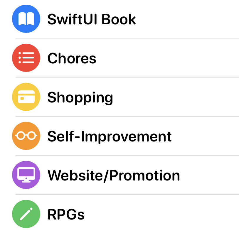
The row is going to display two things: the list’s icon and its title. The icon will be displayed in white, using a circle in the list’s color as its background, looking like this:
This will require three properties, so add them to the Row:
// file: "Views/Home.swift"
var name: String
var icon: String
var color: Color
With these in place, you can put together the view’s body. You’ll need an HStack containing an Image and a Text view. The image will use the icon name to locate a system icon, namely a vector image from a special system font named SF Symbols. You’ll then use several modifiers to give it the required appearance. The title needs only a simple Text view.
Use the following code for the Row view’s body:
// file: "Views/Home.swift"
private struct Row: View {
    var body: some View {
        HStack {
            Image(systemName: icon)
                .foregroundColor(.white)
                .frame(width: 32, height: 32)
                .background(color)
                .clipShape(Circle())
            Text(name)
        }
    }
}
On line 4 the system icon is obtained through the Image(systemName:) initializer. It’s then given a white foreground color, and on line 6 it gets a fixed-size frame. This helps because the different icons have slightly different dimensions—similar to letters in a variably-spaced font. Giving the image a fixed size with the .frame modifier ensures that every row will line up, regardless the intrinsic sizes of the icons themselves. To obtain the circular background, first the background(_:) modifier is used to provide a color fill, then the .clipShape(_:) modifier is used to clip the content of the resulting view. Clipping means that any pixels outside the provided shape are not drawn—so providing a Circle clipping shape means that only the parts of the image and background within the circle are drawn, leaving a circular colored background.
The row view is now complete: let’s put it to use. The list chooser itself will use a List view to display the available options. Since it will be the new root view for the application, this will be placed inside a NavigationView. There are two types of lists you would like to show, as well: the individual lists, showing only the items they contain, and the list of all items, regardless of their container. That split lends itself to a grouped list with two sections: one for the lists, one for “All Items.” The fonts used within the list can be a little different as well, using a rounded appearance rather than the flat beveled edges of the system font’s regular appearance.
Use the following code to lay the groundwork for the list:
// file: "Views/Home.swift"
NavigationView {
    List {
        // ...
    }
    .font(.system(.headline, design: .rounded))
    .listStyle(GroupedListStyle())
    .navigationBarTitle("Lists")
}
The “All Items” section will appear at the top, so that’s the first section to add. You create sections within List views using the Section view. This is passed a ViewBuilder block that defines the contents of the section. Here you only have a single row inside a navigation link, so the implementation is straightforward:
// file: "Views/Home.swift"
Section {
    NavigationLink(destination: TodoList()) {
        Row(name: "All Items",
            icon: "list.bullet",
            color: .gray)
    }
}
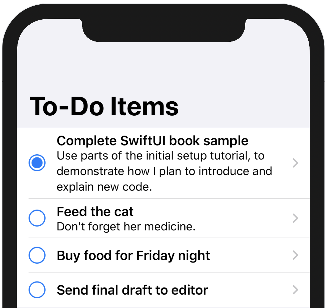
If you launch a live preview now and click on the row, then the familiar item list will appear, although it will look a little strange, with a giant navigation bar:
This appears because the TodoList view still contains its own NavigationView; now that there’s a new root view in the navigation hierarchy, that’s no longer needed. However, thinking ahead a little, there’s more that needs to be changed inside TodoList: at present, it shows all to-do items, while you now want it to potentially show only the items within a certain list. That will need to be fixed before you can proceed.
Open TodoList.swift, locate the body implementation, and remove the NavigationView, leaving the List as the top-level view. At present, the list is iterating over todoItems, the global collection of all to-do items, but that needs to change. You’ll potentially want to reference a single list, instead, and that means you’ll need a property to hold that list. Along with that, you can add computed properties to return the view’s title—either that of the list or “All Items”—and the items to display. Color-coding will depend on the type of content being shown, as well. When showing a single list, only that list’s color will be used. For “All Items,” however, each item should use the color of its associated list (it’s why the color is there, after all).
Add the following code above the body:
// file: "Views/Home.swift"
var list: TodoItemList? = nil
var items: [TodoItem] { list?.allItems ?? defaultTodoItems }
var title: String { list?.name ?? "All Items" }

func color(for item: TodoItem) -> Color {
    let list = self.list ?? item.list
    return list.color.uiColor
}
Temporary Code
The methods used here are defined in
Helpers/StaticListAPI.swift, and are only there to keep things simple for this chapter. In the next chapter they will be replaced.
Here the list property holds either a list or nil. The items and title properties then return the name or items from that list, and use the ?? operator to return the appropriate all-items values when list is nil.
The color(for:) method will return a color to use for a given item row. If list is non-nil, the list’s color will be used. Otherwise, the item will be asked for its list, and that list’s color will be used instead.
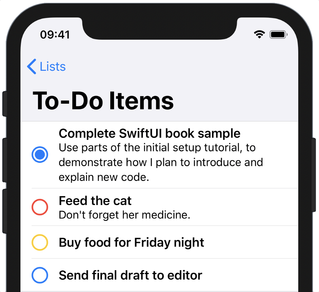
To make use of these new properties, return to the body implementation and change the List view declaration like so:
List(items) { item in
    NavigationLink(destination: Text(item.title)) {
        TodoItemRow(item: item)
            .accentColor(self.color(for: item))
    }
}
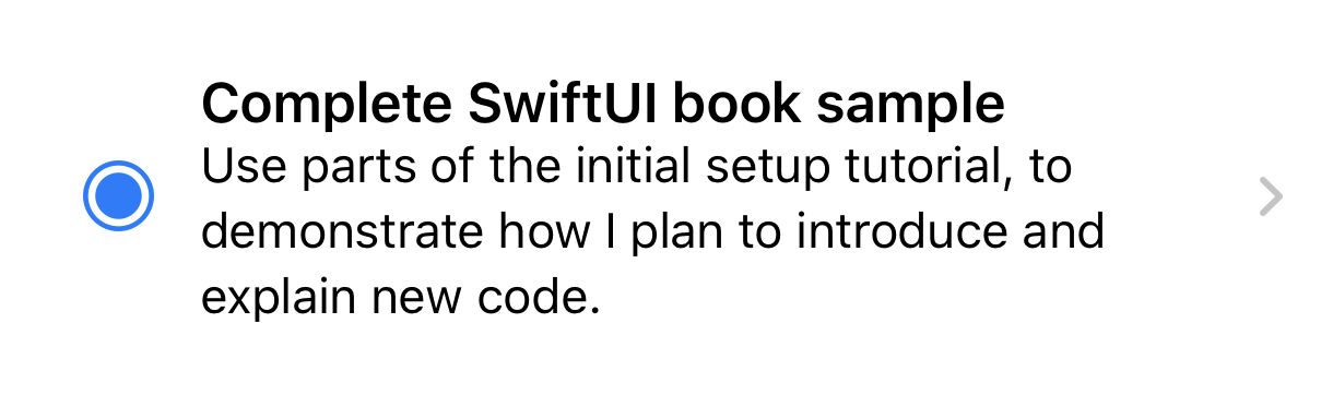
Here you’ve changed two things: on line 1 the List now iterates over the result of the new items property; secondly, the associated list color is now being set as the accent color for the item row on line 4. Recall that the completion button in TodoItemRow has its foreground set to Color.accentColor—the .accentColor(_:) modifier sets the value for that color on the item row view and everything within it, meaning that the completion buttons will all take on the color of their respective lists:
The work on TodoList is now done, so return to Home.swift and add the second section directly below the first:
// file: "Views/Home.swift"
Section {
    ForEach(defaultTodoLists) { list in
        NavigationLink(destination: TodoList(list: list)) {
            Row(name: list.name,
                icon: list.icon,
                color: list.color.uiColor)
        }
    }
}
This looks almost the same as the section above it, with the exception of the ForEach view iterating over the todoLists global variable. Within there, everything is recognizable: the destination for the NavigationLink is the same TodoList view, but this time it’s initialized with the list to display. The content for the link is the same Row view as before, this time with the properties of the associated list passed as parameters.
All that remains is to set this as the application’s root view. Open SceneDelegate.swift and replace TodoList with Home inside scene(_:willConnectTo:options:). Save, build, and launch your application, and try it all out!
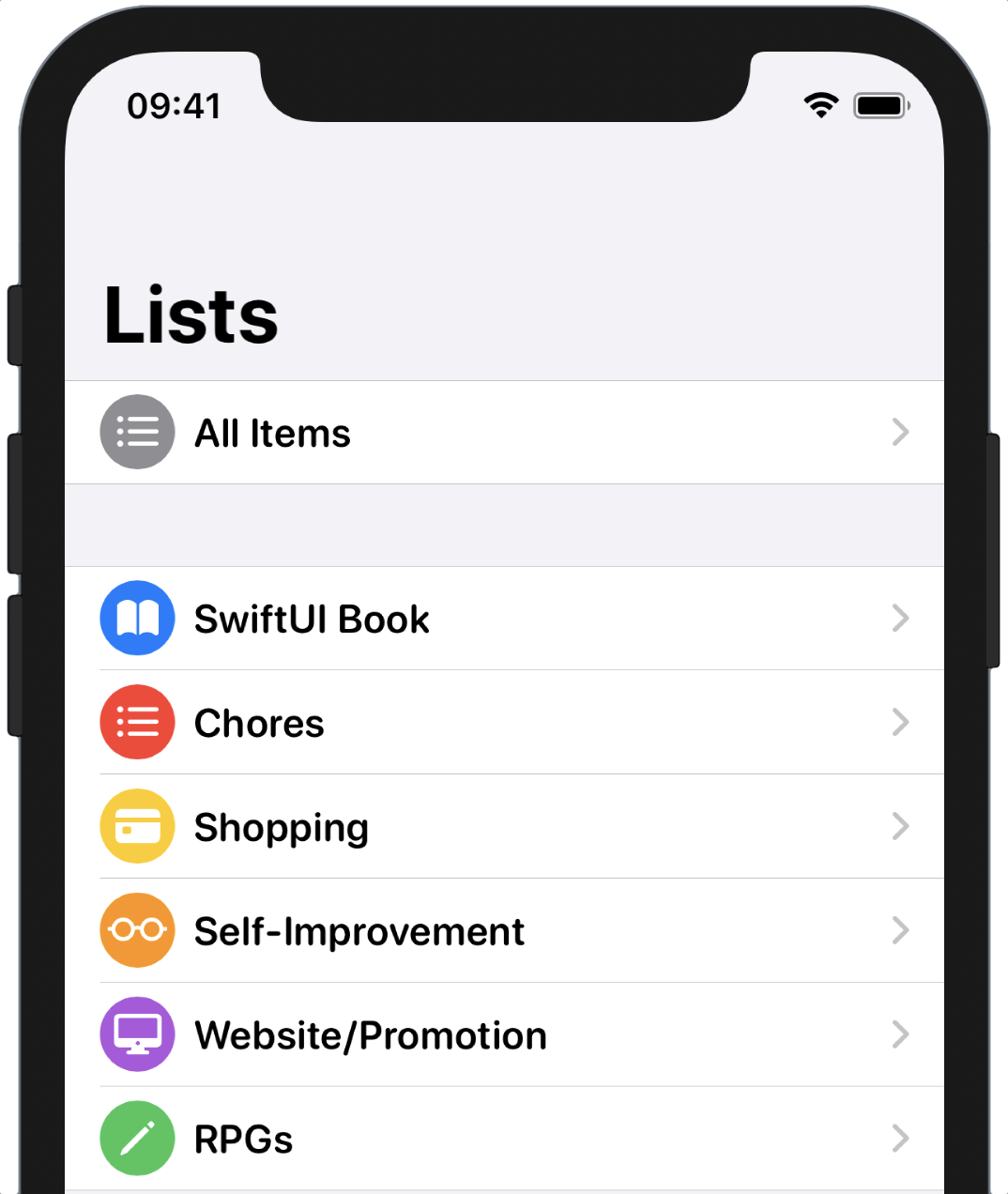
In particular, note that every row uses a rounded headline-sized font, thanks to the .font(_:) modifier you attached to the List above. The selected font actually applies to the entire view hierarchy rooted at that view.
Warnings and Glitches
It appears that SwiftUI is doing some things that UIKit doesn’t like, probably by reaching in through internal APIs that those of us on the outside can’t access. This results in a few warnings appearing sometimes in the logs, but you can consider these benign.
Additionally, you might notice a stutter in the layout of the item list after you navigate in. This is nothing you can affect, it seems, and is simply a bug that will hopefully fall by the wayside.
Dynamically Ordering List Contents
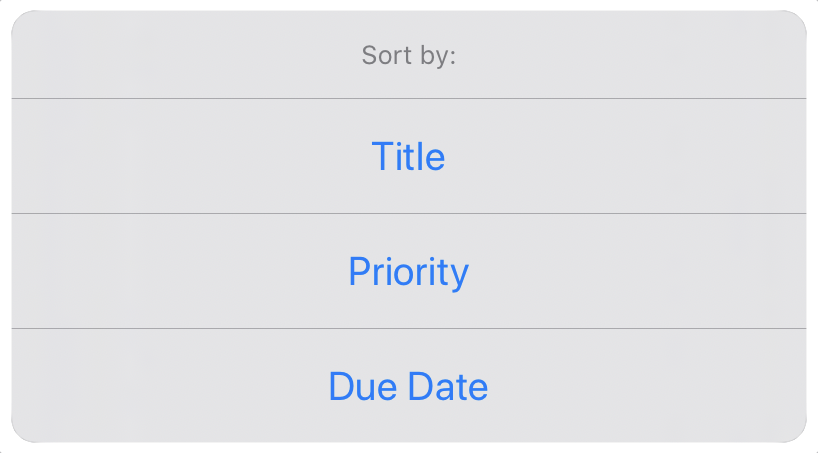
The implementation of TodoList looks rather empty now, so let’s make use of all the extra room and investigate the ways you can sort the list’s contents. Three methods of grouping currently present themselves: title, priority, and urgency—the items’ due dates. You’ll add a means to toggle this option, and to do that you need to represent the option values somehow. An enum seems like a good fit, so add this to TodoList.swift inside the definition of the TodoList type:
// file: "Views/TodoList.swift"
private enum SortOption: String, CaseIterable {
    case title = "Title"
    case priority = "Priority"
    case dueDate = "Due Date"
}
You’ll take advantage of the ability to assign string values to enumeration cases to have each item’s rawValue be usable in the UI.
Add this state variable to the properties of your TodoList:
// file: "Views/TodoList.swift"
@State private var sortBy: SortOption = .title
Sorting the list is straightforward, as the Swift standard library provides all the tools, and a simple static function in TodoList is enough to wrap the work:
// file: "Views/TodoList.swift"
private var sortedItems: [TodoItem] {
    items.sorted {
        switch sortBy {
            case.title:
                return $0.title
                    .caseInsensitiveCompare($1.title) == .orderedAscending
            case.priority:
                return $0.priority > $1.priority
            case.dueDate:
                return ($0.date ?? .distantFuture) < ($1.date ?? .distantFuture)
        }
    }
}
Note that here you’re sorting in ascending order of title or date, but descending order of priority: higher priority and closer date are most important.
Lastly, use your new sortedItems property as input to the List view inside the body implementation:
// file: "Views/TodoList.swift"
List(sortedItems) { item in
    // « … row content … »
}
Refresh your canvas, and you’ll see that your to-do items are now sorted by title in ascending order. Try changing the value of the sortBy property in your code and refreshing the preview—does the ordering change correctly?
Changing Selections
The sort algorithm appears to be working, but your users can’t very well edit the source code every time they want to change the sort order. Let’s give them the means to change it via an action sheet, a small pop-up menu:
Action sheets and modal views in SwiftUI are implemented as view modifiers and controlled via state variables and bindings. The basic flow is straightforward: add a boolean-typed state variable to control whether the sheet is shown (true) or not (false); call the sheet(isPresented:content:) or actionSheet(isPresented:content:) method, passing a binding to your state variable; set the value of the state variable to show or hide the sheet.
Bindings
All property attribute types act as a wrapper for their underlying value type. For a wrapped property named
foo, the compiler creates a concrete property of the wrapper type named_fooand a dynamic property of the underlying type calledfoo, which simply asks_footo supply the wrapped value. Additionally, each wrapper type can provide an additional property namedprojectedValuewhich returns either the wrapped type or another wrapper. The compiler creates a new dynamic property named$foowhich calls_foo.projectedValue.SwiftUI makes use of the projected value facility to provide another wrapper type,
Binding, wrapping the same underlying storage as theStateproperty. A binding, in SwiftUI parlance, is “A value and the means to mutate it.” It references some piece of state and allows other parts of your view hierarchy to observe and change that value in a thread- and type-safe manner.
First, create your state variable. Name it showingChooser:
// file: "Views/TodoList.swift"
@State private var showingChooser = false
Next, create your action sheet. Add a call to the .actionSheet(isPresented:content:) method onto your List view, next to the calls to .navigationBarTitle and .listStyle. Bind it to your showingChooser property using the $-prefixed variable $showingChooser:
// file: "Views/TodoList.swift"
.actionSheet(isPresented: $showingChooser) {
    // ...
}
The content block for the actionSheet(isPresented:content:) is expected to return an instance of ActionSheet to present, and it will be invoked whenever your showingChooser state property changes from false to true. You’ll need to provide a title and a list of buttons to present. Let’s start with the title:
// file: "Views/TodoList.swift"
.actionSheet(isPresented: $showingChooser) {
    ActionSheet(
        title: Text("Sort Order"),
        buttons: // ...
    )
}
Since the sheet will display options derived from the list’s SortOption type, you can easily determine the text for each button by mapping the enumeration’s allCases to each item’s rawValue, similar to this:
SortOption.allCases.map { Text($0.rawValue) }
For an action sheet, you can map these to button definitions. Action sheet buttons are all instances of Alert.Button, which provides factory functions to create three types of button: default, cancel, and destructive. Destructive buttons are highlighted to indicate that they will destroy some data (typically they are colored red, though this changes in some locales), while a cancel button is usually presented separately, and has a default title of “Cancel” (appropriately localized for the user’s language and region). Any other type of button is created with the default type, which is what you need here.
Action buttons need two things: a label, and an optional action block. For each of your supported sorting options, you’ll need to provide that option’s rawValue as the button’s label, and its action should set the TodoList’s sortBy property to the corresponding option. Using the map approach, that leaves the following implementation—place it in your .actionSheet content block:
// file: "Views/TodoList.swift"
.actionSheet(isPresented: $showingChooser) {
    ActionSheet(
        title: Text("Sort Order"),
        buttons: SortOption.allCases.map { opt in
            ActionSheet.Button.default(Text(opt.rawValue)) {
                self.sortBy = opt
            }
        }
    )
}
Your action sheet is now ready for prime-time, but so far, there’s no way for the user to invoke it. Let’s use your new familiarity with buttons to create one that will present the sheet. Regular buttons in SwiftUI (i.e., Button rather than Alert.Button) are initialized with two parameters: an action block to be invoked when the button is tapped, and a content block to define its content (unlike alert buttons, you can use text, images, or both). To implement this button, the action is simple: call self.showingChooser.toggle(), or explicitly set it to true, if you prefer. For the content, let’s use a large symbol image with a bold appearance. Add the following new property to TodoList:
// file: "Views/TodoList.swift"
private var sortButton: some View {
    Button(action: { self.showingChooser.toggle() }) {
        Image(systemName: "arrow.up.arrow.down.square")
            .imageScale(.large)
            .font(.system(size: 24, weight: .bold))
    }
}
This button will fit nicely in the navigation bar, so add it to the (growing) list of modifiers on the List view you’re building in your body with the navigationBarItems method:
// file: "Views/TodoList.swift"
.navigationBarItems(trailing: sortButton)
Testing the Code
The code is complete, so click Resume… on the canvas to see the button presented at the top-right of the screen:
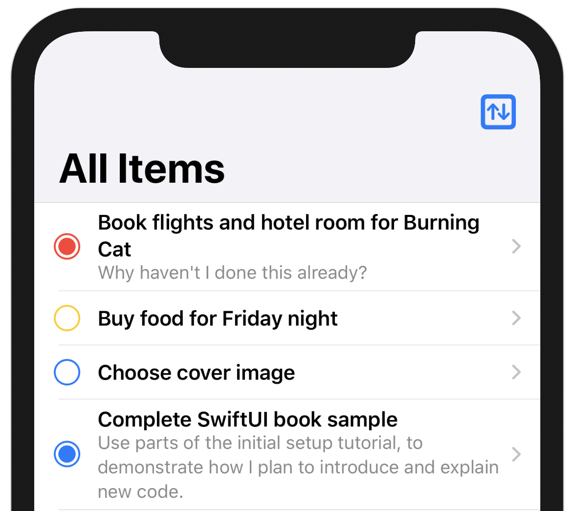
Now look to the lower right of the canvas, where the Live Preview button waits, its image is a blue ‘Playback’ icon. Click that icon and wait a moment while a simulator is launched inside the canvas. After a moment, the canvas will re-draw, and any selection rectangles will disappear. Click on the sort button to see the options pop up. Select each in turn (remember, it’s likely set to Title already) and marvel. Not only does the list’s order change, but it animates. SwiftUI provides a lot of useful features by default, and animation is just one of them.
Runtime Warnings
As noted earlier, you’ll sometimes see warnings popping up in the debugger output when you run a SwiftUI application. At this point you might see a message about an invalid auto-layout constraint; consider it benign, since the application works, and you’ve written no auto-layout code that would need revision.
You might wonder whether the rows should display the dates or priorities of their items, and if so, you’re right—they should. Right now, though, you have a simple development interface here, providing enough to interact with, and you’ll implement a more fully-featured UI in Chapter 5, Custom Views and Complex Interactions.
Crafting a Full-Screen View
Now that you have some List views and rows implemented, it’s time to think bigger and look at how you can present all the information for a to-do item in its own view.
Create a new SwiftUI View in the Views group and name it TodoItemDetail.swift. It will need a TodoItem to operate on, so add a property for that, use it to supply the item’s title to the Text view in the body, and update the TodoItemDetail call in the preview to pass in an item:
// file: "Views/TodoItemDetail.swift"
struct TodoItemDetail: View {
    let item: TodoItem

    var body: some View {
        Text(item.title)
            .font(.title)
    }
}

struct TodoItemDetail_Previews: PreviewProvider {
    static var previews: some View {
        TodoItemDetail(item: defaultTodoItems[0])
    }
}
The detail view will present the item’s title in a header section, which will make use of the to-do item’s color to make the view ‘pop.’ Below that will be the priority, due date, and any notes.
If you think this sounds like a job for a VStack, then you’re right, so that’s where you’ll start. Wrap the existing Text view in a VStack, then put a new Rectangle view above the title, setting its height and color:
// file: "Views/TodoItemDetail.swift"
var body: some View {
    VStack(alignment: .leading) {
        Rectangle()
            .fill(item.list.color.uiColor)
            .frame(height: 210)
        Text(item.title)
            .font(.title)
    }
    .navigationBarTitle("", displayMode: .inline)
}
Note the call to .navigationBarTitle(_:displayMode:) at the end of the VStack. If this view is displayed in a navigation view (and it will be), this call specifies the content and format of the navigation bar. Duplicating the title seems a little redundant, so an empty string will suffice, but the main reason this call is here is to specify the display mode of .inline, which will give the usual semi-transparent white bar across the top of the view, containing the back button. Without this call, the bar would be transparent, and the title displayed in a large area below (you can see the effect on the TodoList view). Once the rectangle is extended to the top of the screen in the next section, however, any buttons on the navigation bar would become either hard to see (against a blue background) or would clash horribly. Using the standard bar provides the best of both worlds: it’s white enough that the buttons look good and transparent enough that the color underneath can bleed through and give it some character.
Define a Layered Header View
This detail view doesn’t look very appealing right now; what would be really nice is to have the title appear on top of the colored rectangle. SwiftUI provides two tools which can do this: first, a ZStack view will place views one on top of the other and supports both horizontal and vertical alignment types, along with combinations of both. The second tool is an overlay view, created by passing a view to the .overlay(_:) modifier method. An overlay view is placed over the top of an existing view as in a ZStack, but is explicitly sized to match the frame of the view below it.
In this case, a combination of the two will be useful, because there’s one particular issue that can arise when placing text over a colored background: contrast. Black text works well over a light-colored background, but not so well on a darker or bolder color. Black on a mid-blue is readable, but not appealing. White text on a pale yellow is hard to read. There are ways around this. For example, you can look at the hue, saturation, and brightness of the underlying color and pick black or white text based on that, but this can be error-prone.
Instead, let’s take a Gordian-knot approach and cut through the problem with a simple solution. You’ll always darken the color underneath the text, then use white text. A gradient from a slightly-transparent black to fully transparent laid over the bottom part of the colored rectangle will darken the area containing text enough that you have a pleasant contrast, while still allowing the user’s choice of color to shine through unchanged toward the top of the rectangle.
First, let’s create the overlay view. This will contain the text of the title and a gradient providing the darker background that will give more contrast for the text above it.
In TodoItemDetail.swift, at the bottom of the TodoItemDetail definition, add a new sub-type named TitleOverlay:
// file: "Views/TodoItemDetail.swift"
private struct TitleOverlay: View {
    let item: TodoItem
}
Next, define the overlay’s gradient through a dynamic property:
// file: "Views/TodoItemDetail.swift"
var gradient: LinearGradient {
    LinearGradient(
        gradient: Gradient(colors: [
            Color.black.opacity(0.6),
            Color.black.opacity(0),
        ]),
        startPoint: .bottom,
        endPoint: .init(x: 0.5, y: 0.1))
}
The linear gradient type takes a single Gradient, defined on line 3, and a start and end point which define where within the view the color should begin to change. This gradient fades between two colors: a slightly transparent black to a completely transparent one. The start point on line 7 states that the gradient should begin at the bottom of the view, while line 8 states that it should end close to the top of the view (in SwiftUI, the y-coordinate grows downwards, meaning 0.0 is at the top of the view).
Unit Points
A common concept in drawing APIs is that of a unit point, namely a value between zero and one that is used to define a position within some other area: the unit value is multiplied by the size of the appropriate axis within the target area to get a real location. Gradients use these extensively, and SwiftUI includes the
UnitPointtype to aid in their use.Conceptually, a unit point in a 2D coordinate system is a point with x and y coordinates, each between zero and one. A gradient is defined as a series of colors which will be interpolated with one another to create a smooth change across some region, like the content bounds of a view. When the gradient is created with some number of colors, a unit point is used to define the location at which it will place each of its constituent colors. To fade between two colors from top to bottom of an entire view, you would use y coordinate values of zero and one, respectively. To fade from the left to the right, use x coordinates of zero and one. To fade from top-left to bottom-right, both x and y values would use zero and one. The
UnitPointtype includes several pre-defined values for the most commonly-used locations, including the leading and trailing edges, top and bottom, corners, and center.When you only want to make use of a single dimension, as in
TitleOverlay, you simply provide the same value in all points. The standard convention, however, is to use0.5for values on an unused axis. All of the built-in unit points provided by SwiftUI follow this scheme, so you’ll need to be aware of this if you want to pair a custom point with.bottom, as in the gradient defined above.
Assemble the Overlay Layer
With these parts in place, you can start on the body implementation. To place the text on top of a rectangle containing the gradient, use a VStack with an alignment of .bottomLeading, so that the content is laid out from the lower-leading corner of the header view:
// file: "Views/TodoItemDetail.swift"
struct TitleOverlay: View {
    // ...

    var body: some View {
        ZStack(alignment: .bottomLeading) {
            Rectangle().fill(gradient)
            // ...
        }
    }
}
Note that in this view, you don’t need to specify any frame sizes; since it’s used as an overlay for another view, its size will be defined by that other view.
To see this view on the canvas, you need to add it to the body of the TodoItemDetail view. At the same time, let’s display any notes in the to-do item. Add a call to .overlay(TitleOverlay(item: item)) to the existing Rectangle view, and replace the title with a Text view containing the item’s notes field, if it’s non-nil, with a little horizontal padding. Lastly, place a Spacer view at the end to push the header to the top of the screen. Your body implementation should look something like this:
// file: "Views/TodoItemDetail.swift"
var body: some View {
    VStack(alignment: .leading) {
        Rectangle()
            .fill(item.list.color.uiColor)
            .edgesIgnoringSafeArea(.top)
            .frame(height: 210)
            .overlay(TitleOverlay(item: item))

        if item.notes != nil {
            Text(item.notes!)
                .padding(.horizontal)
        }

        Spacer()
    }
    .navigationBarTitle("", displayMode: .inline)
}
Press the Resume button in the canvas, and you’ll see the color rectangle taking up the top part of the device’s screen, complete with a smooth gradient darkening it toward the bottom. This could look nicer, though—if you’re looking at an iPhone X, XS, XR, or iPhone 11 in your canvas (this can be changed by selecting a different simulator device in Xcode’s scheme switcher), then you’ll notice a white strip across the top of the screen above the header. That real-estate could be a lot more use to us as part of the header, so append a call to .edgesIgnoringSafeArea(.top) to the Rectangle in TodoItemDetail’s body implementation, between the .fill and .frame modifiers. The item’s color now swoops upward to fill in the status bar area, giving the view a much more appealing aspect.
Returning to the TitleOverlay view, you can now begin to add the content. Following the Rectangle containing the gradient, add a new VStack with leading alignment and a spacing of eight points, and place the item’s title in here using a Text view with a bold .title font. Your code should look like this:
// file: "Views/TodoItemDetail.swift"
VStack(alignment: .leading, spacing: 8) {
    Text(item.title)
        .font(.title)
        .bold()
    // ...
}
.foregroundColor(.white)
.padding()
Your text should appear in large white letters over the darkened part of the item header. Next, let’s add the priority and due date, if any. Start out by appending a HStack after the title:
// file: "Views/TodoItemDetail.swift"
VStack(alignment: .leading, spacing: 8) {
    Text(item.title)
        .font(.title)
        .bold()

    HStack(alignment: .firstTextBaseline) {
        // ...
    }
    .font(.subheadline)
}
.foregroundColor(.white)
.padding()
All the text in this stack is going to use the same font, so that font is set on the HStack itself—this will cascade that setting to any descendant views.
Show Item Priority
For the priority, simply including the name isn’t necessarily very descriptive. While “Urgent,” in English at least, sounds like a call to action and can be quickly interpreted as “this is an urgent to-do item,” the same can’t be said for “low,” “high,” or “normal.” “This item is low” doesn’t necessarily suggest a priority in the way “this item is urgent” does—and that’s only in English. When your application is localized, there may be yet more ways that a single-word priority indicator can appear detached or even nonsensical.
For that reason, you’re going to use a formatted string of “Priority: X,” where “X” will be replaced with the priority name, and will additionally be rendered with bold text to indicate that this is the part of the sentence containing actionable information. Looking at the initializers for Text views, though, it doesn’t seem like there’s an obvious way to specify different fonts, colors, or any other attributes for parts of the text. The NSAttributedString type—the typical way to supply text with formatting information in UIKit—isn’t mentioned anywhere in SwiftUI’s API, in fact.
Happily, all is not lost. Text happens to implement a very Swift-y way of achieving exactly what you need:
extension Text {
    public static func + (lhs: Text, rhs: Text) -> Text
}
You can, in fact, take two separate Text instances, each with modifiers affecting their content and presentation, and add them together, resulting in a single text view with all that presentation information retained. Here, then, you can easily combine a plain “Priority:” label with a bolded label containing the priority’s name (suitably capitalized), in one line of code:
// file: "Views/TodoItemDetail.swift"
HStack(alignment: .firstTextBaseline) {
    Text("Priority: ") + Text(item.priority.rawValue.capitalized).bold()
}
Your canvas now displays exactly what you defined, and not a mention of NSAttributedString.attributes(at:effectiveRange:).
There’s plenty of horizontal space left over, so let’s put the due date on the trailing edge of the view. First, add a Spacer view, then add a Text view containing either the due date (suitably formatted) or a static message if there is no date attached:
// file: "Views/TodoItemDetail.swift"
HStack(alignment: .firstTextBaseline) {
    Text("Priority: ") + Text(item.priority.rawValue.capitalized).bold()
    Spacer()
    if item.date != nil {
        Text("\(item.date!, formatter: Formatters.mediumDate)")
    }
    else {
        Text("No Due Date")
    }
}
Note that the date string uses a form of string interpolation that makes use of an optional Formatter; this uses the static formatter property you created earlier, which the string interpolation engine uses to convert the provided value (a Date in this instance) into a String, ready for display.
Now, your item should be displayed on the canvas with a vibrant color-filled header view drawing attention to the primary attributes of the item, with any additional notes showing below. All that remains is to tie it into the rest of the application.
Open TodoList.swift and find the NavigationLink in the view’s body implementation. Replace the link’s destination with a TodoItemDetail like so:
// file: "Views/TodoList.swift"
NavigationLink(destination: TodoItemDetail(item: item)) {
    TodoItemRow(item: item)
        .accentColor(self.color(for: item))
}
Start a live preview, or launch the application in the simulator or on a device, and navigate into a to-do item to see your new view in action:
What You Learned
This chapter has covered a lot of ground, but now you ought to have a number of useful tools on your belt:
- You can drive view content updates via state properties.
- You’ve seen how you can create interesting and inventive interfaces by composing several views together.
- You’re able to make use of the gesture system to implement your own input controls.
- Management of deeper navigation hierarchies is now a straightforward task.
- Rich-text labels are within your grasp.
- You took your first steps into the realm of styles and modifiers in SwiftUI.
- Stack views are clearly the power tools of SwiftUI.
Next, you’ll investigate the facilities provided for working with mutable data, and how to implement editing functionality in your SwiftUI application.