Chapter 3: Modifying Application Data
This text was prepared for publication in March 2020. As a result, a lot of the code and techniques in this book are out of date. It is provided as a historical curio, and does not provide accurate guidance on using SwiftUI today.
In this book so far you’ve used SwiftUI to present data, arranging it in an aesthetically pleasing manner. A real application does more than just display static data, though: it allows the user to interact and modify that data. Really good applications alert the user to changes through the use of animations that draw attention in the right direction without interrupting the application’s flow and its primary purpose.
In this chapter, you’ll begin to wire your data model into SwiftUI properly, providing edit controls where necessary, and reacting to changes in the data model cleanly when they happen. SwiftUI’s state management tools make these tasks simple to approach for the majority of cases while stepping out of the way when you need to take more fine-grained control of the process.
To follow along, download this book’s source code download and use the starter project found in 3-ModifyingData/starter. An example of the complete result of this chapter’s work can be found in 3-ModifyingData/final.
Data Flow in SwiftUI
One of SwiftUI’s strengths is its focus on state management. It provides types and property wrappers that work hand-in-hand with its layout and rendering system to ensure that any modifications to your application’s state are correctly reflected in your view hierarchy. It also makes use of its central position in the procedure to ensure that only the requisite parts of the interface are updated: it is able to use its knowledge of state to determine that some subviews haven’t changed without necessarily diving through the full hierarchy, comparing view contents one by one.
Property Wrappers
Swift has a few special keywords or attributes that can be applied to properties to induce certain behavior. For example, the
lazykeyword causes a property to be initialized lazily—i.e. only when first requested. The@NSCopyingattribute for properties of an Objective-C type will cause that type to be copied rather than retained during assignment to the property.Swift 5.1’s property wrappers allow programmers to create their own attributes via use of the
@propertyWrapperattribute on a type along with some special properties. When these attributes are used, the compiler synthesizes several stored and computed properties implementing the API you’ll use in your appliation.When you declare a property using a property wrapper attribute named
myProperty, the compiler creates a property of the property wrapper’s type and names it_myProperty. It then creates a second, computed, property namedmyPropertywhose value is fetched from within the wrapper. Further, if the wrapper offers a special projected value, the compiler generates a computed property named$myPropertywhich fetches the project value from the wrapper. The SwiftUI@Stateproperty wrapper uses this to produce a binding to its value.
State in a SwiftUI app is managed with several different tools, each with a particular purpose. There are types used to manage discrete state for one or more views, and there are ways to directly share state downwards toward child views or to pass state changes upwards to ancestor views. There are also ways to indirectly pass data up and down the view stack, making it available to any descendants or any ancestors that may be interested—without tying the two together directly.
State Management
State data in SwiftUI is managed by the framework. You mark certain items as state by using property wrappers, and SwiftUI then observes when these are accessed and modified. When a view’s body implementation accesses state, this is noted by the framework. Then, when a state value is modified, any views that accessed it are recreated through their body property, after which SwiftUI will determine what in the view hierarchy actually changed and will merge those changes (and only those changes) into the on-screen interface.
There are two property wrapper types that you use for this:
@State
Mark a structure-type property with the @State attribute, and SwiftUI will keep track of it, using any changes to that value to trigger updates of the view hierarchy. This type is logically for mutable data; you can use a class type, but mutating the contents of an object instance won’t trigger anything—only directly assigning a new (object) value will cause any change. Structure types, on the other hand, fit perfectly into @State properties, since any change to the contents is a change to the whole structure, triggering an update.
@ObservedObject
For class types, the @ObservedObject attribute is the tool of choice. It works specifically with objects that implement the ObservableObject protocol from the Combine framework. Once you have a class that conforms to this protocol, Combine’s @Published property attribute will cause any changes to the tagged attribute to be published by the containing object. SwiftUI then uses this to observe changes to the content of an object (reference) type, obtaining the same behavior that @State properties provide for struct types.
From the point of view of the SwiftUI framework, these types both serve the same purpose: they allow the framework to react to changes of state. Additionally, they provide a second function: they can automatically provide bindings to themselves and their content.
Bindings are conceptually references to the @State or @ObservedObject properties, or to their contents; they read their values from the original object, and any changes made to them are written back to the original object. Here, the state properties are considered the source of truth for a given value, while a binding is merely a reference back to that source of truth. The idea is that your application should have one source of truth for a particular piece of its state—it should live in one place exactly—while anywhere else that wishes to access it will instead bind to that value remotely.
When defining the properties of a view, you use the @Binding attribute to declare that your property should be a binding to some other state. When you need to create a binding, you can obtain one by using the $ prefix on a state property, which will return a binding to itself. To get a binding to some property within a state type, you prefix the entire expression with the $ prefix, and you’ll ultimately receive a binding to the final item in the property chain:
@State var myState: SomeData

var body: some View {
    SomeView($myState.user.name) // receives a binding to the 'name' property
}
Dependency Propagation
Bindings are one of the principal tools provided for dependency propagation in SwiftUI. Dependency propagation refers to the way in which state data is made available to different parts of your application, from a single source of truth to various other views. You can thus link together your views in a dependency chain—one view depending on state from another—in several different ways.
In UIKit or AppKit applications, you’re generally left to handle this task on your own by copying values or references around the view hierarchy, then manually notifying controllers and views when the data changes. SwiftUI sets out to handle as much of this task as possible on your behalf, distilling dependency propagation into four distinct types of direct and indirect linkage both up and down the view hierarchy:
Direct, downwards
Regular Swift properties will pass an item as a parameter when creating a subview to make that data available directly. Text views function this way, for example; you pass them a plain String.
Direct, upwards
For upward state movement, the Binding type is preferred. You pass a binding to a @State or @ObservedObject property into a subview to allow that subview to both see and modify your state. Most controls use this to bind them to some data owned or observed by the ancestor that created them.
Indirect, downwards
For passing values down the view hierarchy in general, SwiftUI provides the Environment. Two property wrappers, @Environment and @EnvironmentObject (equivalent to @State and @ObservedObject respectively), allow child views to pluck from the environment that were placed there when some ancestor view was created. Many view modifiers use the environment behind the scenes; this is how setting a foreground color on a top-level view takes effect on its descendants.
Indirect, upwards
Here, you’ll find one of the lesser-known power tools of SwiftUI: the PreferenceKey protocol. This allows you to define a type that carries some data value along with the knowledge of how to reduce multiple values down to a single one. Any descendant view can associate a value with a particular PreferenceKey type, and its ancestor can request that value via the .onPreferenceChanged view modifier. The values from all subviews are reduced to a single value that is provided to the ancestor. This way, a subview can potentially alter many things about a parent view—a settings editor might change the background color of an application’s root view, changing the values used in the body property of the root view.
Application Data in “Do It”
The application you’re building involves a few items of data, which at present are being loaded from a built-in JSON file. While that may be a useful way to present some initial sample content to the user, real data generally lives elsewhere and is updated by the application in response to user input. As a precursor to building out editing support, you’ll look at the final storage of your data and how it is passed down through your application’s view hierarchy.
In the starter project look at Model/DataCenter.swift; this component is going to become more important as you work through this book, and you’ll make use of more of its API as you continue. This defines the data source where your data will live—your application’s source of truth. It implements the shared storage for all the lists and items you’ll be using, along with automatic save and load functionality, and more. Most of its implementation is outside the bounds of a book focussed purely on SwiftUI, but there are a few lines are worth pointing out:
// file: "Model/DataCenter.swift"
import Foundation
import Combine
import SwiftUI

final class DataCenter: ObservableObject {
    @Published var todoItems: [TodoItem] = []
    @Published var todoLists: [TodoItemList] = []
    @Published var defaultListID: UUID
}
You’ll notice a new module is being imported, named Combine. This framework, introduced by Apple alongside SwiftUI, underlies a lot of SwiftUI’s reactive workflow. It implements a publisher-subscriber model of data flow along with a variety of tools used to transform and validate different types of data automatically. It’s being imported here to tie in with SwiftUI’s @ObservedObject attribute, which explicitly uses Combine’s ObservableObject protocol. You’ll note that DataCenter specifies conformance to that type.
Observable objects are those that publish information on their changes to subscribers, such as SwiftUI. While it’s possible to implement the necessary protocol conformances manually, the simplest way to get what you need is to mark properties you wish to publish with the @Published attribute. This property wrapper from Combine will do everything for you so that when the property is modified (as it’s a value type, that includes modification of its contents), all subscribers will be notified. SwiftUI will learn about changes by subscribing, which will happen automatically via the @ObservedObject property wrapper.
Using the Environment
Now that your data is contained and managed by an instance of the DataCenter class, you’ll have to feed that instance into your application’s view hierarchy. The simplest approach is to have your root view declare and initialize a property using the @ObservedObject attribute to hold it, like so:
@ObservedObject private var data = DataCenter()
That, however, presupposes that the chosen view will always be at the root of the application and that it will always pass bindings down to its children. At present, this might seem reasonable enough—your view hierarchy isn’t terribly deep at present—but as your application grows, manually passing bindings around will start to become rather cumbersome. Instead, you’ll use the @EnvironmentObject attribute and the .environmentObject modifier to make it available as part of your views’ environment, available to any descendants.
To install it, open SceneDelegate.swift and modify the content of scene(_:willConnectTo:options:) as follows:
// file: "SceneDelegate.swift"
let contentView = Home()
    .environmentObject(DataCenter())
Here, you’ve initialized a DataCenter instance for the scene and attached it to the environment for the root view at the same place you define that root view. Should you ever swap out the Home view for a different type, the data will still be attached to the new view in the same manner.
With the data now living in a new location, your views will need to be updated to correctly bind to the items managed by the DataCenter.
Start by opening Views/Home.swift. Here you need to add a DataCenter property with the @EnvironmentObject attribute, and then you’ll need to change the the ForEach view initializer to use the todoLists property of that DataCenter. Lastly, you need to add a call to .environmentObject in the preview provider at the bottom of the file, so that the data is available in previews as well as the real application.
Make the following updates to the file:
// file: "Views/Home.swift"
struct Home: View {
    @EnvironmentObject private var data: DataCenter

    var body: some View {
        NavigationView {
            List {
                Section {
                    // « all items »
                }
            }
            // « view modifiers »
        }
    }

    // « struct Row: View { ... } »
}

struct Home_Previews: PreviewProvider {
    static var previews: some View {
        Home()
            .environmentObject(DataCenter())
    }
}
Next open TodoList.swift. The changes here will be confined to three places: the items property will be rewritten to use the new DataCenter instance fetched from the environment; the environment object will be attached to the for the TodoItemDetail view; and the color(for:) method will use the data center to find the list associated with an item. The required changes are minimal:
// file: "Views/TodoList.swift"
@EnvironmentObject private var data: DataCenter

var list: TodoItemList? = nil
var items: [TodoItem] {
    guard let list = list else { return data.todoItems }
    return data.items(in: list)
}
var title: String { list?.name ?? "All Items" }

func color(for item: TodoItem) -> Color {
    let list = self.list ?? data.list(for: item)
    return list.color.uiColor
}

// « ... »

var body: some View {
    List(sortedItems) { item in
        NavigationLink(destination: TodoItemDetail(item: item)
            .environmentObject(self.data)
        ) {
            // « TodoItemRow(...) »
        }
    }
    // « modifiers »
}
Note that the code for creating the list content views hasn’t changed, and doesn’t need to; the TodoItemRow doesn’t need to bind to the contents of the to-do list, as it is just reading from its contents. A copy of the value will suffice, and the potential dependency problems are nicely sidestepped. The call to .environmentObject inside the NavigationLink is important though: the new view pushed onto the navigation stack won’t automatically inherit the DataCenter, and the TodoItemDetail view will need to use it to access the list color for its TodoItem.
Don’t forget to attach a DataCenter to the environment in the preview provider:
// file: "Views/TodoList.swift"
struct TodoList_Previews: PreviewProvider {
    static var previews: some View {
        NavigationView {
            TodoList()
        }
        .environmentObject(DataCenter())
    }
}
Lastly, open TodoItemDetail.swift and make the following changes to fix the errors noted by Xcode:
// file: "Views/TodoItemDetail.swift"
struct TodoItemDetail: View {
    let item: TodoItem
    @EnvironmentObject private var data: DataCenter

    var body: some View {
        VStack(alignment: .leading) {
            Rectangle()
                .fill(data.list(for: item).color.uiColor)
                // « modifiers »

            // « notes »
        }
        .navigationBarTitle("", displayMode: .inline)
    }

    // « private struct TitleOverlay: View { ... } »
}
Once again, don’t forget to add an .environmentObject(DataCenter()) modifier inside the preview provider.
Building an Editor
Your next task is to implement an editor for your to-do items. This involves a few extra types added as part of this chapter’s starter project, all of which reside under the Helpers group.
Create a new SwiftUI View file in the Views group and name it TodoItemEditor.swift. Edit the view and the preview provider to match the following example:
// file: "Views/TodoItemEditor.swift"
struct TodoItemEditor: View {
    @Binding var item: TodoItem
    @EnvironmentObject private var data: DataCenter
    @State private var showTime: Bool

    init(item: Binding<TodoItem>) {
        self._item = item
        self._showTime = State(wrappedValue: false)

        if let date = item.date.wrappedValue {
            let components = Calendar.current.dateComponents(
                [.hour, .minute], from: date)
            self.showTime = components.hour! != 0 || components.minute != 0
        }
    }

    var notesEditor: some View {
        TextView(text: self.$item.definiteNotes)
            .padding(.horizontal)
            .navigationBarTitle("Notes: \(item.title)")
    }

    var body: some View {
        Form {
            // « form contents will go here »
        }
        .navigationBarTitle(
            Text("Editing: \(item.title)"), displayMode: .inline)
    }
}

struct TodoItemEditor_Previews: PreviewProvider {
    static var previews: some View {
        NavigationView {
            StatefulPreviewWrapper(defaultTodoItems[0]) {
                TodoItemEditor(item: $0)
            }
        }
        .environmentObject(DataCenter())
    }
}
Two items here deserve special attention:
Your first
@Bindingproperty appears on line 2. An editor logically operates on data owned by someone else—it provides a service. You model this by using a binding, as discussed in xxx. This allows the editor to view the current value and also to modify them, triggering changes to the underlying@Stateor@ObservedObjectproperty that owns the value.It turns out that previews and
@Bindingtypes don’t mix terribly well. You might normally pass in a constant binding viaBinding.constant, but that isn’t useful in an editor: all changes are ignored. Declaring a real@Stateproperty is fine, but sadly fetching a binding from that outside of aView.bodycall isn’t allowed—and SwiftUI doesn’t considerPreviewProvider.previewsa body method—so you can’t define mutable preview state within the preview provider itself. TheStatefulPreviewWrapperreferenced on line 35 provides a concise workaround for this issue by accepting a value in its initializer that it stores as a@Stateproperty, then provides a binding to that state as input to the providedViewBuilderblock, allowing the preview to pass it on. You can see find the implementation inPreview Assistants/StatefulPreviewWrapper.swift.
The view’s body contains a Form view. This container view is available on all platforms, and it behaves in the appropriate manner for each. On macOS, for example, it acts more or less like a VStack, laying its contents out in a regular view. On iOS, it will instead use the appearance of a List with a grouped style. Furthermore, it alters the default appearance of certain control types, assuming the use of a navigation view to push a new view containing menus of items to choose, for example. Overall, it aims to mirror the appearance of the Preferences application, so look at that to get an idea of what you’ll see.
The first thing to include in the form is the to-do item’s title. For this, you’ll use a TextField view, which takes a label string (amongst other things, labels serve as accessibility aids) and a binding to the value to display and edit. The title is straightforward—"Title" will suffice—and the binding is generated using the $-prefix operator on this view’s item property:
// file: "Views/TodoItemEditor.swift"
TextField("Title", text: $item.title)
Choosing Values
Next let’s provide a way to select the list to which the item will belong. For this you’ll use a Picker control, which also takes a label string and a binding to the underlying value. This differs, however, in how you provide its content. Where a TextField is representing some straightforward data, a picker might display any number of options representing all sorts of things, so the picker uses a @ViewBuilder block to build its content. This picker will contain one entry for each defined TodoItemList, so to provide that you’ll use a ForEach view iterating over the contents of the todoLists property of the DataCenter, providing a Text view displaying each list’s name.
The picker’s value itself will be bound to the listID property of the view’s bound item. This presents an interesting situation: the picker is displaying Text views, each generated from a TodoItemList, but each option needs to assign a related Int value to the picker’s bound property. How can SwiftUI map from a TodoItemList to an Int here?
The answer lies in the specifics of the ForEach view, or, more specifically, its output. The ViewBuilder block passed to the ForEach is invoked once for each value in the provided collection, and the resulting view is then tagged with that value in SwiftUI’s internal data store. The associated value is then used by the picker to set the value of its binding. “That’s all well and good,” you may think, “but the value doesn’t match the type of the binding I’m using,” which is true. In this case, you can override the tagged value using the .tag(_:) modifier, in essence supplying the value that the Picker will assign to its binding. Here the value you need is each list’s id value.
The resulting code is short and sweet, belying the complexity underneath (a common occurrence in SwiftUI):
// file: "Views/TodoItemEditor.swift"
Picker("List", selection: $item.listID) {
    ForEach(data.todoLists) { list in
        Text(list.name).tag(list.id)
    }
}
The next property to tackle is the item’s priority, which will also use a Picker view. Here, however, the type of the bound property and the type iterated by the enclosed ForEach view already match up, so the explicit .tag(_:) call isn’t needed. The TodoItem.Priority type conforms to CaseIterable, so you’ll pass TodoItem.Priority.allCases as the collection the ForEach view will iterate over. Lastly, to see a properly localized representation of the priority, its rawValue will be wrapped in a LocalizedStringKey:
// file: "Views/TodoItemEditor.swift"
Picker("Priority", selection: $item.priority) {
    ForEach(TodoItem.Priority.allCases, id: \.self) {
        Text(LocalizedStringKey($0.rawValue.capitalized))
    }
}
Since these pickers are appearing in a Form, they will take on a particular appearance by default, that of a NavigationLink with a value displayed at its trailing edge. Tapping on the link will push a new Form view containing the available options—tapping on one of these will assign the value and pop the view from the navigation stack. If you change the Form to a List, though, you’ll see that the picker changes to appear as an inline wheel control containing the possible selections. Revert back to using a Form before continuing.
Editing Optional Properties
Following the priority, you’ll add the UI to select a date for your to-do item. This leads to an interesting issue, though, when no date is assigned, and the property value is nil. In logical terms, the user may not want or need to assign a date; in programming terms, the date property is an Optional. Date pickers—like the other controls you’ve seen so far—are bound to a concrete value, not an optional, so you’ll need to lend a helping hand to make this work. You’ll also need to do something similar for the notes property, which likewise may legitimately be nil.
To make this all work, you’ll take a two-pronged approach. For binding the notes and date properties, you’ll create wrapper properties that transform nil values into suitable ‘empty’ variants. In addition, while an empty string can be easily turned into nil for the notes property, the same can’t be said of the date because there isn’t a suitable ‘not a date’ value that the user could select from a date picker. For that, then, you’ll create a new property used to toggle the presence of a valid date on and off.
Add the following file-private extension for the TodoItem type inside TodoItemEditor.swift:
// file: "Views/TodoItemEditor.swift"
fileprivate extension TodoItem {
    var hasDueDate: Bool {
        get { date != nil }
        set {
            if newValue && date == nil {
                date = Date()
            }
            else if !newValue {
                date = nil
            }
        }
    }

    var definiteDate: Date {
        get { date ?? Date() }
        set { date = newValue }
    }

    var definiteNotes: String {
        get { notes ?? "" }
        set {
            if newValue.isEmpty {
                notes = nil
            }
            else {
                notes = newValue
            }
        }
    }
}
The first property, hasDueDate, simply returns whether the date property is not nil. On line 5 in its setter, the property checks whether it needs to assign a concrete value to date; if so, it uses the current date, since this is a reasonable initial value.
The second property is named definiteDate. It assigns any values straight through to the real date property, but in the case there currently is no concrete value, it will again return the current date, as seen on line 15.
The last property, definiteNotes, will return an empty string if there is currently no concrete value to use. When a new value is assigned, it is either saved directly to the underlying notes property, or—as you see on line 23—it will translate any empty string into a nil value.
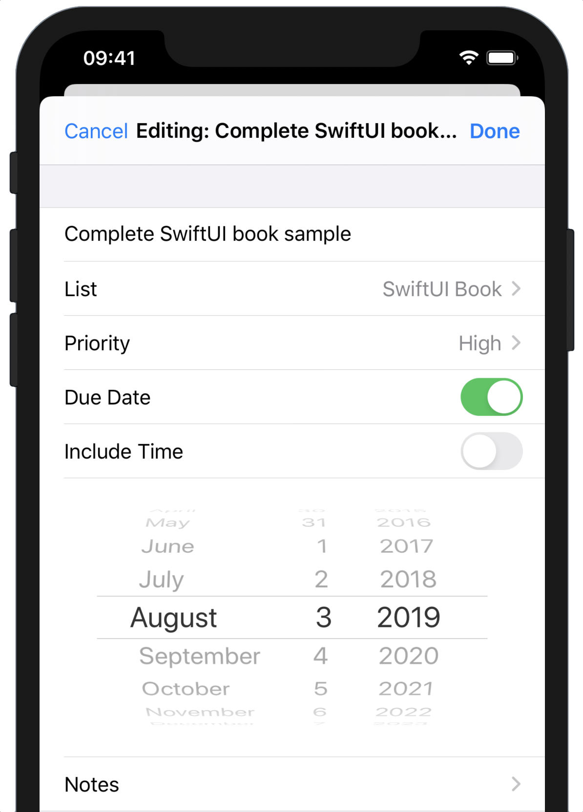
With these new properties in place, you can continue implementing the body of the TodoItemEditor view. You’ll start by adding a Toggle control bound to the hasDueDate property. Turning this on will reveal the date picker itself, and turning the toggle off will hide the picker. The picker, in turn, will be bound to the new definiteDate property.
The use of two separate controls to work on a single logical value leaves you with some nuances to consider, though. Visually the two controls are clearly related, and the animation provides a visual cue to the nature of that relation. The key word, however, is “visual,” and many of your app’s users will be unable to see, and will not get those cues. To VoiceOver, these are simply two separate controls, and to visually impaired users, the user interface consists almost entirely of their labels. For users able to follow the visual cues, though, the UI needn’t be cluttered with two separate descriptive labels (“a picture says a thousand words,” they say).
Your solution here is to provide suitably descriptive labels to the controls for VoiceOver’s benefit, and then to hide those labels from the screen. You’ll then add a single Text view to serve as a label for visual purposes:
// file: "Views/TodoItemEditor.swift"
HStack {
    Text("Due Date")
    Spacer()
    Toggle("Has Due Date", isOn: $item.hasDueDate.animation())
        .labelsHidden()
}
Here, you’ve used a HStack to lay out a label followed by a Toggle control. The toggle has the accessibility-compatible label of “Has Due Date,” and its selection is bound to the hasDueDate property of the to-do item being edited. You’re also taking advantage of some of SwiftUI’s built-in support for animations. Since bindings are frequently used for changing values, which in turn cause views to change, they provide quick means to attach animations to all changes. Here, you use the .animation() method on Binding to get a new binding that animates its changes. As you’ll see in a moment, the date picker control is added to the view when the hasDueDate property is true—using the .animation modifier here will cause the picker to be moved into place with a suitable animation.
Now you’re almost ready to implement the date picker, but there’s one extra factor worthy of consideration: is the due date for this to-do item just a day, or a specific time of day? SwiftUI’s DatePicker view can display either a date, a time, or both, and it would be good to let the user choose the level of granularity they want to use here (Apple’s Reminders application takes a similar approach). To implement this, you’ll need a new @State property that can be adjusted with another Toggle, but you’ll need to do some additional set-up to have it working; you need to inspect your item’s date property, if set, to see if it contains a non-zero hour or minute, and set the state appropriately. That will need to happen in the editor’s initializer, which means you’ll now have to implement that yourself:
// file: "Views/TodoItemEditor.swift"
@State private var showTime: Bool

init(item: Binding<TodoItem>) {
    self._item = item
    self._showTime = State(wrappedValue: false)

    if let date = item.date.wrappedValue {
        let components = Calendar.current.dateComponents(
            [.hour, .minute], from: date)
        self.showTime = components.hour! != 0 || components.minute != 0
    }
}
There’s some unusual activity here. There are no properties named _item or _showTime in the code, but Xcode isn’t complaining at all—what’s going on? The answer lies in the implementation of property wrappers, as described in Property Wrappers above. Thus, when the compiler sees @State var showTime: Bool, it effectively inserts the following code:
var _enabled: State<Bool> = State(initialValue: false)
var enabled: Bool {
    get { _enabled.wrappedValue }
    set { _enabled.wrappedValue = newValue }
}
var $enabled: Binding<Bool> { _enabled.projectedValue }
Swift normally synthesizes initializers for you and handles the details of creating a State instance from a regular value transparently. When you implement the initializer yourself, however, you can’t just assign to showTime, as Xcode will complain “Variable ‘self.showTime’ used before being initialized.” Instead, you must initialize the wrapper type itself via the synthesized _showTime property. The same, naturally, applies to the item argument: the view’s item property is synthesized, and has a type of TodoItem, but the initializer has received a Binding<TodoItem> instance. That argument must therefore be assigned to _item, the Binding property itself.
Now you have everything you need to define the date picker; add the following code at the bottom of the Form content to add the new rows:
// file: "Views/TodoItemEditor.swift"
if self.item.hasDueDate {
    Toggle("Include Time", isOn: $showTime)
    HStack {
        DatePicker("Due Date", selection: $item.definiteDate,
                   displayedComponents: showTime
                       ? [.date, .hourAndMinute]
                       : .date)
            .datePickerStyle(WheelDatePickerStyle())
            .labelsHidden()
            .frame(maxWidth: .infinity, alignment: .center)
    }
}
With this code, you check whether the toggle was enabled by looking at the state to which it was bound. Remember that in SwiftUI views are just a generated representation of state—so you don’t check if a control is toggled on, you check if a value is set, and trust that the toggle will display that value appropriately. If the property is set, then two rows are added to the form: one toggles the showTime property, and the next displays the date picker, bound to the new definiteDate property.
As with the priority picker earlier, a Form will adopt a special layout for date pickers by default; you can see it for yourself by removing the call to .datePickerStyle(WheelDatePickerStyle()). Normally, a form will show an abbreviated representation of the date value, and when you tap on it, a wheel-style picker will animate into place below it. Tapping the row again will close the picker. However, you already have your own toggle to enable/disable the date picker, so here you explicitly request the wheel style of picker via the .datePickerStyle modifier. As with the “Due Date” toggle above, the picker’s label value is visually superfluous, so you again hide it using the .labelsHidden() modifier.
The use of .frame(maxWidth:alignment:) causes the picker to be centered onscreen without needing to resort to Spacer views on either side. The .frame(...) modifier takes a fairly large number of optional arguments, but here you’re providing a maximum width and an alignment. What this says is that the picker’s width can grow larger than its intrinsic content size, and that its actual drawn content should be centered within the view’s width. Without the max-width value, the control’s size would be clamped tightly to its content, and the view would be aligned to the left of the screen by the Form—which doesn’t look great. Now it’s still left-aligned, but it expands its bounding box to fill the screen’s width, letting the picker itself center its content.
Launching a Text Editor
Last but not least, you need to add an interface for editing the notes field of your to-do items. Since this can contain arbitrary content with multiple lines, you’ll use a NavigationLink to push a full-screen text view. Unfortunately, SwiftUI doesn’t yet provide a TextView type. Happily, it’s not too difficult to wire in a standard UITextView from UIKit, and if you look in AccessoryViews/TextView.swift you’ll find just that. There’s some fiddly wiring involved when it comes to correctly mapping the SwiftUI environment across, so we won’t go into the details here. You’ll learn about integrating views from UIKit and AppKit in later chapters, but for now, just pretend that TextView is the same as any other View type provided by SwiftUI.
Before creating the navigation link, you can make things a little easier on yourself by defining a new property on TodoItemEditor to create and return the text view. Recall that a NavigationLink takes a View as an argument to its initializer, and chaining multiple view modifier calls inside of a parameter declaration of another function call quickly becomes ungainly. Instead, create the following property in TodoItemEditor:
// file: "Views/TodoItemEditor.swift"
var notesEditor: some View {
    TextView(text: self.$item.definiteNotes)
        .padding(.horizontal)
        .navigationBarTitle("Notes: \(item.title)")
}
This wraps up the TextView initializer (bound to the new definiteNotes property on TodoItem) and the couple of modifier calls you need to attach a navigation bar title and a little padding on the leading and trailing edges of the screen. With that in place, you can return to the body implementation and add the final piece of the form:
// file: "Views/TodoItemEditor.swift"
NavigationLink("Notes", destination: notesEditor)
With that done, the editor view itself is now complete. Now, you just need to wire it into the detail view.
Presenting Modal Views
The editor you’ve created is designed to operate without maintaining its own state. It operates via @Binding on data owned by someone else and doesn’t make assumptions about ‘live’ versus ‘draft’ data, nor about saving versus cancellation of the results. Making fewer assumptions about its use makes it a more flexible component, but it means that anyone presenting it needs to make those determinations themselves.
The detail view is going to present the editor in a modal sheet, wrapped in the NavigationView required by the editor’s Form view. It will add Cancel and Done buttons to the editor’s navigation bar, and those buttons will operate on the state managed by the detail view. The editor itself will be bound to a local copy of the to-do item being presented; if the user taps Cancel, the local copy is discarded, while a tap on Done saves it to the data store, effectively committing the changes.
State
The detail view will need a few new properties to maintain the state required. Open TodoItemDetail.swift and add the following properties to the TodoItemDetail view:
// file: "Views/TodoItemDetail.swift"
@State private var editingItem: TodoItem = .empty
@State private var showingEditor = false
The first line here defines the local copy of the item to be manipulated by the editor. It’s a @State variable so you can generate a binding for the editor to use. However, since this is an implementation detail, you must provide a default value for it; otherwise, anyone creating a TodoItemDetail will be required to pass a value into its initializer. Since the initial value will be unused, you’re assigning it to an ‘empty’ value that you’ll define in a moment.
The next line is used to present the editor itself. Recall that in SwiftUI, views are a function of state, and all changes to the UI are driven by changes to state data. This continues with the concept of presenting a modal view: your state needs to include a value defining whether the modal view is shown or not. Here is that variable, and you’ll see shortly how it’s used to present and dismiss the modal view containing the TodoItemEditor.
Right now you should have a compiler error. Xcode is informing you the .empty value assigned to TodoItemDetail.editingItem isn’t defined anywhere. To remedy that, add the following file-private extension to the TodoItem type at the top of TodoItemDetail.swift:
// file: "Views/TodoItemDetail.swift"
fileprivate extension TodoItem {
    static var empty = TodoItem(
        title: "", priority: .normal, listID: .null)
}
Now your code compiles happily.
Presentation
Next, you need to implement the scaffolding around the editor view. As described in Presenting Modal Views above, you’re going to embed the editor in a navigation view with a pair of buttons to either commit or cancel the pending edit. Let’s start by creating those buttons, beginning with cancellation. Add the following property to TodoItemDetail:
// file: "Views/TodoItemDetail.swift"
private var cancelButton: some View {
    Button(action: {
        self.showingEditor.toggle()
    }) {
        Text("Cancel")
            .foregroundColor(.accentColor)
    }
}
This is a straightforward button with the simple task of dismissing the editor. It accomplishes this task by modifying the showingEditor state value on line 3. This will trigger SwiftUI to update the view content, dismissing the modal sheet containing the editor.
Next comes the Done button, another property on TodoItemDetail:
// file: "Views/TodoItemDetail.swift"
private var doneButton: some View {
    Button(action: {
        self.data.updateTodoItem(self.editingItem)
        self.showingEditor.toggle()
    }) {
        Text("Done")
            .bold()
            .foregroundColor(.accentColor)
    }
}
The button’s action here also toggles showingEditor to dismiss the modal sheet, but before that, it needs to save the changes. The editor has been operating on a local copy of the data, while the source of truth lives in an Array in the DataCenter within the environment. To save the to-do item, the value in that array needs to be updated, so you use a DataCenter API call to do that on line 3.
You likely have noted that you’re not altering the value of the TodoItem being used to present the detail view itself. In fact, looking at the declaration, it’s an immutable property. You wouldn’t be amiss to think that when you exit the editor, you’ll see the same old data you started with since that hasn’t changed.
SwiftUI is way ahead of us here. By updating the array in the DataCenter, all views based on that data are recomputed. First, the TodoItemList view has its body invoked, and that then re-defines the TodoItemDetail views that are the targets of each row, including the one currently on-screen. SwiftUI maps all these values onto the existing visible view hierarchy, triggering redraws of their content, so the detail view does have its content modified, but it’s SwiftUI that does the work of propagating those changes for you.
At this point, you have two buttons—let’s give them somewhere to live. Define the content of the modal editor sheet with the following new property on TodoItemDetail:
// file: "Views/TodoItemDetail.swift"
private var editor: some View {
    NavigationView {
        TodoItemEditor(item: $editingItem)
            .navigationBarItems(
                leading: cancelButton, trailing: doneButton)
    }
}
With this code, you’ve created a TodoItemEditor, binding it to the editingItem property, and you’ve wrapped it in a navigation view. The two buttons are attached to the editor view as navigation bar items; Done on the trailing edge, Cancel on the leading.
Next, you need to provide the user with some way to invoke the editor, and then actually present it.
Launch the Editor
It’s common to have an Edit item on the trailing edge of the navigation bar for editable views. You’ll follow this convention, using the pencil-in-a-square icon commonly used to represent edit actions. Once more, you’re going to place this in a new property within TodoItemDetail to allow for more brevity and clearer code within the view’s body:
// file: "Views/TodoItemDetail.swift"
private var editButton: some View {
    Button(action: {
        self.editingItem = self.item
        self.showingEditor.toggle()
    }) {
        Image(systemName: "square.and.pencil")
            .imageScale(.large)
            .foregroundColor(.accentColor)
    }
    .accessibility(label: Text("Edit"))
}
The button’s action performs two operations: it starts by setting the value of the editingItem property that will be bound to the editor. Doing this at the last moment ensures the most up-to-date data is used. Next, the showingEditor property is toggled, informing SwiftUI that the modal sheet is to be displayed (you’ll wire up that functionality momentarily).
Note also a new modifier being used on the button: .accessibility(label:). Since the edit button only uses an icon, any user with visual impairments would benefit from a more descriptive name, and this modifier attaches just that. When a user activates VoiceOver to describe what’s on the screen, it will announce that this is a button labeled “edit.” Without this, the response would likely be something like “a button with an image: square and pencil,” which isn’t particularly illuminating.
Your last task is to update the body implementation to add the edit button and present the editor itself. The edit button is added to the navigation bar using the familiar .navigationBarItems(trailing:) method, but presenting a modal view requires a new tool: .sheet(isPresented:content:).
In SwiftUI parlance, a full-screen modal view is called a sheet. Their presentation is—like everything in SwiftUI—tied into the values of @State properties. A couple of different options exist, but the one you’ll use here simply binds to a boolean value that toggles presentation of the view on an off: while the value is true, the modal view is presented, and while false it is not. SwiftUI automatically uses the appropriate transition to animate its arrival and departure.
All this is done by appending two modifiers to the content of TodoItemDetail.body:
// file: "Views/TodoItemDetail.swift"
var body: some View {
    VStack(alignment: .leading) {
        // « view content »
    }
    .navigationBarTitle("", displayMode: .inline)
    .navigationBarItems(trailing: editButton)
    .sheet(isPresented: $showingEditor) {
        self.editor.environmentObject(self.data)
    }
}
With that in place, you’re ready to roll.
Test the Code
Your application is now ready to go. Launch it in the Simulator or on an iPhone and try changing a few things. Note that edits you confirm are visible when you return to the detail and list views, and even survive after you quit and relaunch the app.
What You Learned
You’ve now dug deeper into the state management system of SwiftUI and are beginning to see the edges of the “view as a function of state” approach it uses. You have some further tools at your disposal:
- You know when and how to use
@State,@Binding,@ObservedObject, and@EnvironmentObjectto make state available across your applications. - You understand the implementation of property wrapper types and can deal with them explicitly when necessary.
- You’ve worked with the
Formtype, and with several types of UI controls. - You can present and manage modal interfaces via the
.sheetoperator. - When it comes to accessibility, a little can go a long way. By keeping in mind how your application might be described via VoiceOver, you can ensure you provide a good experience to all your users.
In the next chapter, you’ll look at the facilities provided for editing collections of data, dynamically adding, removing, and re-ordering items, and you’ll work with filtering list data at runtime.