Chapter 5: Custom Views and Complex Interactions
This text was prepared for publication in March 2020. As a result, a lot of the code and techniques in this book are out of date. It is provided as a historical curio, and does not provide accurate guidance on using SwiftUI today.
- Creating Custom Controls
- Creating View Modifiers
- Custom Button Styling
- Working with Anchors
- Creating and Using Gradients
- Passing Data with View Preferences
- Building a Single-Choice Control
- Dealing with Multiple Preference Values
- Composing the Final Interface
- What you Learned
At this point, you now have a working application that displays and edits to-do items. Your detail view is presentable, and your editor makes good use of both animation and VoiceOver labels to provide important cues to your users. But it’s missing something: there’s no way to make changes to any of the properties of a TodoItemList. Unlike text fields, sliders, and pickers, the editable content of a list doesn’t rely much on the built-in editor controls. In this chapter, you’re going to create that missing editor, providing the means to update the list’s name, icon, and color. In the process, you’ll build a fully-functional color picker and learn about the tools SwiftUI provides for managing coordinates systems.
This chapter comes with a starter project containing some resources and code that you’ll use while building out the new functionality. You can find a complete starter project in the code bundle inside the 5-Complex/starter folder. Alternatively, you can follow along in your own project by importing the following new and updated files:
Affordances/Trigonometry.swiftHSBWeelHelpers.swiftFormatters.swift
Resources/list-icons.json
Creating Custom Controls
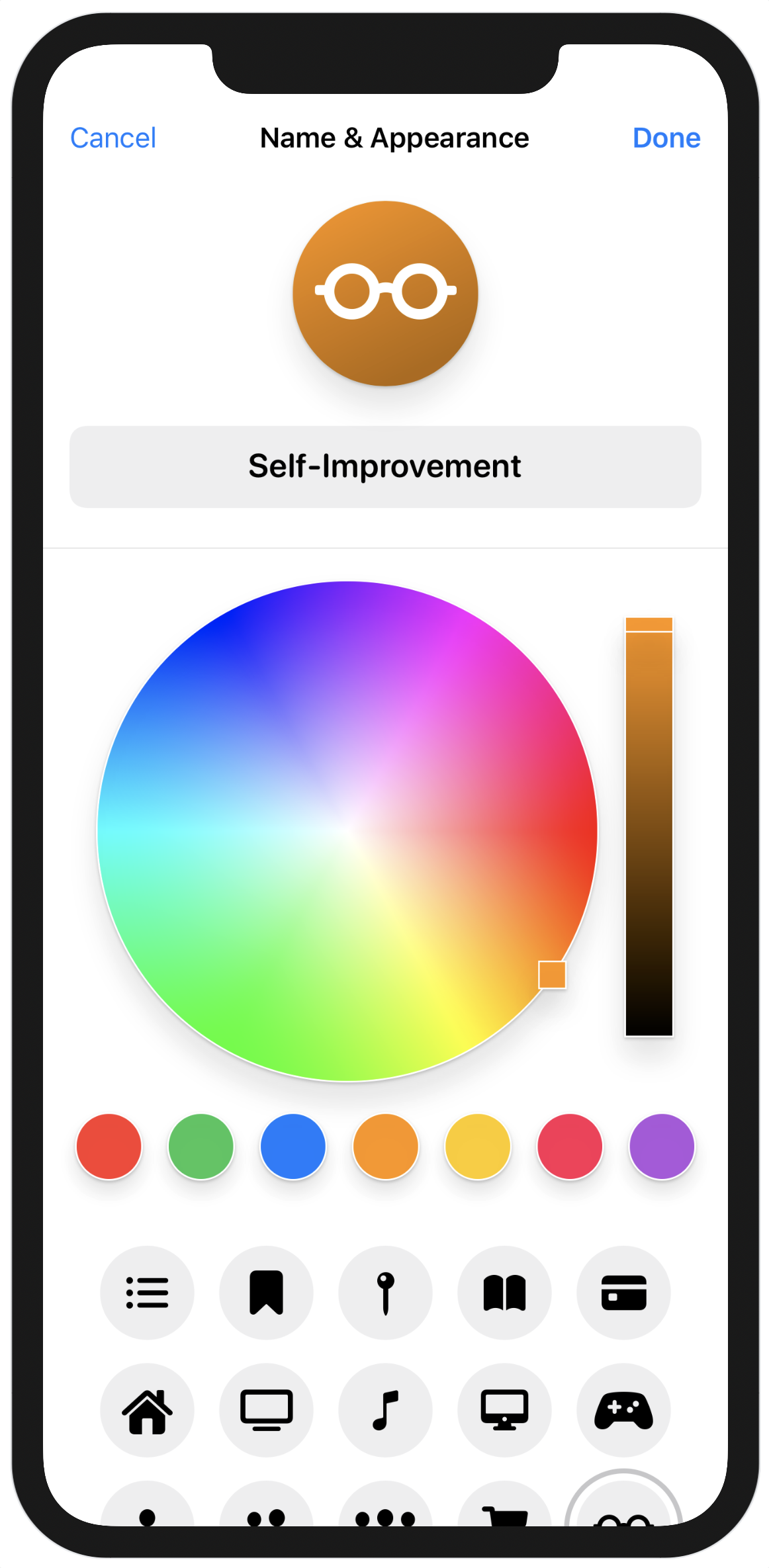
Your list editor will be modeled on the one used by Apple’s Reminders application; look at the editor there to see the general layout. Yours will differ slightly, adding a top row containing done/cancel buttons, and providing a fully-featured HSB color picker as opposed to Reminders’ small selection. Creating the color picker and icon chooser is your chance to look at some reasonably complex elements of the SwiftUI toolkit and will be extremely useful in the future.
The layout for your editor is going to be something like the following:
At the top of the editor itself are the action buttons used to commit or discard your changes. Below that, the icon is shown in a large circle colored with the list’s chosen color, and below that, a text field with a gray background and rounded corners. These elements are all static within the editor.
Below the static icon and title is a ScrollView, which will contain two custom views you’ll create. The first is a ColorPicker, which will let the user pick from a list of predefined colors or choose their own color from a ColorWheel view, which you’ll also create. Below the color selector will be an IconChooser that will display a static list of icons with a circle highlighting the current selection. In both cases, the user will interact with a view, and you’ll need to take the location of their interaction to modify another view. For the icons, when the user selects an icon, you’ll need to move the circle to surround that button alone. In the color picker, you’ll change the bound color value as the user drags their finger around the well, and will display a large loupe view next to their finger as it moves around. Since SwiftUI uses immutable opaque value types for everything, the means of obtaining and using coordinates is somewhat novel but still flexible. You’ll meet the Anchor, GeometryReader, and GeometryProxy types as you assemble this view, and learn to use SwiftUI’s preferences system to pass location data around between your views.
Let’s start with the color picker.
The most common interface for a color picker on Apple platforms is the HSB wheel. This uses a circular area where all colors are laid out around the circumference, and their saturation decreases closer to the center. Alongside this would be a slider controlling the brightness of the resulting color. These will both make use of some custom touch handling and some coordinate inspection, which aren’t as straightforward in SwiftUI as in an iterative framework.
Your color picker will have several components, as shown in the diagram above:
- A color wheel displaying hue and saturation.
- A bar displaying the brightness of the selected color.
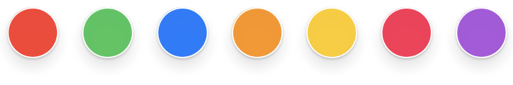
- Several buttons used to select from a list of predefined colors.
- An optional element to display the selected color (since this is a component).
The intent is that the user can tap on one of the buttons to select that color, or they can drag around in the color wheel and the brightness slider to select a color of their own choice. The color wheel will need some means of indicating the location of the user’s chosen color, as will the brightness bar. Additionally, while the user is dragging on the color wheel, it should display a larger loupe view following their finger, so they can clearly see which color they’re selecting.
One immediate issue occurs: given a SwiftUI Color, how does one determine what color it is?
Describing Colors
The Color type in SwiftUI is described as a “late-binding token.” This has a specific meaning: it doesn’t have a concrete value until some time later, usually when it’s about to be used. Several things may cause it to change when it comes time to render it, for example, the color space used by a particular view hierarchy, hue rotations, inversions, and of course, the various accessibility options such as high contrast mode. By using late-binding on all its colors, SwiftUI ensures that these options are supported by all applications—you literally cannot give SwiftUI a color that will ignore these settings. However, this means that the Color type is opaque to those of us outside the library, and we can’t get any useful information out of it. So, how to solve this issue?
A partial solution already exists: TodoItemList.Color. This enumerated type contains several predefined color values and one that contains separate hue, saturation, and brightness values to represent any other colors. The color picker you’re designing needs three things from a color type:
- A means of reading and writing HSB values.
- A list of predefined color values to display as buttons.
- A SwiftUI
Colorvalue to use in the interface.
These requirements are all easily defined using a protocol, and one has been provided for you in Affordances/HSBWheelHelpers.swift:
// file: "Affordances/HSBWheelHelpers.swift"
protocol ColorInfo: Identifiable {
    static var predefined: [Self] { get }
    var hsb: (Double, Double, Double) { get set }
    var uiColor: SwiftUI.Color { get }
    var localizedName: LocalizedStringKey { get }
}
Alongside the ColorInfo type are some helper routines to fetch a color’s individual hue, saturation, and brightness values, and an extension for TodoItemList.Color conforming it to the new protocol. Have a look through that implementation to see how it’s able to obtain and assign HSB values for all its predefined colors (hint: it uses UIKit’s UIColor to do the heavy lifting).
Now you’re ready to start working on the picker view itself. This view will be generic, using as its associated value any type that conforms to ColorInfo:
// file: "AccessoryViews/ColorPicker.swift"
struct ColorPicker<Value: ColorInfo>: View {
    @Binding var selectedColor: Value

    var body: some View {
        // « ... »
    }
}
The picker has a lot of components to implement, but the simplest is the set of selector buttons for the different predefined colors. Let’s start the view out with that: first add the VStack that will separate the color wheel from the buttons, then use an HStack and a ForEach to iterate over the predefined colors, creating a new button for each:
// file: "AccessoryViews/ColorPicker.swift"
VStack(spacing: 16) {
    HStack {
        ForEach(Value.predefined) { color in
            Button(action: { self.selectedColor = color }) {
                color.uiColor
            }
        }
        .frame(maxHeight: 40)
    }
}
The buttons will automatically adjust their widths to fit within the screen, but they will eat as much height as they can get. You stop them eating too much room by limiting their height with the .frame(maxHeight:) modifier on line 8.
Their current appearance leaves a little to be desired. The code you’ve written perfectly and concisely encapsulates their intent, though, so while you can chain on a number of modifiers to change their appearance, that would start to clutter up this clear section of the view. In addition, it would be nice to have a consistent look and feel for all of the components of the color picker, but you want to avoid duplicating code everywhere. SwiftUI provides some tools that help with this aim—one you’ve already met, ButtonStyle, but there’s another more broadly-applicable tool you can use here: ViewModifier.
Creating View Modifiers
Let’s say you want to have a drop shadow effect for the items in the color picker to give them the appearance of lifting off the page a little, which will also be useful for the loupe view in the color wheel. You can use the existing .shadow(radius:) modifier to get a gray fading ring around your view, but for a real 3D appearance, you’ll need to adjust the offset of the shadow. For an even better look, a common trick is to use not one but two drop shadows: one darker, narrower, and close to the original object, and another lighter, further out and softer. This is entirely possible, though it means two calls to the largest of the shadow modifiers, .shadow(color:radius:x:y:). That’s a lot of duplicated code, making it an ideal candidate for your first custom ViewModifier.
Create a new SwiftUI View file inside the AccessoryViews group and name it ViewModifiers.swift. Remove the ViewModifiers structure completely, and replace it with the following:
// file: "AccessoryViews/ViewModifiers.swift"
struct DoubleShadow: ViewModifier {
    var radius: CGFloat = 10.0
    func body(content: Content) -> some View {
        content
            .shadow(color: Color.black.opacity(0.1),
                    radius: radius, x: 0, y: radius * 1.2)
            .shadow(color: Color.black.opacity(0.2),
                    radius: max(radius/10, 1), x: 0, y: 1)
    }
}
As you can see, a ViewModifier doesn’t define a body property like a View would. Instead, it defines a function that is passed some kind of view, and to which it applies various other modifiers. In this case, you’re taking the input view and applying two different shadows; a wider, softer shadow on line 5, and a narrower, darker shadow on line 7.
The modifier itself is designed to be tunable to a certain degree. On line 2 is a radius property with a default value, and this radius is used not only as the basis for the shadow’s radius but also for its y-offset, allowing for a wider and softer or narrower and firmer shadow.
To see it in action, let’s add a few previews. Inside the previews property of ViewModifiers_Previews, create a Group containing three Circle instances. Give each one a frame of 300 by 300 and a white foreground color, then apply the DoubleShadow modifier to each using the .modifier(_:) method. For the first, use DoubleShadow() unchanged, and for the next two use custom radii of 20 and 6 respectively. Lastly, set the preview layout for the Group to use a fixed area of 350 by 350, to leave some room for the shadow. Your resulting code should look something like this:
// file: "AccessoryViews/ViewModifiers.swift"
Group {
    Circle()
        .frame(width: 300, height: 300)
        .foregroundColor(.white)
        .modifier(DoubleShadow())

    Circle()
        .frame(width: 300, height: 300)
        .foregroundColor(.white)
        .modifier(DoubleShadow(radius: 20))

    Circle()
        .frame(width: 300, height: 300)
        .foregroundColor(.white)
        .modifier(DoubleShadow(radius: 6))
}
.previewLayout(.fixed(width: 350, height: 350))
Resume the preview in the canvas and look at each in turn to see the modifier’s effect. Try commenting out then restoring the second (narrow) shadow inside DoubleShadow.body(content:) to see what a difference it makes.
Custom Button Styling
You’ve created a nice shadow effect for your buttons to use, but they’re still a bit basic—just colored squares. It’d be better if you could create a standard appearance for these buttons and even a special interaction. The custom shadow lends itself to an inset effect on press, for example. You’ll return to the ButtonStyle type to implement this, making a reusable component that can be applied to all buttons in an entire view hierarchy.
Return to ColorPicker.swift. Previously you’ve used a PrimitiveButtonStyle to take over handling of a button’s gesture, but here you don’t need to change the gesture itself, you only want to style the content. ButtonStyle enables that, giving you access to the label content and a simple isPressed property on which to operate. Aside from the shadow and its changing radius, the appearance will be straightforward: a circular clip shape and an overlay drawing a stroked circle border in white. Add this to ColorPicker.swift above the ColorPicker implementation:
// file: "AccessoryViews/ColorPicker.swift"
fileprivate struct ColorButtonStyle: ButtonStyle {
    func makeBody(configuration: Configuration) -> some View {
        configuration.label
            .clipShape(Circle())
            .overlay(Circle().stroke().foregroundColor(.white))
            .modifier(DoubleShadow(radius: configuration.isPressed ? 1 : 6))
    }
}
You can now apply this style to all of the buttons in the picker at once by attaching a .buttonStyle() modifier to the HStack containing the buttons:
HStack {
    « ... »
}
.buttonStyle(ColorButtonStyle())
The small shadow animation is currently the only effect these buttons would appear to have since there’s no component displaying the selected color. Let’s fix that.
Add a new boolean property to ColorPicker named showSelectionBar, with a default value of false. Then, within the VStack and below the HStack containing the buttons you just created, add a simple Rectangle in the selected color with a white border, double shadow, and some padding. Fix its maximum width and height to 200 and 60 points respectively:
// file: "AccessoryViews/ColorPicker.swift"
var showSelectionBar: Bool = false

var body: some View {
    VStack(spacing: 16) {
        // « ... »

        if showSelectionBar {
            Rectangle()
                .foregroundColor(selectedColor.uiColor)
                .overlay(Rectangle().stroke().foregroundColor(.white))
                .modifier(DoubleShadow(radius: 6))
                .padding()
                .frame(maxWidth: 200, maxHeight: 60)
        }
    }
}
Now you can create a preview and try it out. As before, use a StatefulPreviewWrapper to get a mutable binding to pass into the ColorPicker initializer:
// file: "AccessoryViews/ColorPicker.swift"
StatefulPreviewWrapper(TodoItemList.Color.blue) {
    ColorPicker(selectedColor: $0, showSelectionBar: true)
}
Launch a live preview in the canvas and tap on each of the buttons. Observe the animation of their shadows as they’re tapped and the effect that has, and note how the content of the selection bar changes as you tap on different buttons.
Next comes the most interesting part: the color wheel, which will require the use of some new tools.
Working with Anchors
The color wheel is going to be your first entirely custom interactive control. To assemble it, you’ll need to handle and track touch input, obtain coordinates based on that input, and feed those coordinates to other views, enabling them to move around. The way SwiftUI does this with its immutable value types is by necessity quite different from the inspect-and-modify approach used elsewhere, so it’s an important technique to master.
Let’s think about how the color wheel needs to function. In both of its subviews, it should:
- Track the user’s input from touch-down to touch-up.
- Directly modify the bound color value as the user’s finger moves.
- Display a small yet clear indicator of the currently selected value within the wheel and bar.
Additionally, for the hue/saturation wheel, there is another requirement:
- Display a larger ‘loupe’ view while the user drags their finger over the different values, changing color to indicate the current value for the user’s finger location.
In all of these cases, this relies on being able to convert between HSB values and coordinate locations in two separate views. To get a color, you’ll need some way of determining the location of a user’s touch, and to indicate the current color, you need to be able to place the indicator at a particular location.
The use of hue, saturation, and brightness allows for some relatively simple trigonometry to convert between color components and screen coordinates. The hue and saturation are contained in the wheel; hue is represented by the angle from the horizontal plane, while saturation is the distance from the center. Brightness uses a third axis, so is represented separately:
Assigning each axis a value in the range of 0 to 1 (also called unit space) allows you to use normal trigonometric operations to convert from angle and distance into coordinates and back again. The routines in Affordances/Trigonometry.swift provide the necessary mathematical operations for that, but still, there’s a question of how to obtain a set of coordinates from the user’s input or how to place something on screen at a given location. Even further, how does one translate a location from one coordinate space to another?
SwiftUI’s answer to these questions is twofold. Firstly, the GeometryReader view provides its content with a GeometryProxy value which vends all sorts of coordinate information. By wrapping a view in a GeometryReader, that view is then able to set its width to exactly half the width of its parent or give itself a 20% offset above its parent’s central horizontal axis. For the purposes of the color wheel and brightness bar, the item’s size can be used to scale unit space coordinates to locations within the GeometryReader view’s bounds, in its local coordinates.
The GeometryProxy has several more tricks up its sleeve, however. It’s also the arbiter for any translation of coordinates and locations between different views and coordinate systems. The key to this is the Anchor type.
Anchor is an opaque type in SwiftUI that represents some type of coordinate or location value. This includes points, rectangles, sizes, and the like. SwiftUI can be asked to vend an anchor based on a given Anchor.Source type, for which there are numerous static methods and properties available based on the type of data represented. An Anchor<CGRect>.Source provides a .bounds property and a .rect(_:) method, for example, while CGPoint-based anchor sources include the various unit coordinates for the edges and corners of a view, along with explicit unit points and physical coordinates. These Source values are used to obtain anchors referencing the local coordinate space, and those anchors can then be given to any GeometryProxy to obtain the same value in the coordinate space of the associated GeometryReader view:
That’s almost everything you’ll need, except for one wrinkle: passing the Anchor value around your view hierarchy. For this, think back to the information on Preference values in Chapter 3. The PreferenceKey type exists for exactly the purpose you need here: carrying information from a subview up to its ancestors. In fact, SwiftUI’s tools for obtaining and working with anchors are tied directly into the preference system: you obtain an anchor using the .anchorPreference(key:value:transform:) view modifier. This modifier takes a reference to a PreferenceKey type, an Anchor.Source, and a block used to transform the requested anchor into the value type associated with the preference key.
On top of that, there are several view modifiers that work directly with preference values to generate other views: .backgroundPreferenceValue(_:transform:) will use the current value of a preference to generate a background view, while .overlayPreferenceValue(_:transform:) will let you create an overlay view in the same way. An overlay preference is, in fact, exactly what you need to create the loupe view and have it track the user’s finger as it moves.
You now have all of the pieces of the puzzle laid out. All that remains is to assemble them.
Creating and Using Gradients
The two core views of the color picker together use all three types of gradient provided by SwiftUI: linear, angular, and radial. Each has a different appearance, and each has a different role to play in the view.
First, create a new SwiftUI View in the AccessoryViews group and name it ColorWheel.swift. The color wheel will be generic, using the same ColorInfo type defined in HSBWheelHelpers.swift. It will bind to a value and will maintain two items of state for its own use: a boolean used to keep track of whether the user is currently dragging around the loupe and the location of the loupe within this view. The body will start out with an HStack to contain the wheel and the brightness bar, with a little space between them. Inside that will live the GeometryReader that you’ll use to drive the wheel’s interaction model.
// file: "AccessoryViews/ColorWheel.swift"
struct ColorWheel<Value: ColorInfo>: View {
    @Binding var color: Value

    @State private var dragging = false
    @State private var loupeLocation: CGPoint = .zero

    var body: some View {
        HStack(spacing: 16) {
            GeometryReader { proxy in
                // « ... »
            }
        }
    }
}
The wheel itself consists of two different gradients layered on top of one another. The hue is represented by an angular gradient, which will change colors based on the angle. The saturation will be implemented by a semitransparent radial gradient fading from white to clear the further it gets from the center of the view. Both will need to read the current brightness value from the bound color to obtain the correct appearance.
In both cases, the underlying gradient is defined using the Gradient type, which encapsulates the various colors that make up the gradient along with their positions in unit space (i.e., between 0 and 1). This Gradient is then used to initialize an AngularGradient or RadialGradient, which will handle the details of mapping the colors into place within a view. The approach will be similar for the brightness bar, which will use a LinearGradient to map the changes across a single axis.
Start by adding a private property to ColorWheel implementing the hue gradient:
// file: "AccessoryViews/ColorWheel.swift"
private var wheelGradient: AngularGradient {
    let (_, _, b) = color.hsb
    let stops: [Gradient.Stop] = stride(from: 0.0, through: 1.0, by: 0.01).map {
        Gradient.Stop(color: Color(hue: $0, saturation: 1, brightness: b),
                      location: CGFloat($0))
    }
    let gradient = Gradient(stops: stops)
    return AngularGradient(gradient: gradient, center: .center,
                           angle: .degrees(360))
}
Here, you’ve assigned hue values between 0 and 1 to gradient stops in the same range, using the stride(from:through:by:) method to generate 100 separate stops. At each stop, the hue is set to the stop location, the saturation is always 1, and for the brightness, you use the value from the currently selected color, i.e., the value from the brightness bar. The AngularGradient then uses that and rotates it 360° around the center of its enclosing view. The high number of gradient stops is an important requirement because the display itself uses RGB values. Each HSB value supplied to the gradient is going to be converted to RGB, then each component of the resulting RGB value will be interpolated to generate the intermediate colors of the gradient. This means that you’ll see more errors appear in the wheel as the number of stops is reduced.
For saturation, the RadialGradient similarly uses a defined center point but requires a specific radius over which to change its value. You’ll thus need to define a function to which you’ll pass the required radius. The underlying Gradient, in this case, uses the current selection’s brightness as before, but has a static hue and saturation of zero (zero saturation is white), and fades that color’s opacity to zero over its range:
// file: "AccessoryViews/ColorWheel.swift"
private func fadeGradient(radius: CGFloat) -> RadialGradient {
    let (_, _, b) = color.hsb
    let fadeColor = Color(hue: 0, saturation: 0, brightness: b)
    let gradient = Gradient(colors: [fadeColor, fadeColor.opacity(0)])
    return RadialGradient(gradient: gradient, center: .center,
                          startRadius: 0, endRadius: radius)
}
With these done, you can create the wheel itself. Since you’ll place an indicator on top of this view to highlight the currently selected color, place it in a ZStack within the existing GeometryReader. Then clip it into a circle shape and draw a white outline:
// file: "AccessoryViews/ColorWheel.swift"
ZStack {
    self.wheelGradient
        .overlay(self.fadeGradient(radius: proxy.size.width/2))
        .clipShape(Circle())
        .overlay(Circle().stroke(Color.white))
}
You’ll also need to fix the aspect ratio of the GeometryReader you’re using to contain the wheel so that the coordinate space being used for the gradients and the later interactions all fit into the square region bounding the circle. Along with that, you’ll add the double-shadow effect to the wheel as well. Inside the body implementation, attach the following to the end of the GeometryReader:
// file: "AccessoryViews/ColorWheel.swift"
GeometryReader { proxy in
    // « ... »
}
.aspectRatio(contentMode: .fit)
.modifier(DoubleShadow())
Without this, the GeometryReader will take all the vertical space it’s offered, and the gradient will look rather strange.
To see what you’ve created so far, add the following implementation to ColorWheel_Previews.previews and refresh the canvas:
// file: "AccessoryViews/ColorWheel.swift"
StatefulPreviewWrapper(TodoItemList.Color.purple) { binding in
    VStack {
        ColorWheel(color: binding)
    }
}
Try commenting out the .aspectRatio(contentMode:) modifier you added to the GeometryReader—what happens to the gradients? Now revisit the wheelGradient property and adjust the value of the by: parameter to the stride() function, and see how the gradient changes as the number of color stops is reduced.
Location Calculations
The next step is to look at the current color and determine where on the color wheel that color is located. For this purpose, let’s use a simple 16×16 rectangle, filled with the selected color and given a white outline. Adding that to the ZStack directly will place it at the center of the wheel; to move it into the correct location, you’ll use the .offset(_:) view modifier, passing in the offset calculated using the view’s size. The size itself is available directly from the GeometryProxy; add this to the body implementation, just after the wheelGradient view:
// file: "AccessoryViews/ColorWheel.swift"
if !self.dragging {
    Rectangle()
        .fill(self.color.uiColor)
        .overlay(Rectangle().stroke(Color.white, lineWidth: 1))
        .frame(width: 16, height: 16)
        .offset(HSB.unitOffset(for: self.color, within: proxy.size))
}
Note that this is only going to be placed onscreen if the user isn’t dragging the loupe around to make a selection; when that happens, this small indicator will be replaced by the larger loupe view.
Try changing the color value passed into the StatefulPreviewWrapper view in your preview provider—the color wheel will update to highlight the new value. In some cases, you’ll see the brightness of the wheel change as well: green and purple both have a lower brightness value than the other predefined colors.
To make your wheel interactive, you’ll need some way of setting a color value based on some location within the wheel. With the size of the wheel obtained from your GeometryProxy, it’s quite straightforward to determine a unit location within those bounds and use that to update your color:
// file: "AccessoryViews/ColorWheel.swift"
private func assignColor(at location: CGPoint, in geometry: GeometryProxy) {
    let unitLocation = location.centeredUnit(within: geometry.size)
    HSB.updateColor(&color, at: unitLocation)
}
Responding to User Input
You can now generate colors from the coordinates of a user’s actions; it remains only to enable interaction. A DragGesture, the same you used for the buttons back in Chapter 2, will give you what you need. The Value type for a drag gesture provides all the required information and more, though you only need the location property in this case. Attach this call to the .gesture() modifier to the end of the ZStack declaration containing the color wheel’s gradient:
// file: "AccessoryViews/ColorWheel.swift"
.gesture(
    DragGesture(minimumDistance: 0).onChanged {
        self.dragging = true
        self.loupeLocation = $0.location
            .boundedInCircle(radius: proxy.size.width/2)
        self.assignColor(at: self.loupeLocation, in: proxy)
    }
    .onEnded { _ in
        self.dragging = false
        self.assignColor(at: self.loupeLocation, in: proxy)
    }
)
Here, you’ve provided both .onChanged() and .onEnded() callbacks. You turn on the dragging property when the gesture’s value changes on line 3, then turn it off when the gesture ends (line 9). Along with any change to the gesture, you read the new location and assign it to your loupeLocation property; note, however, that the coordinate gets clipped to the bounds of the circle (line 5), so that even if the user’s finger leaves the area of the view, the location used to determine the color (and place the loupe) will remain within the wheel itself.
To see the effect in action in a live preview, you’ll need to add another view to your preview that displays the currently selected color. Add the following to ColorWheel_Previews.previews, immediately following the ColorWheel:
// file: "AccessoryViews/ColorWheel.swift"
RoundedRectangle(cornerRadius: 12)
    .fill(binding.wrappedValue.uiColor)
    .overlay(RoundedRectangle(cornerRadius: 12)
        .stroke(Color.white))
    .frame(width: 300, height: 60)
    .modifier(DoubleShadow())
    .padding(.top)
    .zIndex(-1)
Now launch a live preview in the canvas and click and drag around the color wheel; the new feedback view at the bottom of the preview should change color as you move the mouse cursor.
Passing Data with View Preferences
Reacting to user input by toggling a boolean or changing a data value is all very well, but an interactive UI should be, well, interactive. It should be possible to adjust and move your views around based on a user’s input. In this section, you’ll learn to use the facilities SwiftUI provides for passing around coordinates, translating them, and applying them to your views in real-time.
To create a loupe view that moves around following the user’s input, you’ll need to create a PreferenceKey to carry anchor information. The anchor will be created using the location of the user’s finger within the circle view, then resolved by the GeometryProxy to a coordinate within the GeometryReader view’s bounds.
The first step is to create a preference key. To conform to the PreferenceKey protocol, a type needs to define three things:
- A
Valuetype. - A default value, as a static property.
- A static function named
reduce(value:nextValue:), to combine multiple values from across the view tree.
The reduce() function provides the core part of the preference system in SwiftUI. While environment values are passed down the view tree to ever-larger numbers of descendants, preference resolve upwards toward a single ancestor. That means that differing values from two branches of the view hierarchy must be resolved somehow into a single value ready to be presented to a single ancestor.
As an example, consider an OptionSet type such as UIInterfaceOrientationMask from UIKit:
public struct UIInterfaceOrientationMask : OptionSet {
    public init(rawValue: UInt)
    public static var portrait: UIInterfaceOrientationMask { get }
    public static var landscapeLeft: UIInterfaceOrientationMask { get }
    public static var landscapeRight: UIInterfaceOrientationMask { get }
    public static var portraitUpsideDown: UIInterfaceOrientationMask { get }
    public static var landscape: UIInterfaceOrientationMask { get }
    public static var all: UIInterfaceOrientationMask { get }
    public static var allButUpsideDown: UIInterfaceOrientationMask { get }
}
There are several different values available, and these may be combined—for instance, .landscape is the same as [.landscapeLeft, .landscapeRight]. This type is ideal for resolution through the preference system. Suppose subviews were able to declare their orientation support as a preference. One descendant supports all resolutions, while another supports everything except .portraitUpsideDown. The reduce() function could be implemented to return the smallest supported set of values, like so:
public static func reduce(value: inout UIInterfaceOrientationMask,
                          nextValue: () -> UIInterfaceOrientationMask) {
    // use the most restrictive set from the stack
    value.formIntersection(nextValue())
}
This would cause the parent view to receive a value of .allButUpsideDown:
Now consider a new subview added further down the tree, which only supports portrait orientations. This value would be reduced along with its parent’s, causing a narrower set of allowed orientations to flow up the tree to the root view:
Tracking the Loupe
It’s time to create your preference key. Add the following to the top of ColorWheel.swift, above the ColorWheel definition:
// file: "AccessoryViews/ColorWheel.swift"
fileprivate struct LoupeLocationPreferenceKey: PreferenceKey {
    typealias Value = Anchor<CGPoint>?
    static var defaultValue: Anchor<CGPoint>? = nil

    static func reduce(
        value: inout Anchor<CGPoint>?,
        nextValue: () -> Anchor<CGPoint>?
    ) {
        if value == nil {
            value = nextValue()
        }
    }
}
On line 2 you’ve identified the associated value type as an Anchor<CGPoint>?—an optional anchor that resolves to a single coordinate location. The default value is nil, defined on line 3. The reduce() function is more interesting. Its two arguments are designed to be as economical as possible with memory. Instead of returning a new instance of some object of potentially large size, the current value is passed using the inout keyword, meaning it can be assigned or modified directly and in-place, avoiding costly allocations and copies. Similarly, the second argument is a block that will create/copy and return the incoming value only when requested. In the implementation you just wrote, you don’t access the nextValue block at all unless the current value is nil—as on line 9.
With the preference key designed, you now need to generate an anchor value to assign to it. SwiftUI provides the .anchorPreference(key:value:transform:) view modifier for this purpose. Its first argument takes the type of PreferenceKey being used. The second takes an Anchor.Source of some kind, to request a concrete Anchor instance. The last parameter is a block to which that anchor will be provided, and which should return the Value type of the associated PreferenceKey.
In your case, you want an anchor for a single point: the value of the loupeLocation property. The value type of your LoupePreferenceKey is already an Anchor, so you won’t need to do anything special in your transform block—just return the anchor as-is.
To create and assign the anchor, add the following to ColorStack.body immediately following the .gesture()() modifier:
// file: "AccessoryViews/ColorWheel.swift"
.anchorPreference(key: LoupeLocationPreferenceKey.self,
                  value: .point(self.loupeLocation),
                  transform: { $0 })
The loupe view will be added to the view hierarchy via the .overlayPreferenceValue(_:transform:), which can be attached to any ancestor of the ZStack to which you attached the .anchorPreference() modifier—even the same view. For the purposes of illustration, let’s attach it to the GeometryReader surrounding the wheel view, immediately following the aspect ratio and double shadow modifiers:
// file: "AccessoryViews/ColorWheel.swift"
.overlayPreferenceValue(LoupeLocationPreferenceKey.self) { anchor in
    GeometryReader { geometry in
        self.buildLoupe(geometry, anchor)
            .opacity(self.dragging ? 1 : 0)
    }
}
Here, you’ve specified the LoupeLocationPreferenceKey as the preference to use, you’ve provided a block that will transform the preference’s value—an Anchor<CGPoint>—into a View to be set as the overlay for the wheel. To obtain coordinates from the anchor, you use another GeometryReader view. You then pass the anchor and the provided GeometryProxy into a new method to create the loupe view itself, then use its opacity to display it only while the user is actively dragging their finger on the view.
The call to a separate buildLoupe() function is necessary here due to the nature of the ViewBuilder block passed to the GeometryReader initializer. To determine the correct offset for the loupe, you’ll need to calculate a couple of values. A view builder block, unfortunately, doesn’t allow for that—only statements that evaluate to View types, along with some basic if/else branches, are allowed. By moving that code to a separate function you regain the ability to use let statements.
The loupe view itself will be a circle 70 points in diameter, filled with the selected color, with a 1-point-wide white outline and a double shadow. It will be put into place using the .offset(x:y:) view modifier. Add this function to ColorWheel following the body implementation:
// file: "AccessoryViews/ColorWheel.swift"
private func buildLoupe(
    _ geometry: GeometryProxy,
    _ anchor: Anchor<CGPoint>?
) -> some View {
    let location = anchor != nil ? geometry[anchor!] : .zero
    let unitLocation = location.centeredUnit(within: geometry.size)

    return Circle()
        .fill(HSB.uiColor(at: unitLocation, basedOn: color))
        .overlay(Circle().stroke(Color.white, lineWidth: 1))
        .frame(width: 70, height: 70)
        .modifier(DoubleShadow())
        .offset(x: location.x - 35, y: location.y - 35)
}
Two locations are used here, both ultimately obtained through the anchor you’ve passed up through your LoupeLocationPreferenceKey. On line 5 you obtain the true screen coordinates for the anchor in the coordinate system of the overlay view. This is used on line 13 to move the loupe into the right location within its superview. The second location, defined on line 6 is in unit coordinates measured from the center of the wheel, and is used on line 9 to calculate the fill color for the loupe.
The hue/saturation wheel is now complete—fire up a live preview in the canvas and try it out. You’ll see the loupe appear and follow your gesture around the wheel, its color changing all the time to match the value beneath it. When you let go, the smaller indicator will reappear in the same location.
Adjusting Brightness
So far, you can select a color based on its hue and saturation values alone. To handle brightness, you need to add a new interactive view to the side of the color wheel, showing the various shades of brightness available for the current color, as shown in the original wireframe. The brightness bar will operate in a very similar manner to the color wheel. It will use a Gradient to fill an area with the chosen color at different levels of brightness, and it will use a small outlined Rectangle to indicate the currently-chosen brightness value. This will similarly use a ZStack to present the selection indicator on top of the gradient.
Your brightness bar is going to be used only along with the ColorWheel, so it can be defined as a fileprivate type within ColorWheel.swift. Add the following skeleton implementation to that file, just after the definition of LoupeLocationPreferenceKey:
// file: "AccessoryViews/ColorWheel.swift"
fileprivate struct BrightnessBar<Value: ColorInfo>: View {
    @Binding var color: Value

    var body: some View {
        GeometryReader { proxy in
            ZStack(alignment: .top) {
                // « ... »
            }
        }
    }
}
The color value from the color wheel is passed on to the bar as a binding, and on line 5 you have the GeometryReader you’ll use to interpret the location of the user’s drag gesture within the range of brightness values represented.
Let’s put the bar in the preview while you build it. First, give the bar some temporary content; add a color fill inside its body:
// file: "AccessoryViews/ColorWheel.swift"
var body: some View {
    GeometryReader { proxy in
        ZStack(alignment: .top) {
            Color.blue
        }
    }
}
Now, scroll down to the body implementation of your ColorWheel view and add a reference to the brightness bar following the GeometryReader there, at the end of the HStack content:
file: "AccessoryViews/ColorWheel.swift"
BrightnessBar(color: self.$color)
    .padding(.vertical, 30)
    .frame(maxWidth: 30)
    .modifier(DoubleShadow())
    .zIndex(-1)
Note here the .zIndex(-1) modifier on the last line; this causes the bar to be placed lower in the view order than the wheel and (crucially) the loupe. Try removing this line and dragging the loupe towards the brightness bar to see why that’s desirable!
Refresh the preview in the canvas. The bar is stretching to fill the entire height of the device’s screen, which isn’t ideal. Really you want it to be of a similar height as the color wheel—a little less, in fact, since the color wheel is the primary element of this view. The reason it’s growing is because its parent view, the HStack, is growing. There are a number of ways to prevent that, such as using a .frame() modifier on the stack view to set or limit its height. However, that seems a little overzealous—the wheel view shouldn’t limit its size, its parent view should be able to adjust its size appropriately. Instead, set an aspect ratio, limiting the height based on its width (and vice versa). A little testing found that an aspect ratio of 1.125 worked best; apply this modifier after the closing brace of the HStack view:
// file: "AccessoryViews/ColorWheel.swift"
var body: some View {
    HStack(spacing: 16) {
        // « ... »
    }
    .aspectRatio(1.125, contentMode: .fit)
}
That looks better. Now return to BrightnessBar to add some useful properties.
First, you’ll need a gradient for the current color, with its brightness ranging from 1 at the top to 0 at the bottom. This is straightforward to implement; read the hue and saturation from the the color property and create a Color instance for each end of your gradient:
// file: "AccessoryViews/ColorWheel.swift"
var gradient: Gradient {
    let (h, s, _) = color.hsb
    return Gradient(colors: [
        Color(hue: h, saturation: s, brightness: 1),
        Color(hue: h, saturation: s, brightness: 0)
    ])
}
Next, you’ll need to be able to translate between a brightness value and a coordinate on the bar’s y-axis. This is straightforward to implement using the brightness property on ColorInfo (see Affordances/HSBWheelHelpers.swift for the implementation):
// file: "AccessoryViews/ColorWheel.swift"
func selectionOffset(_ proxy: GeometryProxy) -> CGSize {
    CGSize(width: 0,
           height: CGFloat(1.0-color.brightness) * proxy.size.height - 5)
}
You now have everything you need to draw the bar and implement the drag gesture. Add a LinearGradient inside the body’s ZStack, and give it a white border with the .border() modifier:
// file: "AccessoryViews/ColorWheel.swift"
LinearGradient(gradient: self.gradient,
               startPoint: .top,
               endPoint: .bottom)
    .border(Color.white)
Below that, add the location indicator: use the current color and give it a border, fix its height, and set its offset based on the current color’s brightness value:
// file: "AccessoryViews/ColorWheel.swift"
self.color.uiColor
    .border(Color.white)
    .frame(height: 10)
    .offset(self.selectionOffset(proxy))
The final step is to add the DragGesture that will enable your users to adjust the brightness of their chosen color. No .onEnded() block is needed this time—just set the color selection as the drag’s location changes:
// file: "AccessoryViews/ColorWheel.swift"
ZStack(alignment: .top) {
    // « ... »
}
.gesture(DragGesture(minimumDistance: 0).onChanged {
    let value = 1.0 - Double($0.location.y / proxy.size.height)
    self.color.brightness = min(max(0.0, value), 1.0)
})
Fire up the live preview and try it out. As you make adjustments on both the wheel and the bar, every view’s content alters in real-time to reflect your changes.
Finalizing the Color Picker
Adding the wheel to the color picker is now a simple matter; open ColorPicker.swift and place it at the top of that view’s VStack like so:
// file: "AccessoryViews/ColorPicker.swift"
VStack(spacing: 16) {
    ColorWheel(color: $selectedColor)

    « ... »
}
Refresh the preview in your canvas and start a live preview running. The wheel works as before, this time updating the contents of the optional selection bar at the bottom of the view. Clicking the buttons for the predefined colors also immediately changes both that and the status of the color wheel and brightness bar. Note how the selection indicators in both move around as you switch between the predefined colors.
That’s the first major element of the list editor complete, with only one more to go: the icon chooser. That won’t be as long, I promise.
Building a Single-Choice Control
Radio buttons—a set of buttons of which only one may be selected at any time—is an interesting challenge in SwiftUI. While the Picker type is the usual way of implementing this concept on iOS, it doesn’t have any representations that are ideal for selecting between a list of purely-visual icons. Instead, you’ll create your own, using the same tools that you’ve used elsewhere in this chapter to quickly assemble a working radio-button group with a clear visual design.
Glance back at the list editor wireframe and look at the “icon chooser” section. It consists of several rows of circular items, each of which will represent a single icon. All of the icons are going to be members of the SF Symbols set provided by Apple, presented in five rows of five. The full list of icons you’ll support is defined in Resources/list-icons.json, and to display them, you need little more than a pair of ForEach views to iterate over the two-dimensional array.
Start by creating a new SwiftUI View in the AccessoryViews group, naming it IconChooser.swift. Give your new view a binding to a String property named selectedIcon, and implement its body using the aforementioned pair of ForEach views iterating over a global property named listIconChoices. Place the outermost ForEach within a VStack, and the innermost within an HStack, with a Button for each icon. The button should set the selectedIcon value when pressed, and its content should be an Image displaying that icon. Lastly, give both stacks a spacing of 14 points. The resulting code should look something like this:
// file: "AccessoryViews/IconChooser.swift"
struct IconChooser: View {
    @Binding var selectedIcon: String

    var body: some View {
        VStack(spacing: 14) {
            ForEach(listIconChoices, id: \.self) { rowData in
                HStack(spacing: 14) {
                    ForEach(rowData, id: \.self) { icon in
                        Button(action: { self.selectedIcon = icon }) {
                            Image(systemName: icon)
                        }
                    }
                }
            }
        }
    }
}
Now, set up the preview using a real binding in the same manner you’ve used before, start a live preview, and try it out:
// file: "AccessoryViews/IconChooser.swift"
StatefulPreviewWrapper("list.bullet") {
    IconChooser(selectedIcon: $0)
}
The buttons aren’t looking particularly special right now; they’re all just accent-colored icons bunched together in the center of the screen, each row a different size, dimming slightly when tapped. Let’s change that by creating a new ButtonStyle to apply to them all.
Inside the IconChooser structure, just above the body implementation, add a new private type named IconChoiceButtonStyle, and implement its makeBody(configuration:) method to give the icons a circular background, a large font, and a scale-up effect when they’re pressed:
// file="AccessoryViews/IconChooser.swift"
private struct IconChoiceButtonStyle: ButtonStyle {
    func makeBody(configuration: Configuration) -> some View {
        configuration.label
            .font(.system(size: 24, weight: .bold, design: .rounded))
            .padding(6)
            .frame(width: 30)
            .padding(14)
            .background(Color(UIColor.tertiarySystemFill))
            .clipShape(Circle())
            .scaleEffect(configuration.isPressed ? 1.2 : 1)
    }
}

var body: some View {
    VStack(spacing: 14) {
        // « ... »
    }
    .buttonStyle(IconChoiceButtonStyle())
}
The background color on line 8 is one that hasn’t been mentioned before. The UIColor type from UIKit makes available the same predefined colors as SwiftUI’s Color type, but UIColor also vends a quite large number of semantic colors, named for the purpose they’re intended to fulfil. By using these values, you can obtain the standard system look and feel, and your application will change to match if these colors are redefined in future OS updates. The colors will also differ appropriately when used in dark mode vs. light mode, or when the user has selected a high-contrast color scheme. SwiftUI doesn’t export all of these as yet, but it’s possible to initialize a SwiftUI Color with a UIColor, so you don’t have to go without. Here, you’ve used the tertiary system fill; there are actually four fill colors defined, with each being a little lighter and less obtrusive than the last. The UIColor documentation describes their intended uses, and tertiarySystemFill is described as the color to use for “input fields, search bars, and buttons.” These are buttons, so that’s the color to use.
Try out the buttons in a live preview. They now stand apart from one another in a well-defined grid, and the bounds of each button are clearly delineated by their background. It would look nicer, though, if the currently-selected icon were highlighted in some fashion. Looking at the list editor from Apple’s Reminders application (which you’re emulating here), there’s a darker ring around the currently selected icon. Let’s do the same here.
At first, though, it seems as though this could be added directly to the Button itself, drawing an overlay or border if that button is selected. Doing so would likely adjust the size of each button, however, making it a little more involved to arrange them nicely. A better approach would be to display the highlight in an overlay or background layer for the entire view, moving the content to place it behind the selected icon. You’ve already seen the tools for implementing this; yes, this is a job for Anchor and PreferenceKey once more.
Dealing with Multiple Preference Values
Preference values in SwiftUI are designed for collection and reduction, combining multiple inputs into a single output. This icon chooser makes use of this facility by having every button add its information to a single array, with that array being used to obtain coordinates for a particular item to highlight it.
Each button will publish the anchor for its bounds, and then you’ll use that to adjust the background view’s location with the aid of a GeometryProxy. However, here you have 25 subviews publishing values into the preference system, so the “first non-nil value” reduction approach used for the color wheel won’t work here. Additionally, there needs to be some way to correlate the selected icon name with the location of one particular button. This means that the preference key type will need to be a little more involved.
The approach you’ll take is twofold: first, you’ll define a structure to serve as the preference key’s Value type. This will contain an anchor for the button’s bounding rectangle along with the icon name associated with that button. The preference key will then use an array of these types as its Value, and it will reduce values by merging together all the values into a single array. When it comes time to create the background using the final preference data, the array can be searched to locate the anchor associated with the selectedIcon property value.
First, create the value and preference key types inside the IconChooser type, above the definition of IconChoiceButtonStyle:
// file: "AccessoryViews/IconChooser.swift"
private struct IconSelectionInfo {
    let name: String
    let anchor: Anchor<CGRect>
}

private struct IconChoice: PreferenceKey {
    typealias Value = [IconSelectionInfo]
    static var defaultValue: Value = []

    static func reduce(value: inout [IconSelectionInfo],
                       nextValue: () -> [IconSelectionInfo]) {
        value.append(contentsOf: nextValue())
    }
}
Each button can now publish its anchor by using the .anchorPreference(key:value:transform:) view modifier:
// file: "AccessoryViews/IconChooser.swift"
Button(action: { self.selectedIcon = icon }) {
    Image(systemName: icon)
}
.anchorPreference(key: IconChoice.self, value: .bounds) {
    [IconSelectionInfo(name: icon, anchor: $0)]
}
The value of .bounds is an anchor source that is used to request an anchor describing the bounding rectangle of the view to which it’s attached. Use it to create a circle view as the background of the outermost VStack using .backgroundPreferenceValue(_:transform:):
// file: "AccessoryViews/IconChooser.swift"
var body: some View {
    VStack(spacing: 14) {
        // « ... »
    }
    .buttonStyle(IconChoiceButtonStyle())
    .backgroundPreferenceValue(IconChoice.self) { values in
        GeometryReader { proxy in
            self.selectionCircle(for: values, in: proxy)
        }
    }
}
The calculations for laying out the selection circle require variables, as the color wheel’s loupe view did earlier. The circle itself is again set up in a separate function.:
// file: "AccessoryViews/IconChooser.swift"
private func selectionCircle(
    for prefs: [IconSelectionInfo],
    in proxy: GeometryProxy
) -> some View {
    let p = prefs.first { $0.name == selectedIcon }
    let bounds = p != nil ? proxy[p!.anchor] : .zero

    return Circle()
        .stroke(lineWidth: 3)
        .foregroundColor(Color(UIColor.separator))
        .frame(width: bounds.size.width + 12,
               height: bounds.size.height + 12)
        .fixedSize()
        .offset(x: bounds.minX - 6, y: bounds.minY - 6)
}
On line 5 you search through the array of preference values to locate the one associated with the chosen icon. With that you’re able to pass it into the GeometryProxy to obtain a CGRect with local coordinates matching that item’s anchor. The resulting view is a circle with a frame set on lines 11–12 to extend an extra six points outside the bounds of the button it surrounds on all sides. The .fixedSize() view modifier provides a hint to SwiftUI’s layout engine that this view’s size should be considered absolute. The offset from the anchor’s bounding rectangle is used to position the circle within the view. Note the presence of another semantic color definition on line 10; this time, you’re using the color defined for separators and thin lines, which seems appropriate in this case. Like the fill for the buttons, this is a semitransparent color that will work on top of most backgrounds.
Run the live preview again, and you’ll see the final effect as the selection circle jumps around when you select each button. Its size matches the scale effect on the buttons so that it lines up with the increased size of the button as it moves; I think that’s a nice effect, no?
Composing the Final Interface
It’s been a long journey, but the end is in sight: now it’s time to assemble all of these components into a single cohesive whole—the list editor.
Start by creating a new SwiftUI View, and name it TodoListEditor.swift. Give the new view the two properties it will need to do its job: the TodoList to operate on, and the DataCenter used to save the changes:
// file: "TodoListEditor.swift"
@EnvironmentObject var data: DataCenter
@State var list: TodoItemList
The list’s structure, as outlined in the original wireframe, consists of five components:
- A titlebar with cancel/done buttons to either side.
- A large display of the list’s selected icon.
- A text field to edit the list’s name.
- The color picker you created earlier.
- The icon chooser.
The last two components are placed inside a scroll view since otherwise, the entire UI wouldn’t fit on the screen; the top three items will stay in place while the color picker and icon chooser scroll beneath. If you think this looks like a job for a VStack, you’d be right. Start by laying out the structure of the view’s body:
// file: "TodoListEditor.swift"
var body: some View {
    VStack {
        // « Top bar: cancel, title, done »

        // « List icon »

        // « Text field »

        VStack(spacing: 0) {
            Divider()
            ScrollView {
                // « Color picker »
                // « Icon chooser »
            }
        }
    }
}
Let’s start at the top and work downwards.
Top Bar Layout
You’ve seen this particular item before when designing the todo item editor in Chapter 3. This bar is a simple HStack containing a title and two buttons, separated by spacers:
// file: "TodoListEditor.swift"
HStack(alignment: .firstTextBaseline) {\
    Button("Cancel") {
        // « dismiss sheet »
    }
    Spacer()
    Text("Name & Appearance")
        .bold()
    Spacer()
    Button(action: {
        // « save data, dismiss sheet »
    }) {
        Text("Done")
            .bold()
    }
}
.padding()
These buttons need to be able to do two things: the “Done” button has to save the data to the store in the DataCenter, and both buttons need to dismiss the editor sheet. Saving the data consists of locating the matching list within the DataCenter and setting it to the value of the modified list property from the editor. That’s also something you’ve done before, and it’s a straightforward matter to create a private function in TodoListEditor to implement it:
// file: "TodoListEditor.swift"
private func saveData() {
    if let idx = data.todoLists.firstIndex(where: { $0.id == list.id }) {
        data.todoLists[idx] = list
    }
}
When showing the TodoItemEditor (see ‘Presentation’ in Chapter 3) you implemented the cancel/done buttons as part of the presenting TodoItemDetail view, so the buttons simply toggled the same property used to present the sheet. Here you’re implementing everything from the context of the presented view, so you can’t take that route. You could use a binding to some showEditor to enable the same approach, but SwiftUI already has your back, in the form of the PresentationMode type.
PresentationMode is a simple struct type that SwiftUI places into the environment. It provides two things:
- A boolean property,
isPresented, which indicates whether the current view or one of its ancestors was presented in some reversible manner. - A function,
dismiss(), which will dismiss the topmost presented view if there is one. IfisPresentedisfalse, then thedismiss()function has no effect.
This presentation mode is wired up by SwiftUI both when a sheet is presented via the .sheet() and when a new view is pushed onto a navigation stack through a NavigationLink, and is able to dismiss both types of view. To access it, you use an @Environment attribute to fetch the presentationMode property from the environment:
// file: "TodoListEditor.swift"
@Environment(\.presentationMode) var presentation
The value of that property is a Binding<PresentationMode>, so you’ll access its contents via the binding’s wrappedValue property, as described in xxx.
This is the last piece you’ll need to implement your buttons’ actions. The “Cancel” button will call dismiss() to close the editor; the “Done” button will save the changes before doing the same:
// file: "TodoListEditor.swift"
Button("Cancel") {
    self.presentation.wrappedValue.dismiss()
}
Spacer()
Text("Name & Appearance")
    .bold()
Spacer()
Button(action: {
    self.saveData()
    self.presentation.wrappedValue.dismiss()
}) {
    Text("Done")
        .bold()
}
Large Scale Iconography
Next up is the list icon. Since it’s going to be quite large, let’s add a subtle gradient to the background color to give it a little texture, so it won’t seem as flat. You’ll darken the list’s color a little by reducing its brightness to about 70% of its current value, then fade from the original color to the darker variant across the bounds of the icon’s background. To make it a little more organic, the gradient will happen at a slight angle, running from the top-left unit point to the bottom-center. Lastly, the familiar double-shadow effect will help lift it from the background.
First, add a new property to TodoListEditor to return a LinearGradient:
// file: "TodoListEditor.swift"
var iconGradient: LinearGradient {
    var (h, s, b) = list.color.hsb
    b *= 0.7

    return LinearGradient(
        gradient: Gradient(colors: [
            list.color.uiColor,
            Color(hue: h, saturation: s, brightness: b)
        ]),
        startPoint: .topLeading,
        endPoint: .bottom)
}
With the gradient defined, you can display the icon using a regular Image view. Increase the icon’s size using a .font() modifier to specify a 56-point size and to draw the icon in a bold, rounded format. Locking a 1:1 aspect ratio, a little padding, and an explicit size round out the appearance you’re looking for:
// file: "TodoListEditor.swift"
Image(systemName: list.icon)
    .font(.system(size: 56, weight: .bold, design: .rounded))
    .aspectRatio(contentMode: .fit)
    .padding(36)
    .foregroundColor(.white)
    .frame(width: 112, height: 112)
    .background(iconGradient)
    .clipShape(Circle())
    .modifier(DoubleShadow())
Custom Text Field Appearance
Next comes the text field. By default, a TextField view appears as plain text on an empty background. It can alternatively be given a rounded border using a style modifier and the RoundedBorderTextFieldStyle type, but that doesn’t quite match the desired appearance. Sadly, though SwiftUI provides a TextFieldStyle protocol, its details are all internal, so you can’t take the same approach for the text field that you have used for buttons so far. This design seems like it might be more generally useful, though, so instead, let’s create a new ViewModifier to style the field.
Open AccessoryViews/ViewModifiers.swift and add the following definition below the DoubleShadow type.
// file: "AccessoryViews/ViewModifiers.swift"
struct BorderedTextField: ViewModifier {
    func body(content: Content) -> some View {
        content
            .multilineTextAlignment(.center)
            .padding(.vertical, 12)
            .background(
                RoundedRectangle(cornerRadius: 10, style: .continuous)
                    .foregroundColor(Color(UIColor.tertiarySystemFill))
            )
    }
}
This modifier applies a few different effects to its view. Firstly, any text it contains is centered within the view’s bounds using the .multilineTextAlignment(_:) modifier on line 4. This, like most other text-affecting modifiers, actually places its value into the environment, so its effect will cascade down the view stack.
The background applied to the view is the familiar RoundedRectangle, but on line 7 an additional argument, style, is being used to describe the type of rounding to perform on the corners. If not specified, corners are given a circular appearance—the curve of the corner is a quarter-circle. Here you’ve specified .continuous, which specifies the use of the same mathematical bezier curve corners used on icons and other types through iOS since version 7. When using rounded corners on larger views, the continuous arc will generally look better, but on smaller corners, the difference is less obvious, so use the default circular corners there.
Lastly, the fill color for the background set on line 8 is the same tertiarySystemFill you used in the icon chooser above.
Update ViewModifier_Previews to display a couple of different uses of this modifier:
// file: "AccessoryViews/ViewModifiers.swift"
static var _sampleText: String = "Sample Text"
static var sampleText: Binding<String> = Binding(
    get: { _sampleText }, set: { _sampleText = $0 })

static var previews: some View {
    Group {
        // « shadow previews »

        Text("Start Making Things")
            .padding(.horizontal)
            .modifier(BorderedTextField())

        TextField("Title", text: sampleText)
            .modifier(BorderedTextField())
    }
    .previewLayout(.fixed(width: 350, height: 350))
}
This code uses an alternate approach to providing a working Binding value for the text field—you can define a static variable on your preview provider to hold the value, then define a Binding property directly that accesses that variable. Refresh the preview in the canvas to see the effect on a regular Text view and a TextField; note that the text field uses all available width since its content isn’t fixed and may grow when edited.
Now, return to TodoListEditor.swift and add the name field, giving it a 20-point semibold, rounded font, with a little padding around the outside:
// file: "TodoListEditor.swift"
TextField("List Title", text: $list.name)
    .font(.system(size: 20, weight: .semibold, design: .rounded))
    .modifier(BorderedTextField())
    .padding()
Only one task remains to complete the list editor. Add the color picker and icon chooser views within the ScrollView, binding them to the list’s color and icon properties respectively. Note that the color picker will not turn on the optional selection view since the icon display at the top of the editor will serve that purpose nicely.
// file: "TodoListEditor.swift"
ScrollView {
    ColorPicker(selectedColor: $list.color)
        .padding()
    IconChooser(selectedIcon: $list.icon)
        .padding()
}
Finally, add a preview, not forgetting the DataCenter in the environment:
// file: "TodoListEditor.swift"
struct TodoListEditor_Previews: PreviewProvider {
    static var previews: some View {
        TodoListEditor(list: defaultTodoLists[3])
            .environmentObject(DataCenter())
            .padding(.top, 30)
    }
}
Refresh the canvas and launch a live preview. Try interacting with all the controls and observe the changes that occur, all in real-time, as you make the changes. Sit back and admire your handiwork—it’s been a long road, but you’ve made it.
Presenting the Editor
One final task remains. At present, there is nothing in the application that will display the editor you’ve just assembled. Let’s add an “Info” button to the navigation bar of the todo list view and have that present the editor in a sheet. Open TodoList.swift and make these changes:
// file: "TodoList.swift"
@State private var showingListEditor: Bool = false

private var barItems: some View {
    HStack(spacing: 14) {
        if self.list != nil {
            Button(action: { self.showingListEditor.toggle() }) {
                Image(systemName: "info.circle")
                    .imageScale(.large)
                    .font(.system(size: 24, weight: .bold))
            }
        }
        sortButton
    }
}

var body: some View {
    List(sortedItems) { item in
        // « ... »
    }
    // « ... »
    .navigationBarItems(trailing: barItems)
    // « ... »
    .sheet(isPresented: $showingListEditor) {
        TodoListEditor(list: self.list!)
            .environmentObject(self.data)
    }
}
This adds a property to control the display of the sheet and replaces the trailing items on the navigation bar with a new HStack containing the two buttons. It’s important to note, however, the check on line 5: you can’t show an editor for the “All Items” view.
Build and run your application and try everything out.
What you Learned
In this chapter, you’ve moved far beyond the basic UI tools of text and background colors and have learned to use the declarative, reactive tools provided by SwiftUI to create a complex and interactive interface.
- You added a good understanding of padding, backgrounds, and clipping shapes to your SwiftUI arsenal.
- You learned to look at your compositions with a critical eye for visual balance and attention to detail.
- You’ve seen how the use of some additional font properties can give your application a sense of identity.
- SwiftUI provides some simple tools that scale easily to implement much more complex systems, and you’ve seen how to use several of these in a few different ways.
The Xcode canvas is an incredibly useful tool for debugging layout issues. In the next chapter you’ll learn some tips & tricks for putting it to best use as you implement support for dynamic type, localization, and right-to-left layouts.