Chapter 7: SwiftUI on iPadOS
This text was prepared for publication in March 2020. As a result, a lot of the code and techniques in this book are out of date. It is provided as a historical curio, and does not provide accurate guidance on using SwiftUI today.
In 2019, at the same time SwiftUI was announced to the world, iOS was split in two. The iPad was growing more capable in each release, and the list of iPad-specific features was growing, as a result, the iPad operating system was officially renamed iPadOS. This signaled a distinct change to Apple’s approach to the device, and in early 2020 iPadOS 13.4 gained some functionality that would bring it closer in use to a laptop running macOS. Now your device could pair with and use wireless keyboards, mice, and trackpads—and the support for these would be absolutely first-class—neither an attempt to shoe-horn the macOS pointer onto a UI designed for fingers, nor a simple set of additional ways to do the same thing. Like the windowing and scene systems announced in 2019, the iPad re-thought the purpose of a pointing device and adapted it precisely to the system.
In this chapter you’ll take the application and see how to make use of iPad-specific features such as pointer support, multiple windows, drag and drop, and scene management. Some of these facilities have more support in SwiftUI than others, so you’ll see how to put together the components described in iterative APIs with those in the declarative format of SwiftUI.
A certain amount of the content of this chapter deals with system-level capabilities that fall outside the purview of SwiftUI itself. The starter project for this chapter implements a lot of the work for you, such as implementing NSItemProvider types, UNUserNotification integration, and support for undo and redo via NSUndoManager. Rather than dive into the details of these subjects, you’ll focus only on how to make use of them in SwiftUI code.
The code bundle contains a starter project for this chapter in 7-iPadOS/starter. The finished version is in 7-iPadOS/final.
Introducing iPadOS
First things first: select the project in the Project Navigator, then select the “Do It” target, and finally the General tab. Under “Deployment Info,” ensure that the target is set to “iOS 13.4,” and that “iPad” is selected. Now launch the application on an iPad or iPad simulator.
The first thing you’ll notice is that the NavigationView now shows its root view and its descendants side-by-side. At least, it does that in Landscape mode—in Portrait, you have a blank screen and a back button in the top left that reads “Lists.” Tapping that button makes the Home view slide in.
This isn’t an ideal first-launch experience for users of your application. It would be best to have the two columns always visible next to one another, but unfortunately SwiftUI doesn’t offer an easy way to do that at the moment (you’d have to use UIKit’s UISplitViewController and a UIViewControllerRepresentable to create one). Aside from that, however, the detail view being empty on launch isn’t good. Let’s fix that.
So far your NavigationView instance contains a single List view, which makes sense. However, this isn’t the only way to set up navigation: the view builder can actually accept two views to display, corresponding to a master/detail pair. The first view is a master list, while the second is the detail view that will appear to the right. The code in the Home view currently only specifies the master view, meaning the detail will initially be empty. To specify an initial state for the detail view, you can just add a TodoList instance following the initial List, and it will appear. Try adding TodoList(list: data.defaultItemList) at the end of the Home view’s NavigationView view builder and relaunch the application. No empty views, even in portrait mode.
It would be useful to make these kinds of changes only while running on iPad. In the case of NavigationView, this behavior is built in, but you might want to make your own adjustments depending on whether your app is running on iPad or iPhone. The standard way to determine this in a UIKit app is for a view to fetch its attached UITraitCollection and look at the userInterfaceIdiom property. This is an enum type which tells you if your app is running on an iPhone, and iPad, an AppleTV, or in CarPlay. SwiftUI doesn’t use UITraitCollection, though, so that option is unavailable. Instead, SwiftUI uses the environment to pass this type of information around.
In the starter project, open AccessoryViews/Environment.swift. You’ll see an enum type here named InterfaceIdiom which acts as a wrapper for the corresponding UIKit type, UIUserInterfaceIdiom. You’re going to initialize an instance of this type and write it to your root view’s environment, so that views further down the hierarchy can access it with an @Environment property.
To create a new environment value, you need to create a type conforming to the EnvironmentKey protocol. This protocol has two requirements:
- It must specify a
Valuetype. This is the type of property to be stored in the environment. - It must have a static property of that
Valuetype, nameddefaultValue. If an@Environmentproperty attempts to retrieve a value from the environment where no value has been set, this will be returned instead.
The values you’d use for this seem straightforward: the Value type will be InterfaceIdiom, and the default value will be .unspecified. Define this type just below the InterfaceIdiom definition:
// file: "AccessoryViews/Environment.swift"
struct InterfaceIdiomEnvironmentKey: EnvironmentKey {
    typealias Value = InterfaceIdiom
    static var defaultValue: InterfaceIdiom = .unspecified
}
The SwiftUI environment itself is made available as an instance of the EnvironmentValues type. All the key paths you’ve passed into @Environment() property wrappers have actually been key paths on an EnvironmentValues type; it contains a great many extensions, each one fetching and/or storing values into some internal storage. If you look at the type’s definition, you’ll see that aside from its initializer and description, it contains one other API, a subscript operator:
public struct EnvironmentValues: CustomStringConvertible {
    public init()
    public var description: String { get }

    public subscript<K>(key: K.Type) -> K.Value where K: EnvironmentKey
}
This subscript provides read and write access to the underlying storage as if it were a Dictionary. Each key is the type of some EnvironmentKey (i.e. SomeEnvironmentKey.self), while the corresponding value is an instance of the same environment key’s Value type. You have an environment key now, so creating your own property on EnvironmentValues is as simple as adding the following:
// file: "AccessoryViews/Environment.swift"
extension EnvironmentValues {
    var interfaceIdiom: InterfaceIdiom {
        get { self[InterfaceIdiomEnvironmentKey.self] }
        set { self[InterfaceIdiomEnvironmentKey.self] = newValue }
    }
}
This—a total of eight lines of code—is everything you need to do to provide your own environment values. Now you just need to set a value. Happily, UIWindowScene provides a traitCollection property that gives exactly what you need, so return to SceneDelegate.swift, navigate to the presentView() method, and make the following change to the definition of rootView:
// file: "SceneDelegate.swift"
let idiom = windowScene.traitCollection.userInterfaceIdiom
let rootView = view
    .environmentObject(sharedDataCenter)
    .environment(\.interfaceIdiom, InterfaceIdiom(idiom))
Now that the idiom is stored in the environment, let’s update the Home view to make use of it. Open Home.swift and add a new property to the Home type:
// file: "Home.swift"
@Environment(\.interfaceIdiom) private var interfaceIdiom
Now scroll down to the end of the body implementation, to where you added the TodoList earlier. Replace that with the following implementation, which will check whether the app is running on an iPad before assigning the view:
// file: "Home.swift"
NavigationView {
    List {
        // « ... »
    }
    .font(/* « ... » */)
    .listStyle(/* « ... » */)
    .navigationBarTitle(/* « ... » */)
    .navigationBarItems(/* « ... » */)

    if interfaceIdiom == .pad {
        TodoList(list: data.defaultItemList)
    }
}
You’ve now made your application launch experience much more pleasant for iPad users, and you now know how to pass information down the view hierarchy using custom environment values.
Popovers
If you tap on an “Add Item,” “Edit,” or “List Info” button now, you’ll see a large sheet appear from the bottom of the screen containing the appropriate editor view. It probably looks a little odd, though; it’s clearly been designed around an iPhone-like view width, and it now has almost double that. Some of the interface elements, for instance the color picker, are now growing to quite large proportions to fill the available space, and that isn’t ideal. On the iPad, this is solved through the use of popovers.
Popovers are small pop-up windows that appear to float above the main interface, and which typically are attached to the UI element that invoked them. They provide an easy way to show a small set of temporary components, and are perfect for showing the editor views that were designed for a narrower and smaller screen.
SwiftUI provides an API for displaying popovers that is very similar to the one used for displaying sheets. In fact, it’s so similar that on iPhone it will just display the same content in a sheet instead. Like sheets, there are two methods available on View, each taking a binding to some state variable that will be used to determine whether the popover should appear. Also like sheets, one method binds to a simple isPresented boolean value, while the other uses a binding to some optional value, displaying when the item is non-optional. Both methods have two additional (optional) parameters though, which are unique to popovers. For instance:
extension View {
    public func popover<Content>(
        isPresented: Binding<Bool>,
        attachmentAnchor: PopoverAttachmentAnchor = .rect(.bounds),
        arrowEdge: Edge = .top,
        @ViewBuilder content: @escaping () -> Content
    ) -> some View where Content: View
}
The two new parameters are attachmentAnchor and arrowEdge. As noted above, a popover is typically attached to some other piece of UI—typically the button that caused it to appear. The attachmentAnchor specifies the location at which the popover will attach to its parent. The default value uses an Anchor.Source<CGRect> to provide the bounding rectangle of the parent view (see Working with Anchors in Chapter 5 for more information on anchors). Alternatively a UnitPoint can be used to indicate some location within or beyond the view’s bounds, in unit-space coordinates.
The second new parameter tells the system which edge of the popover should be connected to its parent view. The default of .top specifies that the popover should appear below its parent on the screen, with its arrow pointing from its top to meet the location of the attachmentAnchor. For a button in a navigation bar, this is entirely appropriate. If your button were located at the bottom of the screen, however, you’d specify a value of .bottom instead, to show the popover above its parent. Likewise for popovers appearing close to the leading or trailing edges of the screen.
Since the popover() modifier falls back to displaying a regular sheet on iPhone, you can replace just about any use of .sheet() with a popover, safe in the knowledge that your code will work correctly everywhere. One important consideration, however, is where you’ll attach that modifier. When using sheets, any view would do, as the sheet would just cover the entire screen; for popovers, the required anchor will be interpreted in terms of the view where the modifier is attached. This means that to attach a popover to a button you’ll need to attach the modifier to that Button instance.
Let’s start with the item detail view. Open TodoItemDetail.swift and locate the body implementation. Find the .sheet() modifier and delete it, then locate the editorButton property. Add a .popover() modifier to this button:
// file: "TodoItemDetail.swift"
var editorButton: some View {
    Button(action: {
        // « ... show editor ... »
    }) {
        // « ... image ... »
    }
    .accessibility(label: Text("Edit"))
    .popover(isPresented: $showingEditor, content: {
        self.editor
            .frame(idealWidth: 500, idealHeight: 600)
    })
}
Note that the editor has been given an explicit ideal width and height. The popover will be sized to fit its contents, but the List, Form, and ScrollView types will all happily shrink down to nothing—and those are what you’re putting into the popover. Setting an ideal width and height here gives the system a hint as to the size it should allocate, while still allowing it to become larger or smaller under certain conditions. On the iPhone, for example, the width and height will grow to match the sheet’s bounds.
Launch the application on an iPad or the iPad Simulator, then navigate into a to-do item and tap the edit button in the top right. A popover should appear containing the familiar editor interface. Tapping either the “Cancel” button or anywhere outside of the popover will dismiss it without saving any changes.
Next, open TodoList.swift. In here you previously used an enum value to specify which of two editors should be displayed by a single .sheet() modifier. Now that you’re going to remove that and use two separate .popover() modifiers attached to two separate views, you no longer need that. Remove the EditorID type and the presentedEditor properties from the TodoList implementation, and replace them with two new boolean state properties:
// file: "TodoList.swift"
@State private var showItemEditor = false
@State private var showListEditor = false
Now find the body property and remove the .sheet() modifier. Now locate the addButton property and change it to use the new state to display a popover:
// file: "TodoList.swift"
private var addButton: some View {
    Button(action: {
        self.editingItem = Self.itemTemplate
        self.editingItem.listID = self.list?.id ?? self.data.defaultListID
        self.showItemEditor.toggle()
    }) {
        // « ... image ... »
    }
    .accessibility(label: Text("Add a new To-Do Item"))
    .popover(isPresented: $showItemEditor) {
        self.editorSheet
            .environmentObject(self.data)
            .frame(idealWidth: 500, idealHeight: 600)
    }
}
Next, in the editorSheet property, replace self.presentedEditor = nil in both button actions with self.showItemEditor = false. Lastly, in the barItems property definition, change the info button definition to show a popover:
// file: "TodoList.swift"
Button(action: { self.showListEditor.toggle() }) {
    // « ... image ... »
}
.popover(isPresented: $showListEditor) {
    TodoListEditor(list: self.list!)
        .environmentObject(self.data)
        .frame(idealWidth: 500, idealHeight: 600)
}
The last place to make changes is in Home.swift. Remove the sheet modifier from the body implementation there and replace it with a popover in the addButton property:
// file: "Home.swift"
private var addButton: some View {
    Button(action: { self.showingEditor.toggle() }) {
        // « ... »
    }
    .popover(isPresented: $showingEditor) {
        TodoListEditor(list: Self.listTemplate)
            .frame(minWidth: 500, minHeight: 600)
    }
}
Multiple Scenes
In iPadOS, applications can be launched in a number of different ways, and can share the screen with one another. You typically pair two applications on one screen in one of two ways:
- Launch both applications, then swipe up from the bottom of the screen to enter the Dashboard. Drag one application’s window on top of another to put them together on the same screen.
- While running one application, swipe up from the bottom of the screen a short way to reveal the Dock, then drag an application from the dock to the left or right of the screen.
In the first method, the two applications are always placed side-by-side in an adjustable split-screen mode. In the second, where you drop the new application makes a difference to how it opens: as you move to the right of the screen, for example, the icon will first expand to show an iPhone-sized window hovering over the top of the current application. Move a little closer to the screen edge and it will expand to fill that side of the screen, pushing the current application across into split-screen mode.
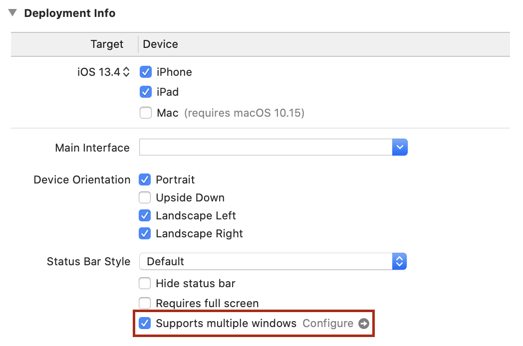
All of this works today—try it out and you’ll see. What you currently can’t do is open a second or third instance of “Do It” in this manner. To enable it, you’ll need to make a small adjustment to the application’s metadata. Open the project settings by selecting the project in the Project Navigator, then select the “Do It” application target in the project editor. In the Deployment Info section, select the checkbox next to “Supports multiple windows:”
With this single change, the application can be opened multiple times , allowing you to drag a second instance out of the Dock.
Each application instance on the screen is a scene. All scenes are part of the same running process, and share all data. Try opening two instances next to one another showing the same list, and then mark an item completed in one—the change will immediately be reflected in the other.
You’ll learn more you can do with scenes in Dragging New Scenes in the next chapter, but for now let’s move on to look at hardware accessories.
Keyboard Commands
The iPad has worked with external keyboards for some time now, whether connected using Bluetooth or integrated with a stand or cover. Along with the ability to type on physical keys, though, this brings the capability of typing key chords to achieve effects within your application, like ⌘Z to undo, ⌘⇧Z to redo, or ⌘F to search.
UIKit provides a handy API for implementing key commands, but SwiftUI on iOS does not (though it does on macOS, so presumably official support will be forthcoming soon). Instead, you’ll build a custom implementation that will serve until a first-party keyboard API for iOS arrives in a future version of SwiftUI.
Start by opening AccessoryViews/KeyCommands.swift. This file currently contains a single structure named KeyCommand, which is a SwiftUI-style wrapper for a UIKit UIKeyCommand instance. This is the type that you’ll be using to define your supported key commands, and which will be used to pass the information along to UIKit in a way that it understands. In UIKit, UIKeyCommand objects are used to define the semantics of a key command while providing an Objective-C method selector—think of it as a ‘function name’ that can be applied to any object. When matching key presses are detected, that method is sent to the responder chain. You don’t typically need to deal with responder chains when working with SwiftUI, but you can find a brief overview in A Little Responder Know-How.
On top of this you’ll build two components:
- A class named
CommandRegistrarwhich will manage the list of installed key commands and vendPublisherinstances that will deliver notifications when the user invokes a command. - A subclass of
UIHostingControllerto serve as the root view, which will vend a list ofUIKeyCommandinstances to the UIKit responder chain and provide an Objective-C method to serve as a target for all SwiftUI-based key commands.
Command Management
At the bottom of the file is a // MARK: - marker. Below that, create the CommandRegistrar class:
// file: "AccessoryViews/KeyCommands.swift"
fileprivate final class CommandRegistrar {
    typealias CommandPublisher = PassthroughSubject<KeyCommand,Never>
    var publisher = PassthroughSubject<KeyCommand,Never>()

    var commands: Set<KeyCommand> = []

    func install(command: KeyCommand) -> AnyPublisher<KeyCommand, Never> {
        // « ... »
    }

    func remove(command: KeyCommand) {
        commands.remove(command)
    }
}
This class is straightforward: it maintains a Set of KeyCommand instances along with a PassthroughSubject that publishes KeyCommand instances. When the user presses a key combination that triggers a command, that command will be sent to this publisher. With a little magic, the appropriate command will invoke a block provided by a view to respond to that command. The magic lives in the install(command:) method:
// file: "AccessoryViews/KeyCommands.swift"
func install(command: KeyCommand) -> AnyPublisher<KeyCommand, Never> {
    commands.insert(command)
    return publisher
        .filter { $0 == command }
        .eraseToAnyPublisher()
}
This is a small function, but it does a lot of work. When a KeyCommand is installed it’s added to the commands set, and then a new Publisher is returned that is specific to that command. This is accomplished by a filter() modifier to the class’s publisher property. This will create a new publisher that only publishes its input if it’s the same KeyCommand that was passed to install(). The result is then type-erased to an AnyPublisher instance and returned.
Receiving Events
Next you need to actually send something to the root publisher. For that, you’ll create a single CommandRegistrar instance, and you’ll build a subclass of UIHostingController that implements the action method used by the KeyCommand type. This will also implement the keyCommands property from UIResponder to return all the commands stored by the CommandRegistrar. The event system in UIKit uses types conforming to UIResponder to deliver common events, and the first responder is the starting point when it looks for event receivers, and is typically a view or a control.
This all takes very little code to implement, added just below CommandRegistrar:
// file: "AccessoryViews/KeyCommands.swift"
fileprivate let keyCommander = CommandRegistrar()

final class KeyCommandHostingController<Content: View>: UIHostingController<Content> {
    override var canBecomeFirstResponder: Bool { true }

    override var keyCommands: [UIKeyCommand]? {
        keyCommander.commands.map { $0.uikit }
    }

    override func swiftUIKeyCommand(_ sender: UIKeyCommand?) {
        guard let command = KeyCommand(sender) else { return }
        keyCommander.publisher.send(command)
    }
}
The first item inside KeyCommandHostingController is an override of the canBecomeFirstResponder property from UIResponder. The UIHostingController doesn’t implement this property, so this subclass is required in order to turn on that functionality.
A Little Responder Know-How
In UIKit, as in AppKit before it, the event system is based around the concept of responders, organized in a chain. In UIKit, this is represented by the
UIResponderclass, which defines the basic event handling semantics of the user interface, such as methods to handle touches, pressing, motion, and more. UIKit views and controls are all responders, as are components likeUIScene,UIApplication, and (typically) their delegates.The primary concept of the responder chain is that there is a single ‘active’ view, which is called the first responder. This will usually be the focused control or view. Any events that arrive are sent to that object first, but if they’re not handled, then the next responder is queried instead. Each
UIResponderidentifies the next responder in sequence. For example, aUIViewwill indicate either its view controller (if it has one) or its superview. In this way, the event is delivered to the highest-placed responder, with the system working downwards until it finds one that accepts it.
With the view controller in the responder chain, it will now be queried by the system for the details of any key commands that it might support via the keyCommands property. This implementation returns the embedded UIKeyCommand objects held by each KeyCommand instance within the shared keyCommander.
The key commands all specify an action selector for UIResponder.swiftUIKeyCommand(_:) (defined just following the KeyCommand type itself). All objects in the responder chain will be queried to see if they respond to this method, eventually arriving at this hosting controller. The method is implemented here to wrap the UIKit class in a KeyCommand structure then send it using keyCommander’s publisher.
You’ll now need to use this new class as your root view controller. Open SceneDelegate.swift and locate the presentView(_:in:) method. Find the line where a UIHostingController is created and assigned to the window, and replace it with a KeyCommandHostingController:
// file: "SceneDelegate.swift"
let window = UIWindow(windowScene: windowScene)
window.rootViewController = KeyCommandHostingController(rootView: rootView)
Handling Key Commands
Now you have storage and management for key commands, and you’ve hooked them into the responder chain. It only remains to devise a suitable API so that views can register their key commands and handle them.
A simple API is the best, especially in SwiftUI. Therefore, let’s use a simple method on View that takes a KeyCommand and a block to invoke. This method can then call keyCommander.install() and use the returned publisher to invoke View.onReceive(); this leaves SwiftUI in charge of the details of correctly managing threads and schedulers for the publisher.
In addition, a helper method that takes some of the component parameters of a KeyCommand would also be useful, allowing a view to just specify a command’s title, input, and modifiers, for example. You can provide default values for each argument so the caller can provide as much or as little detail as necessary for their use case.
Put together, that gives you a simple API, implemented in a View extension. Return to AccessoryViews/KeyCommands.swift and place it at the end of the file:
// file: "AccessoryViews/KeyCommands.swift"
extension View {
    func onKeyCommand(
        _ command: KeyCommand,
        perform: @escaping () -> Void
    ) -> some View {
        onReceive(keyCommander.install(command: command).map { _ in () },
                  perform: perform)
    }

    func onKeyCommand(
        title: String,
        input: String,
        modifiers: KeyCommand.ModifierFlags = [],
        attributes: KeyCommand.Attributes = [],
        discoverabilityTitle: String? = nil,
        perform: @escaping () -> Void
    ) -> some View {
        let command = KeyCommand(title: title, input: input,
                                 modifierFlags: modifiers,
                                 attributes: attributes,
                                 discoverabilityTitle: discoverabilityTitle)
        return onKeyCommand(command, perform: perform)
    }
}
It’s time to put your new API to the test. Let’s add a keystroke of ⌘N to create a new to-do item. There’s an existing way to do this via a button in TodoList, so by adding the key command there you can make use of the same facilities to show the item editor.
Open TodoList.swift. Somewhere above the TodoList type definition, define a KeyCommand, giving it a title and a discoverability title—the former is a short name, while the latter is more descriptive of the command’s intent:
// file: "TodoList.swift"
fileprivate let newItemCommand = KeyCommand(
    title: NSLocalizedString("New Item", comment: "Key command title"),
    input: "n",
    modifierFlags: [.command],
    discoverabilityTitle:
        NSLocalizedString("Create a new to-do item", comment: "Key command discoverability title"))
Now locate the TodoList view’s body implementation and add a call to your new .onKeyCommand() modifier to the List view declaration:
// file: "TodoList.swift"
List(selection: $selectedItems) {
    // « ... »
}
// « view modifiers »
.onKeyCommand(newItemCommand) {
    guard !self.showItemEditor && !self.showListEditor else {
        return
    }
    self.editingItem = Self.itemTemplate
    self.editingItem.listID = self.list?.id ?? self.data.defaultListID
    self.showItemEditor.toggle()
}
After checking that no popovers are being presented already, the attached block performs the same steps as the “Add Item” button in the navigation bar.
Now let’s add a command to pop open the list editor, as though the user had tapped on the “Info” button. Put the KeyCommand next to the previous one:
// file: "TodoList.swift"
fileprivate let listInfoCommand = KeyCommand(
    title: NSLocalizedString("List Info", comment: "Key command title"),
    input: "i",
    modifierFlags: [.command],
    discoverabilityTitle:
        NSLocalizedString("Show or edit list properties", comment: "Key command discoverability title"))
Place the modifier on the List view, just as before:
// file: "TodoList.swift"
List(selection: $selectedItems) {
    // « ... »
}
// « view modifiers »
.onKeyCommand(newItemCommand) {
    // « ... »
}
.onKeyCommand(listInfoCommand) {
    guard !self.showItemEditor && !self.showListEditor, let _ = self.list else {
        return
    }

    self.showListEditor.toggle()
}
Since you’ve provided a key command to create a new item, it seems appropriate to do the same for lists. Open Home.swift and define the key command to use ⌘⇧N:
// file: "Home.swift"
fileprivate let newListCommand = KeyCommand(
    title: NSLocalizedString("New List", comment: "Key command title"),
    input: "n",
    modifierFlags: [.command, .shift],
    discoverabilityTitle:
        NSLocalizedString("Create a new to-do list", comment: "Key command discoverability title"))
Attach the key command handler to the ForEach view. It only needs to toggle the showingEditor state variable on and off:
// file: "Home.swift"
ForEach(data.todoLists) { list in
    // « ... »
}
.onDelete { /* « ... » */ }
.onMove { /* « ... » */ }
.onKeyCommand(newListCommand) {
    self.showingEditor.toggle()
}
Launch the app on an iPad with an attached keyboard, or on the iPad Simulator. If using the simulator, make sure you turn on “Capture Keyboard” using either the button on the toolbar (labeled ⌘) or from the menu in IO → Input → Send Cursor to Device. Press the various key combinations to see them take effect.
That’s not all you can do, though. Your DataCenter has real Undo/Redo support now, and the key commands for that are built-in. Try deleting an item then pressing ⌘Z to see it reappear. Then press ⌘⇧Z to make it disappear again. You can also use the three-finger tap gesture to perform the same built-in actions. This all comes for free due to the KeyCommandHostingController class you created earlier: simply by enabling canBecomeFirstResponder on the root view your SwiftUI app gets to benefit from some of the built-in features of UIKit’s event model, automatically.
Pointing Devices
iPadOS 13.4 added first-class support for trackpads and mice, with a new cursor/pointer interaction model. SwiftUI provides some means to respond to this, though not quite as full as that provided by UIKit. You can still make good use of it to help snap the cursor to important UI elements in a similar manner to Apple’s own applications, however.
SwiftUI provides two methods on View to work with pointer interaction:
onHover(perform:)registers a block that will be run whenever the pointer enters or exits the bounds of its view. The block will receive a single boolean parameter indicating whether or not the pointer is inside the view’s bounds.hoverEffect(_:)specifies aHoverEffectto automatically perform when the pointer is within a view’s bounds. This uses the same facilities as UIKit to provide one of two standard appearances for the interaction, each using a light source effect to provide some dynamism as the pointer moves within the view’s bounds:.highlightwill change the pointer into a platter located behind the highlighted view. This is the default effect for buttons..liftwill simulate a light source casting a shadow behind the view, giving it the impression of being lifted above its surroundings. This is the effect used by icons on the iPad home screen, and is similar to the parallax effect of selectable items on tvOS.- A third value,
.automatic, will let the system choose an appropriate value.
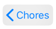
Many standard system components already implement pointer interactions. For example, the back button in a navigation bar already uses the highlight appearance, and any editable text morphs the pointer into a vertical bar cursor to aid precise inter-character selection:
Glitches Ahead!
At present (iPadOS 13.4) the SwiftUI implementation of hover effects leaves something to be desired. When it works correctly everything is fine, but in some cases it has some issues with its appearance. Regular buttons and text will frequently be given a solid white background, making the
.highlightplatter all but invisible. In contrast, when applied to a button inside a navigation bar, the effect, which takes a copy of the view to which it applies, leaves transparency in place in the copy, leaving you with one semitransparent icon floating over another. On top of this, the effect doesn’t pad itself to expand beyond the content of its view, so it will be very tightly clipped.These issues are sure to be resolved soon—maybe even by the time you read this book—but for now you should be aware that this is the case. You’ll resolve the last item above with a custom view modifier in Fixing Hover Effect Bounds.
Generally speaking, you’ll want to implement hover effects on any custom interface components you’ve created. In this application, that means the list editor with its color and icon selectors. The color wheel’s touch interaction works well for pointers already—just clicking and dragging reveals and moves a loupe, and for selecting precise colors fine precision is the order of the day. Everything below that would benefit from a little help though, to snap the pointer between elements and clearly indicate which item is active.
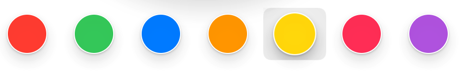
Let’s start with the color selectors. Open AccessoryViews/ColorPicker.swift. The selector buttons are all simple circles with their appearance defined by a custom button style at the top of this file. To apply the hover effect to all the buttons, you can simply add it to the button style. In ColorButtonStyle.makeBody(), add a .hoverEffect() modifier at the end of the method. If you launch the app and try it out, though, you’ll see that the highlight platter fits very tightly around the button, making it less obvious and honestly not very appealing. To fix this, use this simple trick to enlarge the view’s bounds for the hover effect, then reduce them back down for layout:
// file: "AccessoryViews/ColorPicker.swift"
fileprivate struct ColorButtonStyle: ButtonStyle {
    func makeBody(configuration: Configuration) -> some View {
        configuration.label
            .overlay(Circle().stroke().foregroundColor(.white))
            .modifier(DoubleShadow(configuration.isPressed ? 1 : 6))
            .padding(.vertical, 5)
            .hoverEffect()
            .padding(.vertical, -5)
    }
}
Now the selection highlight looks a lot better:
The same approach works for the icon selector. Open AccessoryViews/IconChooser.swift and add the extra modifiers to IconChoiceButtonStyle.makeBody():
// file: "AccessoryViews/IconChooser.swift"
func makeBody(configuration: Configuration) -> some View {
    configuration.label
        .font(.system(size: 24, weight: .bold, design: .rounded))
        .padding(6)
        .frame(width: 30)
        .padding(14)
        .background(background)
        .scaleEffect(configuration.isPressed ? 1.2 : 1)
        .padding(6)
        .hoverEffect()
        .padding(-6)
}
This has a similar appearance to the color selector buttons:
Fixing Hover Effect Bounds
Twice now you’ve used an pad-and-shrink approach to give the hover effect a larger area than the view it surrounds. If you attach a plain .hoverEffect() to any of the text buttons in your navigation bar now, you’ll see that the same problem exists there, and it appears even worse when surrounding text, because at least around a circular button there’s plenty of empty space for the platter to appear. On a text view that isn’t true, though, the bounds of the letters themselves reach all the edges of the view.
Rather than keep manually adding and removing padding everywhere, let’s create a single ViewModifier that will apply the effect for us. It can use an API like the .padding() modifier, and will apply the requested padding, apply the hover effect, then remove the padding. There are several ways to specify padding, though:
- A simple numeric value, applied to all edges.
- An
Edge.Setspecifying which edges of the view should be padded, and how wide the padding should be. Both of these have default values, so this is actually the version you’re using when you type.padding(). - An
EdgeInsetsinstance giving explicit amounts of padding for the top, bottom, leading, and trailing edges of the view.
It turns out that the first two methods can be implemented in terms of the third (and this is what SwiftUI does internally, more or less). That means your modifier only needs to keep track of two things: the HoverEffect to apply, and the EdgeInsets for use for padding.
That implies the following straightforward implementation, which you should put in AccessoryViews/ViewModifiers.swift:
// file: "AccessoryViews/ViewModifiers.swift"
struct NicelyHoverable: ViewModifier {
    private let padding: EdgeInsets
    private let effect: HoverEffect

    init(_ insets: EdgeInsets, _ effect: HoverEffect = .automatic) {
        self.padding = insets
        self.effect = effect
    }

    func body(content: Content) -> some View {
        content
            .padding(padding)
            .hoverEffect(effect)
            .padding(-padding)
    }
}
Crafting an entire structure to specify padding is a little onerous though, so let’s add a simplified initializer that will create it from a width and a set of edges:
// file: "AccessoryViews/ViewModifiers.swift"
init(_ padding: CGFloat = 8, _ edges: Edge.Set = .all,
     _ effect: HoverEffect = .automatic) {
    self.padding = EdgeInsets(
        top: edges.contains(.top) ? padding : 0,
        leading: edges.contains(.leading) ? padding : 0,
        bottom: edges.contains(.bottom) ? padding : 0,
        trailing: edges.contains(.trailing) ? padding : 0
    )
    self.effect = effect
}
Modifiers are typically accessed through functions on View, though, so scroll down to the View extension and add two new functions which map to the modifier’s two initializers:
// file: "AccessoryViews/ViewModifiers.swift"
func niceHoverEffect(_ padding: CGFloat = 8, _ edges: Edge.Set = .all,
                     _ effect: HoverEffect = .automatic) -> some View {
    modifier(NicelyHoverable(padding, edges, effect))
}

func niceHoverEffect(_ insets: EdgeInsets, _ effect: HoverEffect = .automatic) -> some View {
    modifier(NicelyHoverable(insets, effect))
}
Now you’re ready to put it to work. Start by opening Home.swift, where you’ll update the buttons in the navigation bar. Locate the body implementation, and update the .navigationBarItems() modifier by appending .niceHoverEffect() to each button:
List {
    // « ... »
}
// « other modifiers »
.navigationBarItems(
    leading: EditButton().niceHoverEffect(),
    trailing: addButton.niceHoverEffect())
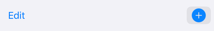
Launch your application and try it out. The platter around the “Edit” button seems correct, but the “Add” button’s platter doesn’t seem tall enough:
As it turns out, everything has indeed worked exactly as requested. The problem here is that images using SF Symbols draw themselves much taller than their bounds. If you create a similar button in an empty view and select it in a preview, you can see where the image view’s bounds really lie:

To remedy this, you’ll need to increase the vertical padding a little on all your icons. Since there are a lot of icons to cover, let’s add another helper function the View extension in ViewModifiers.swift. This will be a version of the simple niceHoverEffect() method, but internally it will create a new EdgeInsets and add a little to the top and bottom values:
// file: "AccessoryViews/ViewModifiers.swift"
func iconHoverEffect(_ color: Color = Color(.systemGroupedBackground),
                     _ padding: CGFloat = 8,
                     _ effect: HoverEffect = .automatic) -> some View {
    let insets = EdgeInsets(top: padding+6, leading: padding,
                            bottom: padding+6, trailing: padding)
    return modifier(NicelyHoverable(insets, effect))
}
Hard-Coded Numbers
The 6-point increase is purely based on what happens to look “about right” in this application. Ideally a better implementation of
hoverEffect()will be forthcoming in a newer iPadOS software release.
Apply this new modifier in the Home view to fix the problem on the “Add” button:
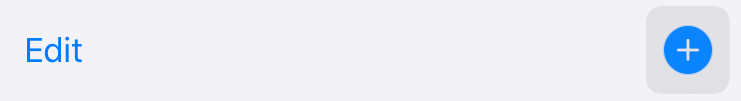
That looks much better. Now look and see what other elements might benefit from a hover effect, and see whether they need the custom niceHoverEffect() or iconHoverEffect(), or whether a plain hoverEffect() will work on its own.
What You Learned
This has been a long chapter, and you’ve learned a lot about the special facilities of iPadOS and how to take advantage of them. Specifically, this chapter covered:
- Displaying multiple scenes from your application side-by-side.
- Making good use of popovers rather than large screen-filling modal sheets.
- Managing the appearance of navigation views in a two-pane system.
- Providing support for the new pointer interaction model in iPadOS 13.4.
- Implementing key command handling, including the necessary wiring to plug into UIKit’s APIs and event propagation system.
Right now, you might be wondering what particular utility is gained from having two instances of your application open side-by-side. In the next chapter, you’ll see the answer to that, as we look at integrating drag & drop support throughout the user interface.