Chapter 6: Making the Most of the Canvas
This text was prepared for publication in March 2020. As a result, a lot of the code and techniques in this book are out of date. It is provided as a historical curio, and does not provide accurate guidance on using SwiftUI today.
- Handling Size and Appearance
- Using Multiple Previews
- Supporting Dark Mode and Light Mode
- Using Device Previews
- Supporting Dynamic Type
- Understanding SwiftUI’s Layout System
- Previewing Localizations
- What You Learned
You have now assembled a working application with numerous components. At this point, you might start using the application to test it under various different conditions. Any localization work would begin, and you’d need to run through everything in your application to ensure correctly localized and translated data appears. That’s potentially a lot of work, but happily the Xcode canvas provides facilities that will help a lot in that regard. The canvas is an important tool in application development with SwiftUI; not only does it provide visual editing capabilities and immediate updates for prototyping, but it can provide customized displays so you can evaluate multiple outputs at design time. It has a number of tricks up its sleeve, which you’ll put to good use in this chapter.
The Perils of Reading an Unpolished Book
This chapter was originally Chapter 3, following on from Application Data in SwiftUI. Right before the project was cancelled, feedback from early reviewers suggested that this be moved further back in the book to have more of the fun stuff up front. When work stopped, I had updated all the links, reorganized the code folder, and rebuilt the book, but I’d not yet reached the point of rebuilding this chapter on top of the new UI from Chapter 5. As a result, all the code here is built on top of Chapter 2’s output. If you look in the code bundle you’ll find the finished sample from this chapter under
6-Canvas. You should use the contents of2-ApplicationData/finalas a starting point if you want to follow along.
Handling Size and Appearance
When you build an application for iOS, there are several classes of devices it can run on. In size alone, you have one size for the iPhone SE, one for each of the iPhones 8S and 8S Plus, then more for the iPhone X, XS, the iPhone 11, and iPhone 11 Pro Max. In addition to these, the user can select their desired text size from very small to quite large, which will have a further effect on your app’s layout. With the advent of the font-based SF Symbols for icon images in iOS 13, even standard iconography will scale with a user’s chosen text size.
Alongside these sizing and layout concerns, iOS 13 brings dark mode support, offering a white-on-black alternative color scheme. This can directly affect some of your choices. Hard-coding your text to be a darkish gray? In dark mode, it’ll be difficult to see against a now-black view background. Manually setting your background to white? Users who favor dark mode won’t be happy that your app doesn’t conform.
Virtually all the work in this chapter will occur inside of the preview views placed at the bottom of each of the swift files containing your views. Let’s start with the detail view.
Open TodoItemDetail.swift and scroll down to reveal the TodoItemDetail_Previews structure at the bottom of the file. This type operates in a similar manner to a View, but instead of returning a view from a body property, it uses the previews property. The content, however, is much the same, with the exception of a few extra methods that only affect the Xcode preview display.
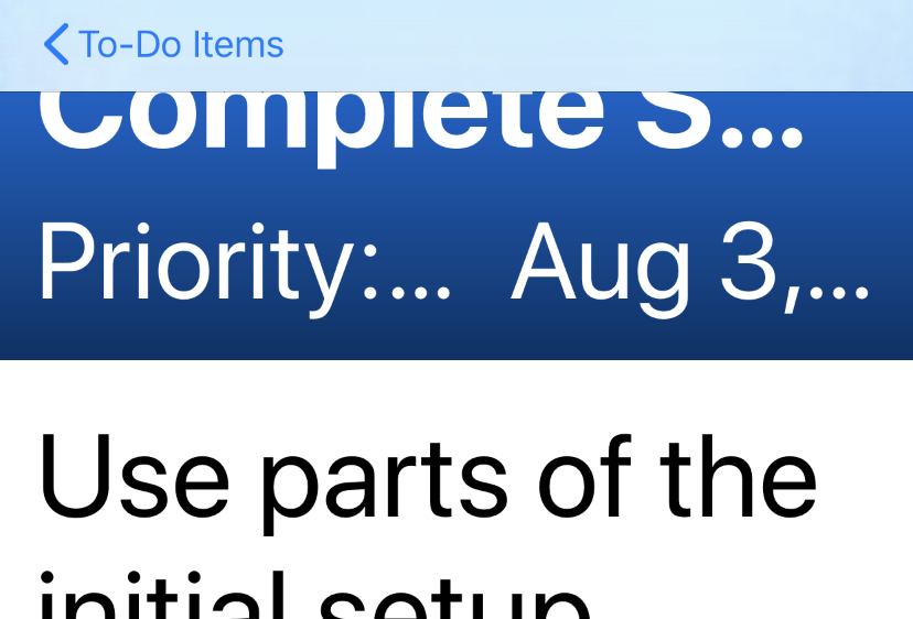
The first thing you’ll notice about the detail view on the canvas is that, unlike in the real app, there’s no title bar or back button. This is expected, given that the preview is showing only this single view; however, it would be more useful to see it in context with the navigation bar displayed. To start, wrap the existing TodoItemDetail() call in the previewsproperty in a NavigationView, like so:
// file: "TodoItemDetail.swift"
static var previews: some View {
    NavigationView {
        TodoItemDetail(item: todoItems[0])
    }
}
Click Resume, if necessary, to update the preview in the canvas, and you’ll see… well, not a lot of difference, to be honest. The header view is tall, has content aligned at the bottom, and is stretching to the very top of the screen, so the navigation bar is fully transparent. Furthermore, it doesn’t have any content, so there’s really nothing to see. Let’s add something there for now.
Add an imitation “Back” button by appending the following modifier to the TodoItemDetail instance you just created:
// file: "TodoItemDetail.swift"
TodoItemDetail(item: todoItems[0])
    .navigationBarItems(leading: self.backButton)
Add a new property to the preview provider to implement the button:
// file: "TodoItemDetail.swift"
static var backButton: some View {
    Button(action: {}) {
        HStack(spacing: 4) {
            Image(systemName: "chevron.left")
                .imageScale(.large)
                .font(.headline)
            Text("To-Do Items")
        }
    }
}
Now your view appears much as it does when you run the app in the simulator:
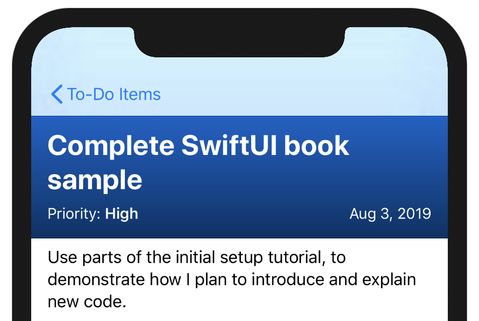
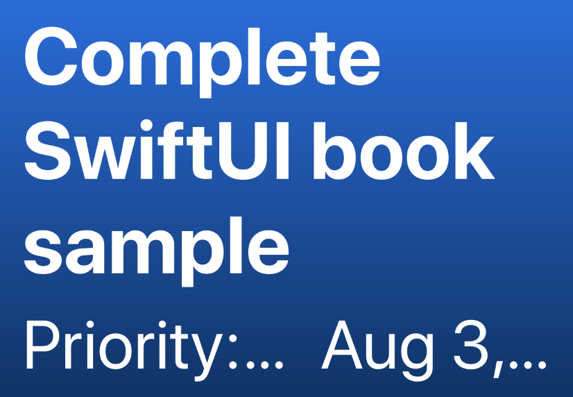
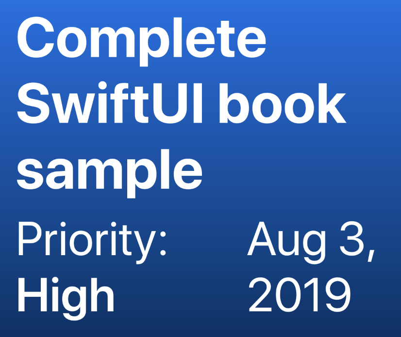
The blue coloring of the header extends up behind the navigation bar, adjusting its appearance slightly to match the rest of the content. Switch your preview to use one of the other to-do items to see what it looks like with other colors.
Using Multiple Previews
The Xcode canvas is quite flexible. One of its more useful features is the ability to display more than a single preview at a time, whether showing different data or presenting in different contexts or layouts.
Within and Without
You might want to compare the appearance of the view both when presented within a navigation stack or without. Previews enable such things via (among others) the Group view. Not so much a view in itself as an ordering mechanism, a Group view will simply render its contents within the group’s enclosing view. In the case of previews, a top-level Group will cause each of its subviews to render as a separate preview.
To see your detail view with and without the navigation bar, use the following code to generate a pair of previews:
// file: "TodoItemDetail.swift"
static var previews: some View {
    Group {
        NavigationView {
            TodoItemDetail(item: todoItems[0])
        }
        TodoItemDetail(item: todoItems[0])
    }
}
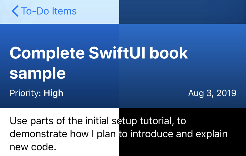
Now you have two previews on the canvas, and you’ll note that the second one doesn’t show the navigation—since there’s no navigation view, there’s no bar.
Multiple Items
Having multiple previews for a single view can help in other ways, too. You can quickly and easily see how several different to-do items will render in the detail view. Try it out:
// file: "TodoItemDetail.swift"
Group {
    TodoItemDetail(item: todoItems[0])
    TodoItemDetail(item: todoItems[1])
    TodoItemDetail(item: todoItems[2])
}
You could wrap each of those in a NavigationView to see a navigation bar, but that quickly becomes unwieldy—as does an increasing number of items. Happily, the ForEach view comes in handy here.
ForEach operates in a manner similar to a list, in that it generates content using a block and a sequence of items. Where List creates an actual list view, however, ForEach simply creates multiple subviews and passes them all up to its enclosing view. That can be a list view itself (this is helpful if your list contains multiple types of row views, for example), or if it’s a PreviewProvider, then each subview will be rendered as its own preview. To see this in action, replace the Group-based preview property with the following ForEach-based version:
// file: "TodoItemDetail.swift"
ForEach(todoItems) { item in
    TodoItemDetail(item: item)
}
Supporting Dark Mode and Light Mode
iOS 13 brings dark mode to iOS for the first time. This provides a white-on-black color scheme, lighting up less of the display, and using a more muted set of standard colors. Many users will expect your app to look good in dark mode, so it’s worthwhile to have the canvas show the different appearances.
SwiftUI provides the .colorScheme() modifier for views, allowing them to override the system setting. You can use this in previews to explicitly turn on dark mode:
// file: "TodoItemDetail.swift"
NavigationView {
    TodoItemDetail(item: todoItems[0])
}
.colorScheme(.dark)
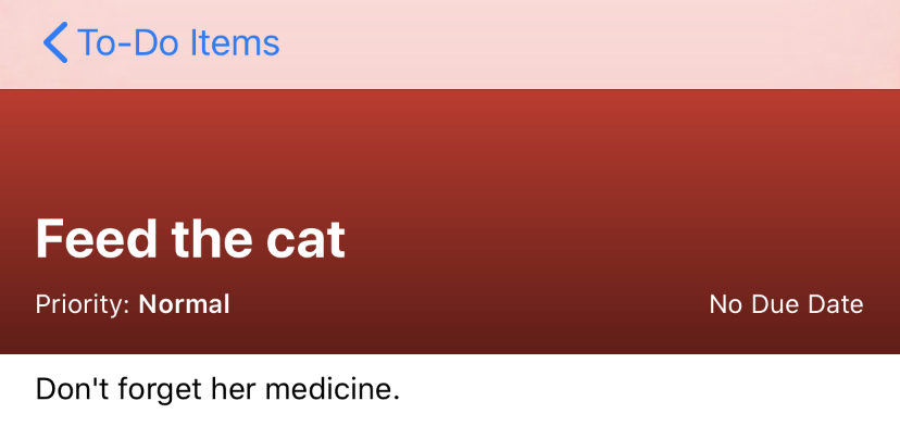
In the following image, note that the blue background of the header view changes slightly:
It becomes softer, a little lighter, and less vibrant so that it doesn’t make such a stark contrast against the black background of the text below. Since the TodoItem.Color type uses SwiftUI’s preset colors, this happens automatically: all the system colors have variants for both light and dark mode.
Right now, there are two color schemes defined in the ColorScheme enumeration: .light and .dark. Since ColorScheme conforms to the CaseIterable protocol, it provides an allCases static property that you can use to enumerate the available values in a ForEach view. Use the following code to generate a preview for each color scheme available, including any additional ones you might encounter in the future:
// file: "TodoItemDetail.swift"
ForEach(ColorScheme.allCases, id: \.self) { scheme in
    NavigationView {
        TodoItemDetail(item: todoItems[0])
    }
    .colorScheme(scheme)
    .previewDisplayName(String(describing: scheme))
}
Here, you’re iterating across all of the available schemes, using their enumeration value as an identifier, then setting that color scheme on the NavigationView using the .colorScheme() modifier.
Using Device Previews
The Xcode canvas can also display several different devices, which will help you to quickly discover any layout problems that might arise on the smaller screen of an iPhone SE, for example. For this purpose, SwiftUI provides a number of view modifiers specific to showing previews in the canvas:
.previewLayout(value: PreviewLayout)enables you to define the size and shape of the preview’s container (you saw this before)..previewDevice(value: PreviewDevice?)lets you specify a particular iOS, watchOS, or tvOS device to simulate; this is the default, with a device chosen based on the active Xcode build scheme..previewDisplayName(value: String?)allows you to customize the name displayed below the preview on the canvas. This can be quite helpful when showing multiple previews.
To show multiple devices, you’ll use the .previewDevice() modifier. Its argument, an instance of PreviewDevice, can be constructed using the standard (or ‘marketing’) name of the device in question using the PreviewDevice(rawValue: String) initializer. Handily, that value is also useful as a name for the preview, meaning that it’s quite straightforward to generate multi-device previews:
// file: "TodoItemDetail.swift"
ForEach(["iPhone 11", "iPhone SE"], id: \.self) { name in
    TodoItemDetail(item: todoItems[0])
        .previewDevice(PreviewDevice(rawValue: name))
        .previewDisplayName(name)
}
Supporting Dynamic Type
One way a user can customize the UI on their iOS devices is by changing the dynamic type size of text throughout all apps that correctly support it, as recommended by Apple. SwiftUI has just about everything you need for this task already implemented, so your app already supports dynamic type sizes. This leaves you with another task, though: you need to make sure that your application will behave correctly at different type sizes. Previews in the Xcode canvas make this once onerous task relatively simple and straightforward.
By now, you can probably guess how this preview will be implemented. The ContentSizeCategory enumeration is used to specify the size class to use, and it conforms to CaseIterable, so it has an allCases static property which can be enumerated using a ForEach view. To actually set the size class to use, you specify it using the SwiftUI environment, with the \.sizeCategory key. You can use a description of the category as the preview name since there are a lot of possible values.
// file: "TodoItemDetail.swift"
ForEach(ContentSizeCategory.allCases, id: \.self) { category in
    TodoItemDetail(item: todoItems[0])
        .environment(\.sizeCategory, category)
        .previewDisplayName(String(describing: category))
}
The results are quite illustrative. A single-line title on the smallest setting makes the header look far too big:
Meanwhile, a double-line title on the largest non-accessibility setting looks like it’s squeezing up against the navigation bar somewhat:
Once you get to the accessibility-related size, though, things just get unbearable:
None of this is ideal. While the very largest accessibility size likely requires some special handling, the non-accessibility issues all come down to one thing: the header has a fixed 200-point height, defined by the rectangle:
Rectangle()
    .fill(item.color.uiColor)
    .frame(height: 210)
    .overlay(TitleOverlay(item: item))
This code defines an area of 210 points in height and then lays the text and gradient on top of it. A better solution is to let the text content determine the size, and have the color and gradient match.
The opposite of the .overlay() modifier is .background(). In both cases, the view provided to the modifier is forcibly sized to match the one to which the modifier is applied. So far, you’ve taken a fixed-size rectangle and applied the text to it. Now that the text is growing and shrinking, the rectangle should follow suit, and swapping the order of the views will fix that.
Take the code from the TitleOverlay view and move it into the appropriate places in the TodoItemDetail view:
- Move the properties
gradientandformatterto become properties ofTodoItemDetail. - Take the content of
TitleOverlay.body, and put it intoTodoItemDetail.body, replacing theRectangle()view and its modifiers. - Attach a
.background()modifier to theVStackyou just moved, filling it with aRectangle, filled with the item’s color, and with an overlay using thegradientproperty.
The code inside the top-level VStack of TodoItemDetail.body should now look something like this:
// file: "TodoItemDetail.swift"
VStack(alignment: .leading, spacing: 8) {
    Text(verbatim: item.title)
        .font(.title)
        .bold()
        .layoutPriority(1)

    // « … more … »
}
.foregroundColor(.white)
.padding()
.padding(.top)
.background(ZStack {
    Rectangle()
        .fill(item.list.color.uiColor)
        .overlay(gradient)
        .edgesIgnoringSafeArea(.top)
})

if item.notes != nil {
    Text(verbatim: self.item.notes!)
        .padding()
}
Spacer()
Refresh the previews in the canvas, and you’ll see that the header is now growing along with the size of the text, preventing it from pushing up into the top of the screen—success!
There’s one last thing you can do here, though. With short notes content such as you’re currently using it isn’t obvious until you scroll down to look at the accessibilityExtraExtraExtraLarge variant. There, you’ll see that the notes no longer fit on the screen, and in fact, are truncated. To resolve this, you can use a ScrollView, either around the text field containing the notes:
if item.notes != nil {
    ScrollView(.vertical) {
        Text(self.item.notes!)
            .padding()
    }
}
…or around the entire view, taking care to move out the .navigationBarTitle() modifier to now sit on the scroll view:
var body: some View {
    ScrollView(.vertical) {
        VStack(alignment: .leading) {
            « ... content ... »
        }
    }
    .navigationBarTitle("", displayMode: .inline)
}
However, note that a scroll view, by definition, clips its contents. This means that the .edgesIgnoringSafeArea() modifier on the header background won’t appear behind the navigation bar if you put the scroll view around the whole thing. If you go with the first option, however, and wrap only the notes, you’ll likely notice a slight problem appear in the header at large type sizes:
This is an artifact of SwiftUI’s layout system. To understand why this happens and how to fix it, you need to look at SwiftUI’s layout model.
Understanding SwiftUI’s Layout System
When SwiftUI looks to lay out a container’s subviews, it follows a relatively simple process for each axis:
- Create an initial budget for each subview by dividing the full amount of space equally.
- Ask each view in turn how much space it needs, passing in its budget as an upper limit.
- If the view doesn’t use its full budget, the remaining amount is apportioned equally amongst the remaining views.
Let’s look at these steps in some more detail.
SwiftUI first determines the amount available space, then it partitions that space equally between all of the available subviews, as shown here:
The layout engine then looks at the kinds of subviews it’s dealing with, separating them into two groups: fixed views are those whose sizes are defined either explicitly—by the .frame() modifier—or implicitly with an intrinsic size—for instance the bounds of an image. Flexible views are those that do not meet this criteria.
SwiftUI then takes each of the fixed views and informs them of their allotted space. In this example, the circle view will be offered one-third of the available width, and all of the height; the circle will reply, thanks to the explicit frame, that it requires only 18×18 plus some padding, taking somewhat less than what was offered. Once all of the fixed views have chosen their sizes, SwiftUI re-assesses the amount of space available for the flexible views to use and again apportions that equally between them. This results in the following prospective layout:
The layout engine hands the assigned size to each view, in turn, in layout order (leading vs. trailing, top-down vs. bottom-up, depending on the containing view’s alignment settings), and each view will determine how much of that size it will use. If it uses less than that offered, then any remainder is divided among the remaining views, leaving the layout seen here:
For the header view you’re working on in this chapter, the text is bumping up against the height constraint of the view. The title, priority, and date Text views all need to wrap their content onto at least a second line. The layout system notices that there isn’t quite enough room for their ideal dimensions, so it gives precedence to the title, allowing it to expand. The priority and date fields are then forced by the height constraint to truncate themselves to a single line.
A similar thing used to happen in the first released versions of SwiftUI, where a Spacer view would always take all the proffered space, rather than shrinking to allow other views to grow. Thus a Text, Spacer, and Text in an HStack would end up using one third of the available width each. Apple resolved this by making implicit what here you’ll have to make explicit: that one view’s layout is more important than the other. For this, you use layout priorities.
In SwiftUI, all views have a layout priority, represented as a floating-point value. By default, this value is zero for everything, meaning all views are treated equally (it seems Spacer is a special case). When these values are not equal, the layout system takes an extra pass, grouping subviews by their priorities in descending order. Then, within each group, it will perform the fixed vs. flexible layout steps outlined above to apportion space, then take anything remaining on to the next-highest priority views, as shown in figure 4. Note that some views have a minimum size, which is always respected—for instance, a Text view will not normally disappear completely: it will instead specify a minimum large enough to display a single ellipsis (…) character.
In the current case, the ScrollView is accepting all the vertical space it’s been offered (50% of the total), and the header view is left without enough room to display all its content. The use of named text types (headline, title, etc.) has allowed the layout system to prioritize the three-line title over the other text areas, but still, there’s not quite enough room.
The solution to this is as simple as adding a new .layoutPriority() modifier to the header view, to raise its priority above that of the scroll view:
// file: "TodoItemDetail.swift"
VStack(alignment: .leading) {
    VStack(alignment: .leading, spacing: 8) {
        « ... content ... »
    }
    .foregroundColor(.white)
    .padding()
    .padding(.top)
    .background(« ... »)
    .layoutPriority(1)
    « ... »
}
Now the header renders in an expected manner:
With this step complete, let’s look at how the canvas can help us preview and verify some other text-related changes: localization.
Previewing Localizations
Ideally, your application will support multiple locales and languages. The Xcode canvas offers an easy way to quickly preview how your localizations are shaping up, that translated text is appearing where it should, and to ensure your layout works for every language you support.
To use the next few examples, you need to add the localization files from the sample project to your own. You’ll find them in the localizations folder within the code bundle, where you’ll see three folders: ar.lproj, en.lproj, and pl.lproj. These contain Arabic, English, and Polish versions of the Localizable.strings file containing translated versions of various words supplied by the app.
One of the localizations, Arabic, has been chosen explicitly to exercise one particular aspect of application localization: right-to-left layout. You may have noticed that alignments are named ‘leading’ and ‘trailing’ rather than ‘left’ or ‘right.’ This is because, in a right-to-left locale, the leading edge will be on the right side of the screen, and the trailing edge to the left. You’ll use these three localizations in your next canvas update.
There are two parts to set related to your localization. The first part is the locale, the information around the language, and the common formats used for things like decimal points, currencies, times, and dates. The second part is the layout direction, either left-to-right or right-to-left. Given a list of locales and their corresponding layout directions, you can easily use a ForEach view to generate a preview using each localization and layout.
The values are passed into the preview’s views using the SwiftUI environment. The .environment(_:_:) view modifier is what you’ll use to pass in modified versions. This modifier takes two arguments. The first is a key-path expression, such as \.locale, used to identify which value to set. The second is an instance of the appropriate type for that value. For a locale, you use \.locale and an instance of Locale. For the layout direction, the parameters are \.layoutDirection and a case of the LayoutDirection enumeration—either .leftToRight or .rightToLeft.
That gives you the pieces you need. Now put them together, creating an array of Locale–direction pairs to iterate over, then set the relevant environment variables on the NavigationView:
// file: "TodoItemDetail.swift"
let localePairs: [(Locale, LayoutDirection)] = [
    (Locale(identifier: "en-US"), .leftToRight),
    (Locale(identifier: "pl"), .leftToRight),
    (Locale(identifier: "ar"), .rightToLeft),
]

return ForEach(localePairs, id: \.self.0) { value in
    TodoItemDetail(item: todoItems[0])
        .environment(\.locale, value.0)
        .environment(\.layoutDirection, value.1)
        .previewDisplayName(value.0.languageCode ?? value.0.identifier)
}
Now, the actual titles and notes from the to-do items won’t be translated, but the back button title, the date, and the priority labels will be. Additionally, the Arabic locale will be laid out right-to-left, with any English text being written left-to-right but right-aligned. However, two errors immediately leap out:

The back button has been translated, but it appears on the left-to-right leading edge for some reason, and its chevron is pointing left—but in a right-to-left context, it should be pointing right.
The second error is that the priority hasn’t been translated: it still reads “High,” even though a translation was provided.
Happily, the first issue is a glitch with the previews and doesn’t affect the real application. You can verify this by switching to TodoList.swift and applying the locale and layout direction environment changes to switch it to Arabic, then running live preview. Navigate into an item, and the back label correctly appears on the right side of the screen:

Localizing String Variables
The label is produced by the following code from TodoItemDetail.TitleOverlay.body in TodoItemDetail.swift:
Text("Priority: ") + Text(item.priority.rawValue.capitalized).bold()
The “Priority:” is being translated, so why not the other Text view’s content? Neither is using the Text(verbatim:) initializer, so shouldn’t this be translated automatically?
You can find the answer by looking at the initializers available on the Text structure:
public init(verbatim content: String)

public init<S>(_ content: S) where S : StringProtocol

public init(_ key: LocalizedStringKey, tableName: String? = nil,
            bundle: Bundle? = nil, comment: StaticString? = nil)
- On line 1 is the verbatim-text initializer, which does nothing special with its input.
- On line 3 is the string-type initializer, which will accept values of type
StringorString.Substring. Note that only those two types conform toStringProtocol; theStaticStringtype used to represent text such as"this"in the code specifically does not conform to that protocol. Static inline strings will therefore not be matched against this initializer. - The initializer on lines 5–6 has no argument label and takes an input of type
LocalizedStringKey. Looking at that class, it conforms toExpressibleByStringLiteral(viaExpressibleByStringInterpolation), so the use of an inline string argument without theverbatim:label will cause this initializer to be selected.
Looking at the arguments used when creating the Text views for the priority display, you’ll see that the first Text instance is given a static string, so that will match the LocalizableStringKey initializer. The second takes a plain String, though, which will match against the StringProtocol initializer. Aha, that seems to be the issue then.
Test the hypothesis by modifying the code to create a new LocalizedStringKey from the priority string and use that to initialize the Text view:
// file: "TodoItemDetail.swift"
HStack(alignment: .firstTextBaseline) {
    Text("Priority: ") +
        Text(LocalizedStringKey(item.priority.rawValue.capitalized)).bold()
    // « ... »
}
Click Resume on your canvas, if necessary, and note that the priority names are now correctly translated.
Localizing the List
While we’re looking at localization data, it would be useful to interact with the application in Live Preview mode to check that everything is working properly. For this, you should start at the List view.
Open TodoList.swift and scroll down to the TodoList_Previews structure. Add the Arabic locale and right-to-left layout to the preview’s TodoList:
// file: "TodoList.swift"
TodoList()
    .environment(\.locale, Locale(identifier: "ar"))
    .environment(\.layoutDirection, .rightToLeft)
Click Resume in the Xcode canvas, if necessary, to get the preview updated, and you’ll immediately see the effects of the right-to-left layout.
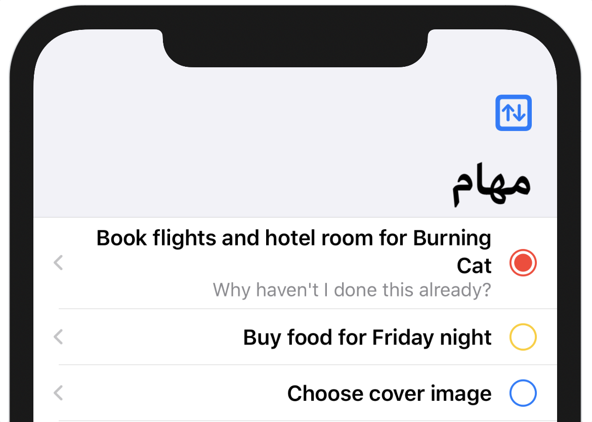
The rows are set out correctly, with their contents’ left-to-right ordering reversed. The color dot and arrow are on the left; the title and notes are on the right. The list’s title is also displayed on the right.
Click the Play button at the bottom of the preview to enter Live Preview mode and select one of the rows. You’ll see the detail view slide in from the left (which is now the trailing edge), and the content, including the back button you worked on earlier, all appears as expected. Click the back button to return to the list (note that the navigation bar’s leading and trailing edges are now correct) and click on the Sort icon that’s now at the top left of the list.
Argh, another problem! The title of the alert is translated properly, but the button titles aren’t. The Localized.strings file definitely contains translations for these buttons, so what’s causing this to go wrong here?
Scroll up in the editor toward the declaration for the ActionSheet and you’ll see a familiar sight: the button titles are created using Text(opt.rawValue). As you saw earlier, this formulation is going to call the StringProtocol initializer for the Text view, so the solution here is the same: initialize a LocalizedStringKey from the option value, like so:
// file: "TodoList.swift"
ActionSheet(
    title: Text("Sort Order"),
    buttons: SortOption.allCases.map { opt in
        ActionSheet.Button.default(Text(LocalizedStringKey(opt.rawValue))) {
            self.sortBy = opt
        }
    }
)
Update your live preview and try the sort button again. This time all the options should be correctly translated. The same should apply if you switch to the Polish localization as well.
The last place that needs some localization love is the TodoListChooser. Here the navigation bar title is correctly translated, but the “All Items” row title is not. The Row instance is initialized with a static string, though:
// file: "TodoListChooser.swift"
NavigationLink(destination: TodoList()) {
    Row(name: "All Items",
        icon: "list.bullet",
        color: .gray)
}
Scrolling down to the Row implementation, the lack of translation becomes clear: the name property has type String, so when it’s passed into the Text initializer it won’t be localized. There are several ways you can handle this, but the most straightforward for now is also the simplest: wrap the value passed into the Text initializer in LocalizedStringKey(), like so:
// file: "TodoListChooser.swift"
var body: some View {
    HStack {
        Image(systemName: icon)
            .foregroundColor(.white)
            .frame(width: 32, height: 32)
            .background(color)
            .clipShape(Circle())

        Text(LocalizedStringKey(name))
    }
}
With that in place, the “All Items” name will be correctly translated.
What You Learned
A lot of user interface debugging and testing takes place only by running the application and trying to get it to enter all the available states, one by one. The Xcode canvas helps out here by providing a quick and easy way to produce the same effects right next to the editor with a minimum of effort. As you’ve seen, it makes it easy to notice errors that you might not normally encounter at this stage of your application, and similarly easy to fix them.
Now you have the know-how to put the Xcode canvas to good use, ensuring your application’s quality right from the word go. With this knowledge in hand, it’s time to move to a larger application canvas. In the next chapter you’ll bring the app to iPadOS and look at implementing support for the unique capabilities of that platform.